Nike didn’t tiptoe into tennis. It showed up swinging by sponsoring Ilie Nastase in 1973, the original rebel in a sport that had always preferred well-behaved athletes. However, it wasn’t until 1978 that Nike created a signature logo for a tennis player.
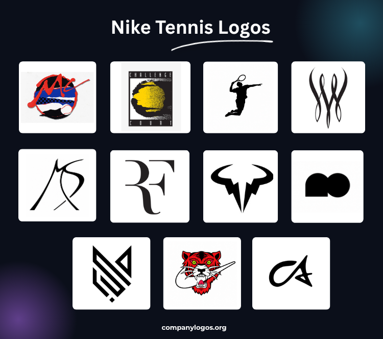
Each Nike tennis logo inlaid for its tennis aces reflects their individuality and manifests the message that the brand wanted to convey from day one: Nike’s here to lead.
1. John McEnroe (1978)
With the outliers as its brand representatives, Nike made it very clear that they weren’t here to blend in. John McEnroe was one such maverick who was signed by Nike in 1978.
In 1985, the sports brand revealed a one-of-a-kind Nike tennis player logo, which was a direct extension of McEnroe’s attitude. Artistically, the overall look of this logo oozes a “radical” aesthetic, a form that incorporates several distinct stylistic elements.
The abstract expressionism is discernible in the first-name wordmark “Mc.” The bold proprietary typeface was rendered in a rough, brushstroke-mimicking, red script.
The background against which the lettering was set was a collage of bold, contrasting blocks of primary colors (red, black, blue, and white) and a black-and-blue checkerboard pattern. The checkerboard carried real meaning, a visual nod to the taxi cabs of his New York City hometown.
Peter Moore was the designer who crafted McEnroe’s brand identity, building out the posters, logos, and footwear that made the first Nike tennis logo so cohesive. The partnership stood as an early blueprint for what the best Nike player logos could accomplish when a brand commits fully to an athlete’s actual personality rather than a polished version of it.
2. Andre Agassi (1990): Challenge Court
How did Nike’s Challenge Court line, introduced in 1989, become closely associated with Andre Agassi in 1990? The answer lies in his unmatched charisma and on-court flair, which complement the Challenge Court “Hot Lava” line well and make it famous.
And the logo? Well, that was one happy accident.
Tom Andrich was sketching with a tech pen when the inky lid slid across the paper, leaving a blob. Most designers would have tossed it. Andrich didn’t. He tore out the paper, set it on his desk, and when he came back to it after a meeting, something clicked.
“It looked exactly like a tennis ball,” he recalls. That accidental blob became the iconic “fireball,” one of the most well-known Nike tennis logos.
A bold black rectangle frames a loose, ink-blotted circular form. At its core, a burst of grainy yellow sits covered in black freckles and surrounded by the imperfect edges of the black outer ring. Two horizontal streaks cut across the composition, one at the top and the other at the bottom.
The white letterforms in “CHALLENGE” above and “COURT” below look comfortable on the black band. They appear in a generously spaced, all-caps, sans-serif typeface with slightly irregular, hand-cut edges.
3. Pete Sampras (1997): Jumpsmash
The Californian tennis player joined Nike in 1994, but the visual identity most associated with him took years to fully materialize – most notably in 1997, on the Nike Air Oscillate, designed by Tinker Hatfield.
This signature shoe was a player-exclusive, promo-only colorway to mark his 26th birthday. The limited release features a heel graphic of Sampras suspended mid-air, executing his signature overhead “Jumpsmash”.
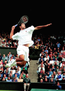
The clean and unembellished outlines made it appear as a printed logo, letting the shape of the movement carry the weight of the identity.
4. Serena Williams (2004)
The “Queen of the Court” has never done anything quietly, and her Nike signature logo is the prime example.
In the 2004 US Open, Serena walked onto the court unapologetically, and debuting on her headband that day was her official Nike logo, introduced the same way she introduced herself to every opponent.
The Serena Williams logo assembles three pairs of sweeping, blade-like strokes that cross and weave around each other. The beginning and ending of these strokes are fine, elegant points that curl subtly outward at the tips like the tendrils of a vine.
At its center, four individual strokes converge and intertwine into a layered structure. A comprehensive look reads it as a stylized “W.”
Serena stepped up her game by bringing a cause into her Nike branding. In 2019, she and Nike launched the Serena Williams Design Crew, an apprenticeship program that gives diverse designers a chance to shine at Nike.
The monogram dominates the composition in a massive, bold, serif uppercase typeface. Four letters, “SWDC,” sit nestled, commanding the space completely. The “W” appears slightly compressed in italics to fit the four letters into a balanced lockup.
The Nike swoosh blesses the monogram in a sleek, clean look. The wordmark runs beneath the monogram in a tight, all-caps, condensed sans-serif, spelling out the full name and giving the bold monogram above its meaning.
5. Maria Sharapova (2008)
Over the course of her career, Maria Sharapova won 36 WTA titles, including five Grand Slams.
For the legendary player, Nike’s design team created the “MS” monogram. The ‘S’ takes the form of a boomerang with its tail intersecting with the right arm of ‘M,’ which also appeared to be arched.
Like all Nike tennis logos, the Sharapova monogram also aligned with the athlete’s temperament. The logo, although seen rarely, traveled with her through all of Nike’s apparel, footwear, and court-side branding.
6. Roger Federer (2006)
Roger Federer ruled professional tennis for 24 years, claiming 20 Grand Slam championships and 103 singles titles before hanging up his racket at the Laver Cup in 2022. Nike had backed him throughout his entire career, signing him in 1994 and supporting him throughout decades of dominance on the court.
Federer first introduced a personalized “RF” Nike tennis logo in 2006 on a custom white blazer at Wimbledon. What made this mark so near to the player was that his wife, Mirka, had originally designed the monogram for a fragrance brand she launched in 2003. Although that fragrance line didn’t last long, the logo did.
Recognizing its potential, Nike modified the design, transforming it into the elegant mark we see now. They officially conceptualized and registered this Nike tennis player logo in 2008, then expanded it across Roger’s full apparel collection in 2010.
The genius of the design lay in its minimalist approach. It combines the tennis great’s stylized initials into a single unified mark by cleverly removing the vertical strokes that were common in both letters.
The typography further elevated the design. Federer’s mark drew inspiration from luxury fashion brands and used a modified, high-end serif font that looks somewhat similar to the Bodoni typography. The use of high-contrast weight, a curved tail on the “R,” and a sharp, precise diagonal on the “F” made it more like a Vogue cover than an athlete’s personal mark.
The End of an Era
In March 2018, Federer concluded his long partnership with Nike.
Federer’s connection with the mark can be well put by this statement he gave at a 2018 Wimbledon press conference: “It’s also something that was very important to me, for the fans. They are my initials. They are mine. The good thing is it’s not theirs forever. In a period of time, it will come to me.”
He regained the rights to his logo in early 2020.
Federer has a 10-year $300 million deal with Uniqlo, a Japanese fashion retailer, which continues to use his ‘RF’ logo on apparel.
7. Rafael Nadal (2013)
Rafael was just 13 years old when Nike signed him, but soon that boy became the “King of Clay.” Nadal is one of the greatest tennis players of all time, ranking No. 1 for over four years in his professional career, basically unstoppable!
In 2013, the sports brand gave this force of nature a well-suited Nike tennis logo: the raging bull. The base of two sweeping, crescent-shaped horns that arch outward resembles a lightning bolt.
They plunge from the horns jaggedly, narrowing into sharp points at the base to form what resembles a skull. The white space between the horns and skull divides the mark into two perfect halves.
8. Naomi Osaka (2020)
In November 2020, Naomi Osaka, a four-time Grand Slam champion, launched her apparel partnership with Nike.
The collection is inspired by her multicultural background spanning Japan, Haiti, and the US. The line did more than put her name on the product; it introduced distinct brand elements that together formed the visual foundation of her Nike athlete symbol.
Her primary tennis logo is the “NO” monogram. Structurally, it abandons conventional letterforms entirely. The “N” sheds its diagonal strokes and distills down to a 2-D, composite semicircle while the ‘O’ adjoins it.
The circular element carries a deeper meaning beyond its function as initials. It directly references the “Hinomaru,” the red disc at the center of the Japanese flag depicted as the sun, giving a nod to Osaka’s Japanese heritage.
Another noted symbol from the line was a customized Maneki-Neko illustration. The traditional Japanese cat was redrawn to reflect Osaka’s personality. In the reworked version, the figure holds a tennis racket in place of the customary gold coin.
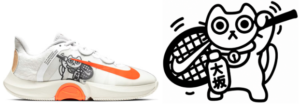
Nike has since printed the motif on insoles and embroidered it onto the heels of her special edition sneakers, giving the symbol a recurring presence across her footwear releases.
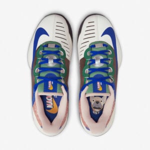
During the 2022 US Open, Naomi entered the New York court in her new Nike shoe, NikeCourt Air Zoom GP Turbo ‘Butta’ Custom PE, featuring her pet French bulldog “Butta” wearing a collar with the Swoosh, as well as her favorite manga series “Naruto.”
9. Jannik Sinner (2022): “The Fox”
Jannik Sinner burst onto the professional tennis scene as one of the most exciting young talents. His Nike tennis logo, introduced in 2022, depicts a fox, his high school nickname.
The genius of this Nike athlete symbol lies in its layered complexity. Sinner’s initials, “J” and “S”, hide in the bottom left corner of the design. The lines and angles throughout the emblem symbolize his two greatest passions: tennis and skiing.
The ears of the fox represent the mountains where he spent his childhood days skiing. Each element connects to a specific memory or part of his identity.
10. Aryna Sabalenka (2025)
Aryna Sabalenka has been constantly reigning over the WTA singles since late 2024.
For the 2025 Australian Open, Nike placed a small figure of a lunging tiger on the side heel of her shoes. This mark was a visual reference to the tattoo she carries.
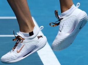
The placement was understated, almost private. The player was quoted as saying, “It’s just a little different picture; I don’t want to keep it the same-same every time.”
The result debuted at Roland Garros 2025, a.k.a. the French Open, as a fully realized Nike tennis logo.
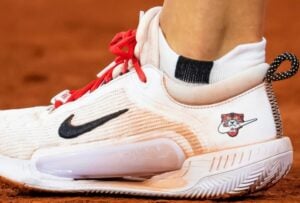
The mark centers on a forward-facing tiger head rendered in vivid illustrative details like striped burnt-orange and black fur, wide yellow-green eyes locked in a fixed glare, and a jaw pulled open in a full snarl that exposes razor-sharp, bared teeth.
A Nike swoosh sits clenched between those teeth. The overall composition is bold and graphic, closer in energy to tattoo art than to the modern minimal mark approach typical of most Nike tennis logos.
11. Carlos Alcaraz (2026)
There have been some speculations about Carlos Alcaraz joining Nike again, but this time with his own custom logo.
The rumor gained traction when Nike registered a logo with the “CA” initial at the U.S. Patent and Trademark Office on 21st January 2026, which is believed to be linked with the current number one men’s singles tennis player.
The registered logo appears as a seamless conjunction of the letters C and A, following an effortless, fluid design – a quality that mirrors the natural flow and finesse required in tennis.
Neither Nike nor Alcaraz has confirmed their connection to the logo yet.
Special Mention: NikeCourt Logo
The Nike Tennis Court logo is the official emblem of the Nike line dedicated to tennis. It showcases a bold rectangular frame, which is a simplified overhead view of a tennis court that Nike modified to suit visibility and the easy addition of other elements. The Swoosh runs through the middle of the court design.
The logo also appears in full color. The golden yellow section lines bordered the entire rectangle. The upper and lower horizontal bands of the service line carry a deep olive-green tone.
The two main court sections are split vertically, with the left panel in deep red and the right in royal blue. A bold white Swoosh cuts across the center, spanning both color fields.