A shoe is not just pieces of leather sewn together; it is art and science combined.
Nike is one such sports brand that didn’t limit its shoes to mere necessities but experimented with materials, design, and tech, Frankensteining them to the point that it almost seems fictional.
From the beginning, when the brand’s future was uncertain, to today, when its momentum is unstoppable, Nike has consistently delivered excellence through its performance-driven lines.
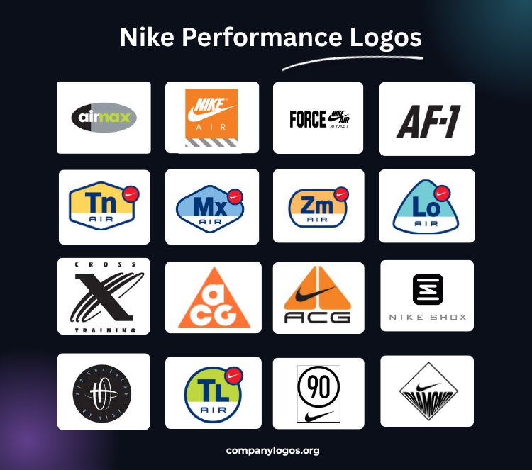
Here are classic Nike performance logos that celebrate the uniqueness of each of its technology-based shoe lines, apparel, and accessories.
1. Nike Air Max Logo
Crowning our list of Nike performance logos is the Nike Air Max logo. Conceived by Sergio Lozano in 1995, it first appeared on the Nike Air Max 95. The groundbreaking sneaker’s design was deeply inspired by nature and the human spine.
For a design so different, the logo had to be equally complementary. With the help of Jeff Weithman, Nike created the iconic Air Max logo. Within the oval, split into a black left half and a grey right half, the lowercase sans-serif wordmark plays a clever visual trick. The letters ‘a’ and ‘i’ sit in white on the black side, with ‘i’ resting right at the junction of the black and grey backdrop.
The partially white ‘m’ creates an illusion of ‘r,’ making the word ‘air.’ The remaining letters appear in neon green against the grey backdrop, directly mirroring the signature colors of Air Max 95.
2. Nike Air Logo
The “Nike Air” logo flaunts the innovative prowess that redefined shoe anatomy through air-cushioning technology.
While the technology debuted in the Nike Tailwind in 1978, created by former NASA engineer Frank Rudy, this Nike performance logo became more visible in the early 1980s, notably with the Nike Air Force 1 (1982). In 1987, it gained widespread recognition with the branding of the Nike Air Max 1, and since then, the logo has become synonymous with this technology.
The Nike Air logo typically combines the Nike swoosh logo and wordmark with “AIR” text in a less-weighted sans-serif font that appears beneath or beside it. Rather than being a single fixed design, the logo appeared in multiple variations across different products and eras.
3. Air Force 1
Did you know that Nike stopped producing the Air Force 1 in 1984, just two years after its launch?
Nike’s first basketball sneaker with air cushioning technology was designed by Bruce Kilgore, who got motivated by the Nike hiking boot, the Approach. The AF1’s release in late October 1982 became an instant hit, so much so that even after Nike discontinued it, its popularity carried on. Eventually, Nike brought it back in 1986 with the text “AIR” in italics and the swoosh on the heel.
The logo proved just as iconic as the shoe itself, transcending footwear and appearing on apparel. The star of the logo is the bold, all-caps “FORCE” on the left. It uses an extremely heavy, geometric display typeface with angular, cut-off edges.

To the right sits the familiar “NIKE AIR” logo in italic, all-caps sans-serif, with the swoosh striking the words diagonally in the middle. Beneath the Nike Air lockup, “AIR FORCE I” appears in a small, spaced-out, clean sans-serif typeface. Uniformity is preserved throughout with the solid black.
Other than this, the AF-1 acronym is also famous for the logo, which can be seen on the lace dubrae in some versions of the shoes. It carries the initials “AF” (short for Air Force) and the numeric “1,” separated by a hyphen and rendered in an all-caps, italic sans-serif font.
4. All Conditions Gear Logo
The mountain that inspired the legendary All Conditions Gear (ACG) line of Nike was K2. In 1978, Nike supplied an American K2 expedition with the newest Nike LDV (Long Distance Vectors). The climbers returned with blown-out LDVs and a list of improvements.
That feedback sparked the launch of ACG in 1989, a performance line exclusively built for athletes who hike, climb, and explore, and its logo carries exactly that spirit.
The early 90s ACG featured a bold equilateral triangular form, inside which three characters, a lowercase “a,” sit atop the uppercase “C” and “G,” creating an upward pyramid. The rounded, sans-serif letterforms pair well with the striking orange backdrop. The logo also appears in a few other color variations depending on the intended use.
During the mid-90s, the brand released another version of the Nike ACG performance logo, placing two right-angled triangles opposite each other, resembling a pair of lungs. The swoosh ran across the lungs with the acronym ‘ACG’ placed right below. This ACG logo edition appeared prominently on apparel rather than shoes.
5. Cross Training
The Nike Cross Training line was introduced in 1987 to support its push into multi-sport athletic training. Built around the idea that one athlete could train across multiple disciplines, the brand expanded through the 1990s.
Before that, Nike presented the line with just a lowercase wordmark stitched on the shoe tongue. However, in 1993, the company launched a recognizable cross-training logo that can still be seen on retro Nike shoes and apparel.
As seen above, the gigantic “X” sits as the centerpiece of the logo, a visual shorthand of “cross”. A massive, solid, serifed left stroke anchors the shape, while three open elliptical shapes loop around it to form the right stroke.
The typography sandwiches the “X,” with “CROSS” sitting above it and “TRAINING” below, both in an amply spaced, all-caps, sans-serif typeface. A consistent black treatment tied the entire logo together. However, the symbol appeared in different colors as well, depending on the overall design of the shoe it was on.
6. Nike Air Elements
The Air Elements feature a new set of “periodic table-inspired” logos representing different innovations in Nike Air technology. If you are a sneaker freak, you might be familiar with the Power Rangers of the Nike Air family, designed by Derek Welch as part of a series of five similarly shaped logos mapping the evolution of the Nike Air.
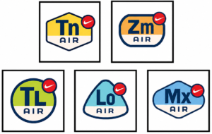
In 1998, a six-corner emblem with a red swoosh badge on its shoulder ended up on the Air Max Plus in a distinctive yellow-white combination. The hexagon bears “Tn,” short for “tuned,” as in tuned cushioning technology. The “Tn” follows bold sans-serif type, while the word “AIR” appears in an all-caps, sleeker sans-serif font, just below the abbreviation on the white portion of the hexagon.
Designers carried this pattern across other performance logos representing various Nike Air technologies, such as ‘Zm AIR’ for Zoom Air (originally known as Tensile Air), debuting with Nike Air Go LWP in 1995, and ‘TL AIR’ for Total Air, appearing on Nike Air Max TL in 1998. Likewise, ‘Lo AIR’ is for Low Air, and ‘Mx AIR’ is for Max Air.
7. Nike Shox Logo
The Nike Shox logo debuted in 2000 with the launch of Nike Shox, taking Nike’s “Cushioning Technology” a notch further. Inspired by space and astronaut apparel, Nike created a shoe with column-like structures called Shox that not only cushions the player’s heel from impact but also turns that impact into a booster-like rebound.
A bold, black, rounded square icon houses two horizontal bars stacked evenly. Between them, two slightly smaller bars break away from the pattern, bending into a sharp, angular “S” shape. It’s subtle at first glance, but once you see it, you can’t unsee it.
Below the icon, the “NIKE SHOX” wordmark settles in a wide-spaced, all-caps, geometric sans-serif type rendered in a medium grey. Another variation of the logo swaps the black icon for neon green and the wordmark for white.
8. Nike Total 90 Logo
In 2000, Nike strengthened its presence in football footwear by launching the Total 90 line. Designed with the focus on power and accuracy, the Total 90 marked a major change in boot design. Additionally, its distinctive circular logo and branding helped differentiate it from other Nike product lines.
The Nike Total 90, or T90, logo features a clean, circular form that frames a large numeral “90” in a thick, rounded sans-serif typeface. The circle is drawn with a heavy and consistent stroke. Sitting just below the circle, the Nike swoosh serves as a signature logo element, appearing cleanly on its own.
9. Nike Huarache
Have you hugged your foot today?
Believe it or not, Nike used this tagline when the Nike Air Huarache debuted in 1991. The shoe design itself inspired it. Tinker Hatfield wanted to design a shoe that captured the same feel as water skiing: lightweight and minimal. So, he incorporated sock-like neoprene and spandex materials that hug the foot, and the tagline wrote itself.
Since the tech was talking here, designers chose a different Nike performance logo for this innovative line.
The text “AIR HUARACHE” and “BY NIKE” curves along the inner edge of the circle in a profusely spaced sans-serif typeface. The blue color creates a certain contrast, bringing out the text on the black backdrop. The restrained and sophisticated color palette lets the product speak.
The Nike Air Huarache logo has a more badge-like feel with its solid black circle. Starting from the center, a deconstructed symbol comprises two incomplete elongated ovals that intersect a horizontal one.
10. Nike Diamond
Nike decided to give its sub-brand for the baseball and softball division, Nike Diamond, a facelift. The purpose was to repopularize these sports among younger generations.
So, in 2023, with the collaborative efforts of Nike’s internal design team and Hyphenated, a creative studio, a brand new logo for Nike Diamond was introduced.
The Nike diamond logo takes the form of a stylized baseball diamond composed of symmetrical geometric lines. The negative space inside the rhomboidal shape is divided into two equal parts.
The lower half is occupied by the ‘DIAMOND’ wordmark that is anamorphically distorted along the bottom vertex. Its uppercase letters are rendered in the Farmica_Alt. OTF typeface. Moreover, a relatively small Nike swoosh hovers in the upper half.
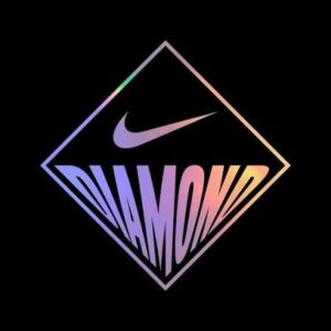
On the sub-brand’s online platforms, the mark appears in a diverse color gamut. It was developed as part of the ‘Doin’ Damage’ campaign, as seen below:
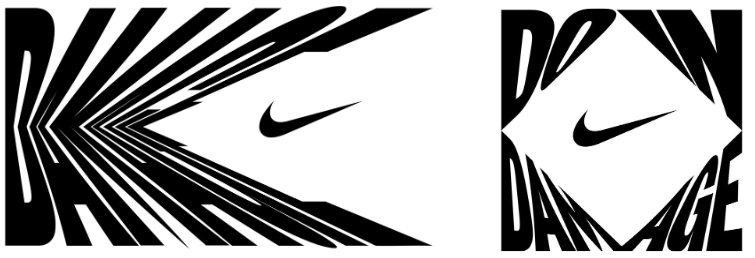
Hyphenated’s statement made it very clear what Nike exactly aimed for its sub-brand, “Nike needed a Platform Idea and Visual Center to inspire and empower retailers, Grassroots teams, and MLB League and teams alike. Damage is for the athletes who set trends, break records, and do a little flexing along the way. When others are trying to survive and make contact, they’re DOIN DAMAGE.”
Finally
The application of these Nike performance logos goes far beyond the surface of a shoe. They explain the technology beneath your feet.
From a shoe that hugs your foot to a column that bounces you back up. From a mountain expedition that sparked ACG to literal air, harnessed to cushion your landing, each of these logos carries a purpose.
The purpose is to help people understand what a performance-line shoe feels like. These Nike logos gave the technology a name, shoes an identity, and wearers a taste of what happens when a shoe is conceptualized, not just produced.
It’s amazing how they pushed boundaries so early on. The way they blended form and function really changed the game in athletic footwear.