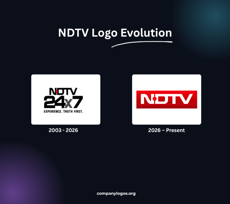
NDTV is one of India’s leading news channels, which has undergone several changes since its inception in 1988. A key aspect of its identity is its logo, which reflects the channel’s evolution in branding and visual communication. This article explores the history and evolution of the NDTV logo, along with other details over the years.
The Genesis of the NDTV 24×7 Logo (2003 – 2026)
The NDTV 24×7 news channel logo featured a simple design that emphasized professionalism and clarity. It consists of the wordmarks “NDTV,” “24×7,” and the tagline “EXPERIENCE. TRUTH FIRST” in black with a bold typeface in three levels. At the top level, the acronym “NDTV” for “New Delhi Television” has the upper bar of the letter “T” connected to the letters “D” and “V.”
Also, the diagonal bar in the letter “N” appears slightly curved, with a red dot appearing between the letters “N” and “D.” Under the wordmark, “NDTV” appears “24×7” in a bigger size and in a bold style, while the letter “X” appears in grey. The tagline is written in a much smaller size in uppercase. This logo is designed to convey trustworthiness and authority, essential qualities for a news organization.

NDTV Drops ‘24×7’ From the Logo (2026-Present)
After more than two decades, NDTV 24X7 revealed its first major logo revamp on 15 August 2026. The ‘24 x 7’ mark was no longer a USP for the news organization at a time when people can consume information at any time, across various platforms – TV, website, app, social media, etc.
As a result, NDTV has undergone a rebrand, removing the ‘24 x 7’ from its name, along with the tagline ‘EXPERIENCE. TRUTH FIRST.’ Only the network name remains as the new logo, presented in the previous modern sans-serif style with a new, vibrant red-and-white color palette.
The News channel name appears on an intense red rounded rectangle. The red gradient darkens along the lower lines and sides, creating a more three-dimensional, dynamic effect.
NDTV links this update with a new tagline, “When it really matters.” Shiv Aroor, Managing Editor at NDTV, explains the idea by stating, “At a time when news is often obscured by competing chaos, ‘When It Really Matters’ gives us a clear editorial compass. It is a reminder to separate what commands attention from what carries genuine significance, and to remain focused on the stories, questions, and consequences that deserve the public’s attention.”
Finally
The history and evolution of the NDTV logo reflects the channel’s growth and responsiveness to changing viewer expectations and technological advancements. The NDTV logo is expected to adapt further to maintain relevance in an increasingly competitive media environment.