The garage has proven to be the origin of many successful businesses. Apple, Microsoft, Mattel, the Walt Disney Company – the list goes on.
One such brand is Lotus Cars, an automotive manufacturer ruling the racetracks. From its early experimental days to championship-winning models and modern electric ambitions, the logo moved the company forward.
This article captures the metamorphosis of the Lotus Cars Logo – shaped by heritage, challenged by change, and refined for the future.
1948 – 1984: Beginning of Lotus Cars’ Visual Identity
Anthony Colin Bruce Chapman sowed the seed of Lotus Cars when he used his knowledge in structural engineering to rewire an Austin 7 into a faster version for grassroots racing events. The year 1952 marked a milestone, as the Mark 3 rolled out as the first vehicle to bear the Lotus Cars badge.
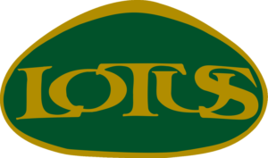
The very first emblem of the brand appears in circular form, enclosing an equilateral triangle that has curved edges and a perfectly arched base. Inside this shape reside the brand name and the initials of Chapman’s full name, ACBC.
The initials weave seamlessly to form a monogram that reflects the founder’s stamp on the company. The brand name appears in a properly spaced and readable uppercase sans-serif font. However, the story behind the name itself has slipped through the pages of history.
The emblem rendered the brand name and monogram in dull metallic gold that delivered a striking chrome effect. The colors work in harmony here; the green of the triangle draws the spotlight to the elements inside it, while the yellow circle that frames it completes the look. A sleek metallic rim traced the outer edge of the yellow circle.
Interestingly, through each progression of the Lotus Cars logo, the color scheme largely remained the same. It became the key identity mark of the famous car company.
1984 – 1986: The Logo Goes Through Dramatic Change
By the mid-80s, Lotus Cars was excelling in both the road car and racing car niches. The brand stood neck to neck with iconic brands like Ferrari and Maserati. With each new model, the brand pushed the boundaries of lightweight, high-performance automobiles.
Tragically, the visionary behind Lotus Cars passed away at the age of 54 in 1982. A year later, Toyota acquired the 16.5% stake in Lotus Cars, forging a new partnership with the brand.
In 1984, the Lotus Cars logo design experienced a major change. The triangle-inspired green form unfurled into an elliptical shape, stretched slightly upward. The redesign reduced the circular yellow shape to a mere outline of the ellipse. The uppercase letters of “lotus” overlapped one another and appeared in a new serif typeface that has some calligraphic inspiration.
Did you notice the absence of the monogram? Surprisingly, this is the only version of the Lotus Cars badge that didn’t carry the founder’s signature monogram. While the logo held onto its base color palette, the colors deepened into a noticeable tone.
1986 – 1988: ACBC Monogram Makes a Comeback
Lotus Cars faced its second acquisition in 1986. General Motors, an American automobile manufacturing company, bought the brand.
That same year, the brand rolled out a slightly modified badge that once again welcomed the famous ACBC monogram. The tangled initials sat on the top of the wordmark at the center, within the emblem. The monogram looks significantly smaller than the wordmark that covers a larger area of the badge, unlike the first iteration, where the initials held a prominent space.
Apart from this addition, the logo stayed closely in line with the previous 1984 version.
1988 – 2005: Revival of a Familiar Form
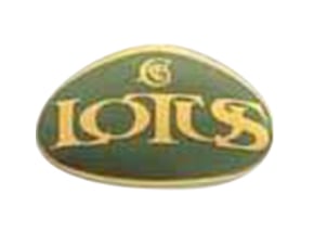
The year 1988 turned out to be a defining year in Lotus Cars’ logo history, marking the return of the very first iteration, introduced in 1948.
The brand this time opted for a more mature color palette. The iconic triangle containing rounded corners and an outward bowed base appears in a low-saturated dark green pigment that almost passes for black. On the other hand, the circle carries a subtle golden undertone.
The letters of the wordmark no longer stand suffocatingly close to each other; instead, they lie spaciously and follow the gentle curve of the triangle’s arched base, much like in the 1948 version.
Displayed in an uppercase sans-serif typeface, the words shine bright in a silver metallic chrome. The same chrome finish constructed the monogram and metallic lining around the triangle and circle, unifying all the elements and giving them a three-dimensional look.
2005 – 2010: A Richer, Polished Icon
This logo update by Lotus Cars made the badge highly defined with a richer finish. The lettering in the wordmark became sleeker and sharper. The wordmark, initials, and the outlines of both shapes carried a lustrous grayish-silver finish.
Moreover, the color palette evolved into brighter and fresher hues. The triangle now popped in a distinct British racing green with a gleaming polish. The roundel appeared in a warm ombré of yellow and orange.
2010 – 2019: Evolution Through Refinement
The next redesign of the Lotus Cars logo can be summarized as a “subtle yet significant refinement.” The symbol became sophisticated with new colors. A bright yellow color replaced the gradient in the circle. Moreover, the British racing green that filled the triangle in the last version turned deeper and lacked the polished effect that once defined it.
The rim encasing the triangle grew thinner, contrasting with the wider rim that outlined the circle, lending the logo a noticeable sense of depth and dimension. The rims, brand name, and monogram all shared the same metallic silver hue, yet the reduced shadow and shine effects created a visual distinction among these elements.
2019 – 2022: Lotus Cars Logo Stepping Into Modernity
In 2017, the British car brand came under new ownership of a Chinese multinational, Geely. With this acquisition came a major global transformation and a new brand image.
Similar to all brands that revamped their logos into a simple and minimalistic 2D version for correct representation on different types of digital and print media, Lotus Cars also released a 2D edition of its logo in 2019.
This rendition further amplified the color palette into a bolder territory, turning the bright yellow into a neon yellow, while the British racing green settled into a deeper tone with a flat matte finish. Instead of hanging low along the convex base of the triangle, the letters of the Lotus wordmark sat straight in a bold, uppercase sans-serif typeface.
The monogram saw an equally significant transformation, with the brand exchanging the hooked, pointy ‘C’ with a cleaner and simpler sans-serif alternative, stripping away any calligraphic influence entirely. The monogram, along with the wordmark, adopted the same color as the circle.
2022 – Present: A Contemporary Lotus Cars Logo
By the 2020s, Lotus Cars, long considered a pioneer in high-performance sports cars, transitioned into the field of electric vehicles. In 2022, Lotus Cars began manufacturing EVs at its new division in Wuhan, China.
Following this transition was the launch of the new Lotus Cars logo. The current update ditched the heirloom British racing green color of the triangle. A solid black succeeded this nostalgic hue. Other than this, the logo stayed largely faithful to its previous version.
Finally
The evolution of the Lotus Cars logo unequivocally expresses the journey of this Hethel-born brand through its various ups and downs. Founded by the visionary Anthony Chapman, the brand introduced its inaugural logo in 1948, featuring lively green and yellow colors.
Except for two editions between 1984 and 1988, the badge has retained its original monogram and wordmark boxed in a triangle, which is further contained in a circular form.
Through the death of its founder, financial instability, acquisitions, and notable success, the Lotus Cars logo attained its current form.
Other Versions of the Lotus Cars Logo
There have been other variations of the Lotus Cars logo as detailed below:
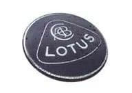
Lotus Cars’ Monochrome Logo
From 1968 onwards, the brand introduced a secondary grayscale version of its badge. The key components, such as the monogram, the wordmark, the outline of the shape enclosing them, and the circle, retained a style similar to the old logo but appear in a whitish-silver hue that lacks enamel properties.
Lotus Cars NYO logo
When Geely took over the brand in 2017, the multinational company expanded the Lotus Cars’ presence in its homeland, China. Unfortunately, they couldn’t use the name for many years, as China Youngman Automobile Group Co. had already registered and used it.
To operate in the market, the brand used a new name, Lu Te Si, a phonetic translation of “Lotus” in Chinese. Additionally, it used the “Lotus NYO” for its logo exclusively in China. The “NYO” stands for “new” and appears below the brand name.
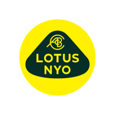
After a prolonged legal battle, the brand regained the right to use its name in the Chinese market in late 2024, discontinuing the NYO logo.
FAQs
1. What is the new Lotus Cars logo?
The current Lotus Cars logo reflects a minimalist update of its predecessor. The logo showcases a circle in bright yellow with a black crest that carries the brand name. Above the wordmark, the monogram “ACBC” represents the founder’s initials.
2. Which font does the Lotus Cars logo use?
The font in the Lotus Cars logo uses a contemporary and simplified sans-serif typeface in uppercase lettering.