In the 1990s, Zee TV introduced a breath of fresh air from the regular, monotonous Doordarshan programs in India.
The original Zee TV logo has undergone several rebrands over the years. In this article, you’ll witness the entire history and evolution of the Z TV logo.
Stick around for this exciting journey!
1992-2000: The Classic Zee TV Logo
Let me jog your memory.
The very first Zee TV logo was a vibrant, 3-D letter ‘Z’ made of deep blue and pink colors along the contours. At the bottom edge, you would see the inscription ‘ZEE TV’ in Sans-Serif font.
The first Z logo was undoubtedly loud, but that’s what the arrival of Zee TV meant for the Indian entertainment industry at the time. After all, it was the first private channel in India that started broadcasting its own TV shows. The logo represented the new dawn in the Indian entertainment landscape.
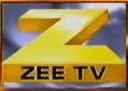
2000-2001: The First Major Rebrand
The first major rebrand for the Zee logo came in the year 2000. The color scheme had now drastically changed from the original blue and pink to a gold palette.
The geometric Z looked shiny and metallic against a gradient purple background, enclosed within a square. Compared to the previous logo, the contours were now sharper. The inscription ‘ZEE TV’ appeared on the bottom edge in the black Sans-Serif font. The gap between the letters had also significantly reduced.
Between 2000 and 2002, the Z logo went through a sort of ‘identity crisis’. (Well, don’t we all?) In just two years, the logo went through three changes.
2001: The Dreamy Logo
In 2001, while the emblem ‘Z’ remained the same, the backdrop was now a cloudy sky. This one only lasted a few months.
2001-2002: The Fiery Zee Icon
In September of 2001, the backdrop again underwent a change from a cloudy sky to a gradient red color scheme that resembled a flame.
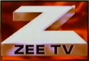
The vibe shifted completely from calm to fierce. With the introduction of Star TV, Zee TV now had a strong rival. The constant logo changes between 2000 and 2002 represented its zeal to stand out in the market.
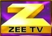
2002-2005: Reconnecting with The Roots
The year 2002 saw the return of the original color palette for the Zee TV logo with a slightly modern look against an orange background with yellow accents. This was also the first logo that had a white inscription ‘ZEE TV’ (instead of black) in the Sans-Serif typeface.
After a crazy couple of years of constant rebranding, Zee reconnected with its roots. This logo stayed for three years until 2005.
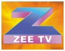
2005-2011: The Second Major Rebrand
The second major reform for the Z logo came in the year 2005. For the first time, the ‘Z’ emblem was in an upright but tilted position. The color scheme largely remained the same, only pink was now closer to purple. This stylized, metallic Z with a custom typeface was placed against a tilted yellow square.
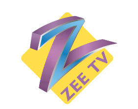
The inscription ‘ZEE TV’ now appeared in purple too, below the tail. This symbol had a contemporary vibe at the time, and it stayed in people’s minds. Most people from the 2000s who watched television may distinctly remember this insignia.
2011-2014: A Complete Makeover
The Zee TV logo went through a complete overhaul in 2011. The 3-D badge changed to 2-D after almost two decades. The classic square background no longer existed, and there was no other color variant except for gradient turquoise.
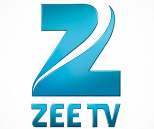
The emblem itself looked like a swan because of the white, swoosh-like element that divided it into two fragments. You could also say that this ‘Z’ looked more like the numerical ‘2’. The inscription ‘ZEE TV’ was also in turquoise color and Helvetica font (a move away from the classic Sans-Serif).
You have to give it to Zee for such a bold decision!
But again, they have always been agile. Beyond just television dramas, Zee eventually expanded to music, news, films, and OTT with the ZEE5 launch in 2018.
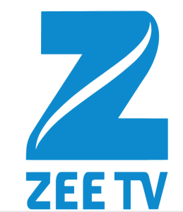
2014-2017: Zee TV Logo Retouched
The next few years saw no major rebrands. Only retouches. For example, in 2014, the color became deeper blue, and the contours slightly extended. This version lasted almost three years.
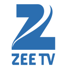
2017: The Complete Z TV Logo
In 2017, that gap in the top-right corner of the Z badge closed. It was no longer divided into two fragments and formed a complete ‘Z’. The color of the symbol became a lighter shade of blue again. And so did the wordmark ‘ZEE TV’.
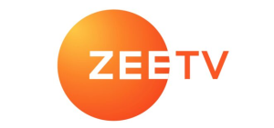
2017-2025: The Era of Circular Zee TV Logo
Remember this one?
The rebrand in 2017 was so popular that this logo became etched in people’s minds for a long time. Designed by Lambie-Narin bureaux, the square background that featured in Z logos before 2011 was now replaced by a glowing orange circular background.
The ‘ZEE TV’ brand name was placed to the right of this circular backdrop. Written in Gotham typeface, ‘ZEE’ appeared in white color while ‘TV’ appeared in orange color (or the color of the respective channel, such as green for Zee Cinema).
These logos appeared in the top-left corner, a move away from the standard practice of placing them in the top-right corner in Indian television.
2025 – Present: The Latest Mega Rebrand
The iconic circular logos are now history with the latest rebrand. Launched in May 2025, the current Z TV logo brings back the letter ‘Z’ in bold Sans-Serif font. It has been designed by Zee Entertainment’s internal design team.
With this rebrand, the media giant has decided to go back to its origins while also giving the logo a young, futuristic look.

With this new logo, the content powerhouse is repositioning itself as a next-gen media house that has a global appeal and presence. Also, you’ll find Z logos in the top-right corner instead of their previously unique, top-left position.
Punit Goenka, the CEO, said during the launch, “The new logo reflects our commitment to embrace emerging technologies to enhance the overall consumer experience. The new brand universe underscores our bold spirit and resolve to remain agile and adaptive in a fast-evolving landscape.”
Get used to the minimalist and futuristic design of the Zee TV new logo in 2025!
Finally
In the last three decades, the Z logo has gone through several rebrands. Some were major, like in 2011, 2017, and 2025, while others were touch-ups. ZEEL periodically refreshes its logo in tandem with its new brand promises and emerging technologies.
The evolution of the Zee TV logo is nothing short of inspiring. It represents the company’s growth from a single-channel broadcaster to a media powerhouse that has spread its wings across continents and oceans.
FAQs
1. Why did Z change its logo?
In the latest 2025 rebrand, Z has updated its logo to give it a modern, futuristic look. It has moved away from its iconic circular logos that lasted almost eight years.
2. What is the logo of Zee TV?
The current logo of Zee TV features a minimalistic letter ‘Z’ in a grayish gradient with sharp edges. On the right side of this letter is the wordmark ‘TV’ in an orange-yellow color palette.
पुराणे वाले लोगो बहुत badiya थें
वही फिर से lagne चाहिये.