A logo is not merely a symbol of recognition for a brand; it embodies its entire essence.
That’s why a strong logo can not only make the brand stand out, but also show everything a brand stands for.
We can learn a lot about the brand from its logo, which is why I want to share about this almost eight-decade-old company that remains deeply relevant to users worldwide.
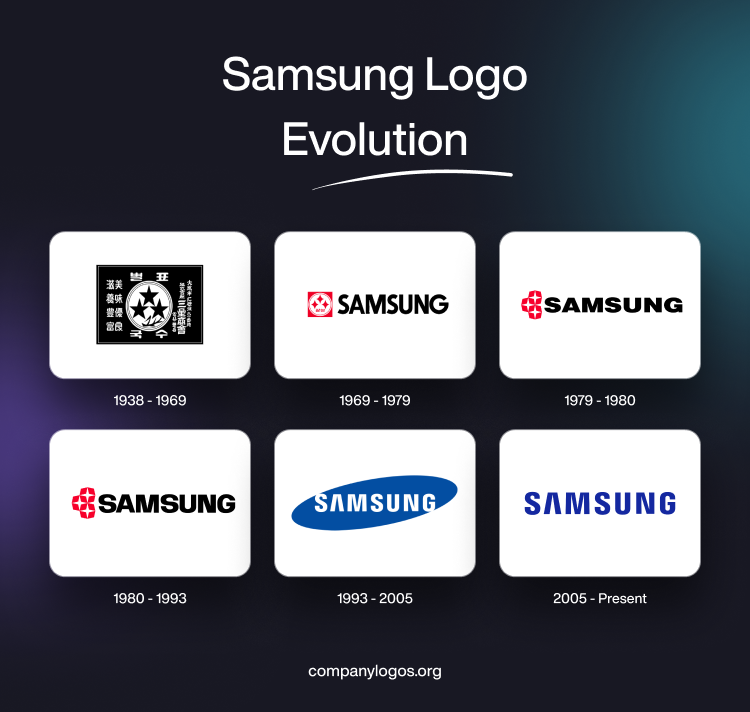
Let’s look at the evolution of the Samsung logo.
1938 – 1969: A Grounded Samsung logo
Lee Byung-Chul, a Korean entrepreneur, founded Samsung on March 1, 1938. At that time, it was a grocery trading store in Taego, Korea, which used to sell and export noodles and other Korean grocery items.
As a matter of fact, the company’s very first logo represents its culturally rooted beginning. This old Samsung logo was very similar to a postage stamp and contained symbols familiar to Korean culture and nationalism.
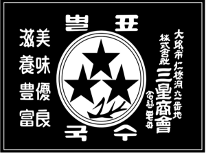
These symbols were three stars, stripes, and an artistic wheat motif inside a circle. It’s those three stars that gave meaning to the Samsung logo.
You see, in Korean, Sam means three, which represents three traits: large, plentiful, and strong, and Sung refers to a star, meaning bright, lofty, and eternally shining. Hence the name – Samsung.
Some Korean Hangul characters were also present around the rim, describing the goods they sold – noodles and the company’s name with its location. The logo followed a monochrome pattern.
1969 – 1979: A Symbol of Expansion
Throughout the decade, Samsung continued to venture into new lines of business. From textile to sugar refinery, they tried their hands at everything. Eventually, they landed in the field of electronics. In 1969, Samsung Electric Industries merged with Japanese electronics manufacturer Sanyo to form Samsung-Sanyo Electronics.
The 1969 logo adopted a more refined and sleeker design. While the logo still featured three stars, it evolved into a four-corner structure. These red stars appeared in a white circle, surrounded by the same red colored square.
At the bottom of these stars, Samsung was written in Korean, and on the right, the company name was displayed in a black uppercase, sans-serif typeface.
1979 – 1980: Well-Embraced Emblem
In 1978, Samsung entered the American market with its subsidiary Samsung Electronics America. Hence, they needed a new logo that would appeal to international consumers.
This restatement in 1979 was one step forward towards minimalism. The stars weren’t in the white circle like the previous version. Instead, each star got its own red octagonal casing. These octagons, stacked vertically, were painted red. On the other hand, the white stars were outstretched and non-curvy.
You can also notice that the company’s name in Korean was gone and only the English name in a flat sans-serif typeface remained. The wordmark appeared on the right-hand side of the insignia.
1980 – 1993: Improved Insignia
This version was a slightly modified update of the 1979 logotype. The symbol was outstretched, and the lettering got enlarged. As you can see below, the arches of the Ss became more refined along with deeper indents of the ‘M’ and ‘N’. Moreover, there is no tail of ‘G’ in this iteration. All these changes pointed to a sleek, modern upgrade.
1993 – 2005: An Electrifying Blue Sign
By 1990, Samsung established itself in the global electronics market. It became a prominent tech company and acquired the reputation of an electronics pioneer. Its expertise was not limited to making already existing electronics. It was now bringing innovations to it.
And the new blue Samsung logo in 1993 paired well with this fresh approach. This logo dropped its rigid “boxed” beginning and grew into a suave, westernized “elliptical” structure.
The words ‘S’ and ‘G’ were not bound by the shape, and the letter A abandoned its crossbar. Moreover, the brand used a revised “Linotype Univers 820 Condensed Black” for the font type.
2005 – Today: The Iconic Lettermark
Even though Samsung does not have tech roots, it gave tough competition to big tech giants like Apple. By the mid-2000s, Samsung became a widely recognized name. Today, its global market share is 20.67%, making Apple climb uphill in its own market.
The logo looks minimalistic and spacey, which gives it a modern feel. The solid blue color fonts have become a synonym of the brand. The lettermark was upgraded into a sharper, more refined look, becoming the design Samsung still uses today.
Finally
Samsung’s logo evolution reflects its journey from a regional company to a global leader in electronics.
When a company is at its growing stage, it depends heavily on symbolism to project its legitimacy. As it grows, its name is enough to get recognised by.
The different perspective on the same situation is that Samsung’s target audience at the start was the local Korean community, so its logo had familiar symbols that evoked a sense of trust for the brand. As it expanded, the design became more aesthetic, catering to wider interests.
The Samsung logo is a delicate balance between values and vision.
FAQs
1. What did the original Samsung logo look like?
Launched in 1938, the original Samsung logo resembled a rectangular stamp. It was black-and-white in color. Moreover, the design contained a few symbols: stripes, three stars arranged in a pyramid, along with a wheat motif placed inside a white circular shape.
Around this shape, the company’s name, its place of origin, and the products it offered were written in Korean Hangul script.
2. Why is the color of the Samsung logo blue?
Like many technology brands such as Intel, Dell, and IBM, blue became a defining color for Samsung, and the brand began using blue in its logo in 1993. The color represents comfort, trust, and inspiration.
3. What does the Samsung logo mean?
The Samsung logo features the brand’s name in blue, both of which hold deep significance. “Samsung,” meaning three stars in Korean, represents large, plentiful, and strong, while the stars depict bright, lofty, and eternally shining. These values reflect the vision of founder Lee Byung-Chull.
4. When was Samsung’s logo redesigned?
The major change in the Samsung logo occurred in 1993, when the brand’s name became dominant, replacing the traditional 3 stars that had been used since the brand’s inception in 1938.