Apple is a company that needs no introduction. The tech giant has been at the forefront of innovation for half a century. Its vision, cutting-edge technology, and revolutionary products have transformed the world of consumer electronics, shaped contemporary culture, and defined global trends.
The brand’s bitten Apple logo is now synonymous with luxury and excellence. But the first logo looked nothing like the one we love today. A masterclass in early minimalist branding, the history and evolution of the Apple logo is worth diving into.
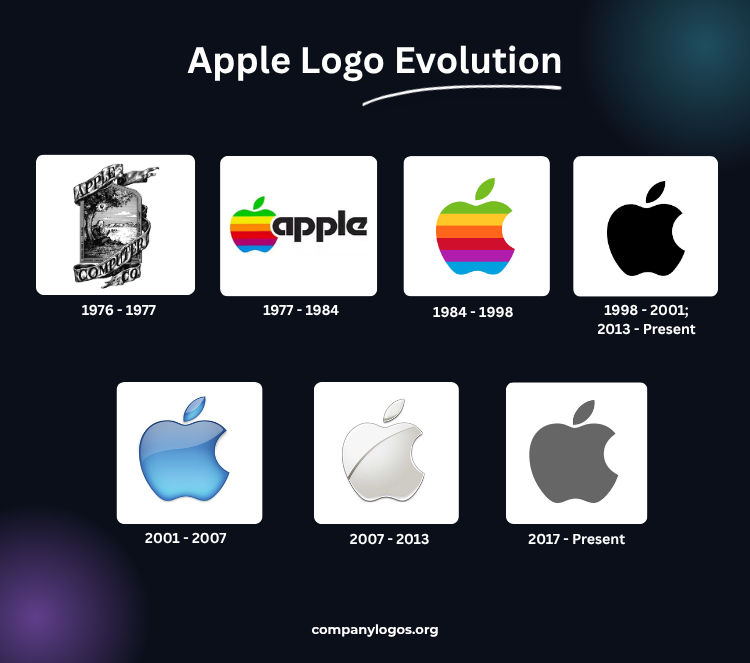
Take a look.
1976 – 1977: The First Apple Logo
Steve Jobs, Steve Wozniak, and Ronald Wayne founded the Apple Computer Company in 1976. The original Apple logo resembled more of an artwork, hand-drawn by Wayne. At the centre of the plaque sat Issac Newton resting against an apple tree with a picturesque view behind him. The logo shows the fruit in mid-fall, about to hit Newton and inspire the theory of gravity.
A ribbon around the illustration displayed the name “Apple Computer Co.” Along the margins of the plaque, you’ll find the words, “Newton…A Mind Forever Voyaging Through Strange Seas of Thought…Alone.” Wayne borrowed these famous lines from an autobiographical poem by William Wordsworth called The Prelude.
This Newton logo appeared on the Apple I, a personal computer without a monitor or a keyboard, launched in 1976.
1977 – 1984: The Rainbow Apple Logo
The 1976 Apple logo soon presented problems, as you can imagine. When scaled down, the details became difficult to print and did not fit the tech company that both Steves had envisioned to build. That logo only lasted a year. Its designer sold his share of the company for $800 and left two weeks after founding the company.
So in 1977, designer Rob Janoff from Regis McKenna, an advertising company, was tasked with creating a new logo just two weeks ahead of the launch of Apple II. He completely did away with the plaque and replaced it with the iconic bitten apple silhouette. The six rainbow colors filled the Apple, representing the revolutionary color display technology of the Apple II.
Janoff also added colors to appeal to the younger generation who were enthusiastic about new electronics. Moreover, the company name was integrated in the design by letting the arch of ‘a ’ fit the bitten part of the fruit like a puzzle piece.
The order of those colors was not typical of a rainbow, as the green was placed where the leaf would be. Jobs instantly liked it and vehemently denied placing separation lines between colors, which would have made printing the logo simpler and cheaper.
Michael Scott, CEO of Apple from 1977 to 1981, described it as “The most expensive bloody logo ever designed.”
The Legend of the “Bite”
The bitten Apple logo is the subject of various urban legends, including that it is a homage to computer scientist Alan Turing, with the bite mark a reference to his method of suicide, or that it is inspired by Eve’s biblical bite out of the forbidden fruit, or that it references the computer term ‘byte’.
In reality, the designer put the bite mark on it so people wouldn’t mistake it for a cherry when put on a smaller scale. Not so exciting, is it? But that’s how professional logo designing works.
The use of an apple symbol to visually represent the company name made it one of the earliest examples of a pictorial mark. Why wouldn’t it? Janoff used real apples to come up with the closest match that would become the face of the company.
1984-1998: First Apple Brandmark
In 1984, the same year Macintosh was launched, Landor Associates reworked the Apple rainbow logo and created a brighter design with a more symmetrical and geometrical shape. They also decided to remove the wordmark since the brand had already gained huge popularity with the Apple II.
The minimalist brandmark already illustrated the company name and no longer relied on it for recognition. It lasted till the late 90s.
1998 – 2001: Introduction of the Monochrome Apple Logo
In 1985, Steve Jobs was ousted from the company after a leadership clash with John Sculley, then CEO of Apple. After 11 years of exile building NeXT, Jobs returned to save the company from near bankruptcy.
After becoming the interim CEO, which he jokingly referred to as “iCEO”, Jobs streamlined Apple’s product lines, and one of his most important decisions was to discontinue the rainbow logo. Instead, a monochromatic version of the Apple logo made its first appearance with the iMac in 1998.
Initially, a translucent sky blue Apple logo was used to suit the “Bondi Blue” casing of the new iMac devices. It was short-lived as, soon, a solid black edition made its way onto the new silver computer models. Its sophisticated design reflected Apple’s position as a leading tech innovator.
After 2013, this black Apple logo became more consistent in branding, featuring on various products and marketing materials.
2001 – 2007: Aqua Theme Logo
2001 was a remarkable year for Apple as it introduced generation-defining products like the iPod, iTunes, and macOS X 10.1.
Amid the growing design trend toward three-dimensional effects, Apple unveiled an aqua-inspired version of its logo to complement the visual style of macOS X. Its ice-blue gradient, glass-like finish, and reflective highlights gave it a futuristic look.
A version of the aqua theme logo with a silver-grey color gradient started to appear in later years. The subtle shift gave the logo a mature, sophisticated, and premium look. Its dark grey shadow enhanced the three-dimensional effect.
2007 – 2013: The Chrome and Metallic Logo
The year 2007 brought another milestone as Apple made history with its first iPhone. It was also the year when the company changed its name from Apple Computer, Inc. to Apple, Inc.
The time was ripe for the next logo update.
Continuing with the three-dimensional design trend, the Apple logo adopted a metallic and chrome finish to match aluminium-bodied products. The clean, glossy logo used a silver-to-grey gradient with bright white highlights and darker grey shadows.
This version became closely associated with products like the iPhone, iPad, and MacBook and gave them a sleek, modern, and high-end appearance.
2013 – Present: The Flat Minimal Logo
Around 2013, Apple started moving away from glossy, reflective, gradient, and three-dimensional design elements in favor of flat, simplistic design. It reintroduced the solid black monochrome logo with the release of iOS 7 in 2013.
The era is also marked by Apple’s shift from skeuomorphism to a more streamlined design in its OS elements.
In 2017, a solid grey Apple logo was released. Since then, the brand has been using the monochrome version in three main color options: black, white, and grey, depending on the product or application.
Other Apple Logo Variations
In 2021, Apple used a revived variant of its rainbow logo for the iMac advertisement. It featured darker, bolder, more muted shades than the original rainbow logo and was inspired by the new iMac lineup, which was available in seven different colors.
Apple’s “Think Different” Logo
Apple ran an advertising campaign, “Think Different,” from 1997 to 2002. It featured the rainbow logo with the slogan text and appeared in the campaign commercials as well as promos for several products.
Finally
The Apple logo is more than just a symbol – it’s a design statement that represents a company synonymous with innovation, technological revolution, and design excellence.
Despite changes in color, style, and texture, the core design by Rob Janoff has remained the same for nearly fifty years, demonstrating exceptional brand consistency.
As the brandmark of a leading tech company having an immense fan following and a remarkably loyal customer base, it has become a symbol of sophistication, quality, and luxury. It stands as one of the finest examples of how a simple design can convey a powerful and enduring brand identity.
FAQs
1. Why is the Apple logo a bitten apple?
Designer Rob Janoff chose the Apple logo as it not only reflects the brand name but is also a simplistic design compared to its Newton-inspired predecessor. He carved a bite out of it so people don’t confuse it with a cherry when scaled down.
2. What color is the Apple logo?
The current Apple logo is monochromatic and is used in three color options, depending on the product and application: Black, White, and Grey.
3. What was the first Apple logo?
The first Apple logo was an artistic illustration of Sir Issac Newton sitting under an apple tree, referencing the moment he discovered gravity.
4. Did Steve Jobs design the Apple Logo?
Steve Jobs didn’t design the original Apple Logo. Ronald Wayne, a co-founder of Apple, created the Newton version in 1976. The Apple silhouette logo was designed a year later by Rob Janoff, a designer working at Regis McKenna at the time.