KFC is arguably one of the most popular fast-food chains in the world. Established by Colonel Harland Sanders in 1930, the restaurant has become the go-to destination for people looking for finger-licking chicken items globally. The KFC logo is an iconic representation of the brand’s heritage and has evolved significantly since its inception. This article outlines the key milestones in the history of the KFC logo and highlights its transformations over the decades.
The Genesis of the KFC (1954–1959)
The original KFC logo featured the brand name “Kentucky Fried Chicken” in a title case and a handwritten style font. Interestingly, the letters “C” in the brand name were italicised to add uniqueness. Besides, there were four chickens hatched out of their eggs and placed next to the capital letters.

(1959-1978)
This particular KFC logo was introduced when the first Kentucky Fried Chicken restaurant was opened in Salt Lake City, Utah. It featured a simple design with a portrait of Colonel Sanders, who was dressed in his signature white suit and string tie. To the left of the image was the full name “Kentucky Fried Chicken,” written in a decorative sans-serif font. This logo was primarily in black and white and emphasised a family-friendly image.

(1978-1991)
The logo underwent a significant redesign in 1978. The Colonel’s portrait was moved to the left, and the name “Kentucky Fried Chicken” was written into three lines using a more modern serif typeface. This design aimed to modernise the brand while retaining the Colonel’s image, which had become synonymous with KFC.

(1991-1997)
In 1991, the company officially adopted the acronym “KFC” to distance itself from the unhealthy or negative connotations of the word “Fried.” The logo was updated to reflect this change and featured a vibrant colour palette of red, white, and blue. The Colonel’s portrait was now depicted in a friendlier manner, with bold red lettering in italics and a rectangular frame to enhance brand recognition. The lettering had pointed glyphs and a thin blue outline. Above the lettering was a red and white pattern of growing thickness with the Colonel’s image placed against the widest band of red.

(1997-2006)
The 1997 redesign introduced a square logo with a more detailed portrait of Colonel Sanders in a tuxedo. The small KFC wordmark in red was incorporated into the design to reinforce brand identity. Alongside this logo update, KFC also revamped its restaurant interiors to align with the new branding. This logo was redesigned by Landon Associates Agency and featured a red background against which the Colonel’s portrait in white, yellow, and blue was placed.

(2006-2018)
The logo was redesigned again in 2006 and featured a deep red circle with a refined image of Colonel Sanders in an apron. This image symbolised a more casual dining experience. The KFC wordmark in white was placed to the right of the Colonel’s face. It maintained the red-and-white colour scheme but introduced a more modern aesthetic.

(2014-2018) (International except China)
In 2014, KFC adopted a simplified monochrome version of the logo and focused solely on the Colonel’s head above the KFC wordmark in a bold and italicised sans-serif typeface. This version aimed to evoke nostalgia while streamlining the brand’s visual identity.

(2018-2024) (International) (2016-2023) (North America)
This particular logo iteration is a modified variant of the 1959 logo. The portrait of the Colonel was made more detailed and realistic to drive home the message that the company values its legacy. To the left of the portrait appeared the brand name “Kentucky Fried Chicken” in a bold font and title case.

(2018-2026)
The latest logo redesign shows a trapezoid and a refined portrait of the Colonel inside. The trapezoid, which looks like a KFC bucket, features three vertical lines in white and red. Besides, the Colonel’s face is displayed using a black outline and placed on a thick white stripe in the middle. And just below the string tie of the Colonel appears the brand name KFC in cursive style. The overall logo evokes a sense of warmth.

2026 – Present: A Peek Into The Bucketverse
You can tell by the wide grin and the miraculous comeback of his well-defined hairline that Colonel Sanders, the iconic KFC mascot, enjoys his new makeover.
On 15th June 2026, KFC unveiled its new brand identity with the help of another three-word acronymed agency, JKR (Jones Knowles Ritchie). The agency kept close to the previous design, but added enough to make it shine. KFC already had all the ingredients for a playful rebrand: its iconic mascot, a catchy abbreviation, and, of course, the bucket.
JKR’s global executive creative director, Sean Thomas, explained what they brought to the table: “Our role was to help it evolve for the next chapter, in a way that only KFC could. Where to start? By building a world and experience that consumers could step into. We call it the Bucketverse.”
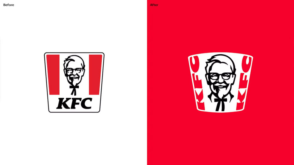
Let’s talk about the new KFC logo. Colonel Sanders appears more expressive and cheerful, thanks to his larger size and clearer outlines. JKR added a collar around his neck to eliminate confusion caused by the bow tie, which made Sanders resemble a bobblehead.
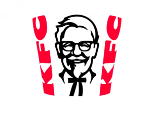
The avatar sits between two vertical red ‘KFC’ initials in the custom Kentucky Fried Serif, all within a white frustum referencing the iconic bucket.
KFC addressed this change by saying, “The brand is evolving its most distinctive assets to feel more relevant, more expressive, and more in tune with modern culture, while staying true to itself and grounded in the Colonel and its iconic ‘Finger Lickin’ Good’ ethos. At the center is the bucket – KFC’s most recognizable asset. It is refreshed with new energy alongside a subtle evolution of the Colonel himself, ensuring the brand’s legacy remains front and center. Together, the updated branding comes to life across packaging, digital platforms, advertising, and restaurant environments.”
KFC also released a new menu featuring raunchy sauces, boneless chicken dishes, and beverages, all adding spice while evoking nostalgic smells.
The Elements of the KFC Logo
Font
Since 1991, the KFC logo has featured a simple italic font to portray “KFC.” The accompanying text stating “Kentucky Fried Chicken” has undergone multiple revisions. It has evolved towards greater simplicity.
Colour
The core colour palette of the logo, comprising red, black, blue, and white, has remained consistent since 1991. However, there has been a subtle shift in the most recent version. For instance, the red has deepened by adopting a slightly darker and less vibrant colour.
Finally
The evolution of the KFC logo reflects the journey of the brand from a simple fried chicken restaurant to a global fast-food icon. Each redesign has maintained the core element of the image of Colonel Sanders while adapting to changing consumer preferences and cultural contexts. Today, the KFC logo stands as a testament to the brand’s commitment to quality and tradition. It continues to evoke a sense of Southern hospitality.