CNBC, or Consumer News and Business Channel, is a leading media channel covering business and finance news globally. Available on both television and digital platforms, CNBC offers a wide range of programming. It encompasses real-time market reports, analysis of economic trends, and interviews with prominent business honchos. It caters to business executives, consumers desirous of knowing about markets and the world of business, and professional traders and investors, among others.
The CNBC logo has undergone a few changes since its inception in 1989. These changes reflect the growth and adaptation of the network to changing media landscapes. This article explores the history and evolution of the CNBC logo, and highlights key milestones and logo design changes that have taken place over the years.
The Genesis of the CNBC Logo (1989 – 1992)
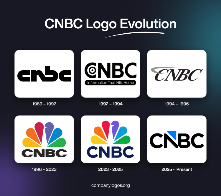
The first CNBC logo was introduced in 1989, which featured the brand name “CNBC” in lowercase letters with “N” and “B” connected diagonally to emphasise boldness and modernity. This design marked the beginning of CNBC’s visual identity and set the stage for future developments.

(1992 – 1994)
In 1992, CNBC shifted to an all-capital style of writing the brand name and incorporated a “target” circle within the first letter “C.” This period also saw the introduction of the tagline “Information That Hits Home,” which was displayed in white inside a black banner below the wordmark. This change aimed to enhance recognition and convey a sense of precision.

(1994 – 1996)
The logo evolved further in 1994 with the brand name written in italics and a light grey orbit or swoosh wound around the upper part of the first letter “C.” This design element symbolised progress and speed and aligned with the network’s focus on dynamic financial news.

(1996 – 2023)
In 1996, CNBC adopted its most iconic logo yet, which featured a stylised white peacock with a rainbow-coloured plume of feathers above the “CNBC” wordmark in bold black letters. The brand name was executed using a sans-serif typeface. This design became synonymous with the network’s global reach and diverse content offerings. The vibrant colours of the peacock represented universality, actuality, and professionalism. Further, they reflected CNBC’s commitment to comprehensive financial coverage.

(2023 – Present)
On December 11, 2023, CNBC unveiled a major rebranding effort to update its logo for the first time since 1996. The new design retained the multicoloured peacock graphics representing the parent organisation, NBC, and the variety of content it offers. However, the style of the CNBC brand name was changed and rendered in a sleek sans-serif typeface in dark blue. This modernisation aimed to enhance viewer engagement and reinforce CNBC’s position as a leading financial news network.

2025 – Present: CNBC Triangle Logo
On December 13, 2025, the famous peacock flew away from the CNBC logo and left a triangular mark behind. This change came along with a declaration that the news channel, along with its related network, will leave Comcast NBCUniversal (its parent company) and become a part of a new company called Versant. This separation materialized in January 2026.

The fresh Gotham Bold fonts in the wordmark are evenly spaced. However, the letters “N” and “B” are almost touching each other near their edge. An upward-pointing blue triangle replaced the right stroke of N, making it a defining feature of the new CNBC logo.
The President of CNBC, K.C. Sullivan, explained the design as “a symbol of the direction where we’re headed and the exciting new chapter we’re headed into.” This justifies the inclusion of the triangle, reminiscent of the space previously occupied by the peacock.
The new CNBC logo also joins the list of famous minimalist logos, often characterized by a wordmark, brandmark, or monogram.
The Elements of the CNBC Logo
Symbol
The logo design of CNBC features a rainbow-coloured “peacock’s tail” composed of six vibrant colours, wherein each colour forms a petal. These petals are arranged in a semicircle to ensure symmetry. The two outermost petals are positioned horizontally to define the traditional border above the company’s abbreviated name. This design allows for seamless integration on branded products, screens, and the internet and maintains its appeal without cluttering the space.
However, December 13, 2025, onwards the logo symbol will undergo a change. The peacock feathers will replace a blue arrow integrated to the letter “N”.
Font
The brand name is displayed in classic black using the Univers Next Pro 940 Extended Extra font. The symmetrical placement of each logo element facilitates easy visual recognition of the entire logo. The logo to come into effect from December 13, 2025, will feature a rounded and modified Gotham Bold typeface.
Colour
The logo showcases a stylised peacock with six vibrant feather plumes, each in a distinct bright colour: red, orange, yellow, green, blue, and purple. These colours are arranged to form a spectrum and look like the natural spread of a peacock’s tail. Below the rainbow-coloured peacock are written the bold and capitalised letters “CNBC” displayed in a deep navy-blue colour. The navy-blue colour thus creates a striking contrast with the multi-coloured plumage above that enhances readability.
The logo to be introduced on December 13, 2025, will feature a colour palette of black and blue, where black will be the letters of the abbreviation “CNBC”, while blue will be the colour of the arrow integrated with the letter “N”.
Finally
The CNBC logo and its various iterations reflect the ongoing efforts of the network to adapt to changing media landscapes. However, this was done without disregarding the core values of innovation and comprehensive financial coverage.