ZEE5 is the digital streaming arm of Zee Entertainment Enterprises Limited (ZEEL). It has rapidly evolved since its launch, both in its content strategy and its visual identity. The channel offers multilingual entertainment options, namely, TV shows, theatre plays, movies, music videos.
The logo of the streaming platform has undergone significant changes, which reflect shifts in technology, audience preferences, and the company’s strategic direction. The article explores the various logo changes that Zee5 has undergone over the years, among other details about the company.
The Genesis of the Zee5 Logo (2012 – 2016)
Zee5 came into existence in 2018 after the merger of two of its predecessors. These included DittoTV, an online streaming channel, and Ozee, a video on-demand service, both owned by Zee Entertainment. The first logo of DittoTV was introduced in 2012, and it featured a solid blue rectangle with wide rounded angles at the bottom compared to the soft rounded angles at the top.
At the centre of the rectangle was placed the wordmarks “ditto” and “TV” written in a bold custom sans-serif typeface. The letters of the wordmark “ditto” had rounded shapes and an extended vertical bar of the letter “d” that touched the edge of the rectangle. The wordmark “TV” in uppercase but smaller in size was placed above the letter “o”.

(2016 – 2018)
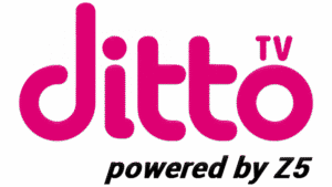
In 2016, the logo of DittoTV was changed, wherein the rounded letters of the wordmark “ditto” in lowercase and “TV” in small-sized uppercase were rendered in dark fuchsia against a white background. The blue rectangle was removed, while an italicised and right-indented phrase, “powered by Z5”, in a black sans-serif typeface appeared at the bottom.
(2016 – 2018)
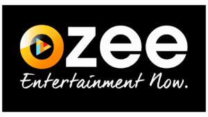
In 2016, Zee Entertainment introduced the video-on-demand service Ozee, the logo of which had a solid black rectangular background. The letters of the wordmark “OZEE” were rendered in white using a stylish sans-serif typeface. However, the first letter “O” was designed using a stylised gradient yellow ring with a small multi-coloured triangle inside denoting the Play button. The logo was accompanied by the motto “Entertainment Now” in a thin handwritten style in white.
(2018 – 2025)
In 2018, Zee5 came into being following the merger of DittoTV and Ozee. The logo of Zee5 featured a solid black circle with partially framed arches in various colours (purple, red, yellow, green, and blue) to the left. The wordmark “Zee” was written from the centre of the black circle and was extended to the right in white. However, “5” was written in black and placed outside the circle against a white background.

(2025)
In 2025, ZEE5 underwent a major rebranding, which coincided with a broader overhaul of all ZEE brand logos. This was part of the company’s renewed focus on premium content, regional storytelling, and a tech-driven, personalised user experience. The minimalist logo consisted of the letter “Z” in uppercase and “5”, using a bold, custom Boutique Sans S Medium typeface and the tagline “Apni Bhasha, Apni Kahaiyan”. The notable part of the new update is the removal of the letters “ee”. The colour scheme includes light purple with a gradient combined with aqua blue and white.
The Elements of the Zee5 Logo
Font
The latest Zee5 logo uses a bold, custom, Boutique Sans-Serif Medium typeface to ensure clarity and offer a contemporary look. The upward flourishes of the stylish “Z” symbol convey hope, growth, and positivity.
Colour
The latest Zee5 logo employs a swathe of colours, such as light purple gradients, white, and aqua blue to symbolise freshness, modernity, and the aspirations of a new, young, and emerging India.
Finally
The logo evolution of the ZEE5 streaming platform reflects the journey of the platform from a digital disruptor to a culturally rooted, technology-driven entertainment leader. Each logo redesign has been closely tied to shifts in content strategy, audience engagement, and technological innovation. The various logo changes ensure that the visual identity of Zee5 remains fresh, relevant, and aspirational.