Soneva was founded in 1995 by Sonu and Eva Shivdasani, visionaries who pioneered the concept of barefoot luxury and sustainable tourism in the Maldives. Their first resort, Soneva Fushi, set a new standard for luxury hospitality. It blended environmental responsibility with high-end experiences. The brand’s name itself is a portmanteau of the founders’ first names to symbolise their personal commitment and philosophy. The article explores the Soneva logo and other details about the company.
1995 – 2026: The Genesis of the Soneva Logo
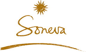
The Soneva logo displays the sun emblem at the top and the brand name in a minimalist aesthetic. The design is intended to evoke a sense of tranquillity, exclusivity, and connection to the natural world. Designed using earthy tones, the sun emblem is followed by the brand name in a handwritten, stylish, and playful bespoke typeface below. A small arc in the same earthy tone is displayed at the bottom to underscore the brand name.
2026: New Soneva Logo Arises
You know what’s good about any philosophy?
It evolves along with an individual’s perspective, yet carries the same core values. Similarly, the “Barefoot Luxury” vision that shaped the eco-luxury resort group Soneva and carried it for three decades has evolved into the “Bare Luxury” philosophy.
This refined approach centers on the purposeful reduction of unnecessary, thoughtless assets and resources without compromising elite guest experiences or nature’s beauty. The rebranded tagline, explained by Soneva, made the philosophy crystal clear: “Just What Matters: nature in its raw wildness, space for joy, presence, and connection.”
On 8th June 2026, Soneva drew the attention of its shift towards more purpose-driven experiences by rebranding its logotype and the monogram named “Soluna.” The new Soneva wordmark ditched its freestyle and almost signature-like cursive font for a classic high-contrast uppercase serif typeface.
The “SONEVA” lettering feels like a rustic variation of any neoclassical serif. The thin, hairline horizontal strokes are noticeably visible against thicker vertical stems, and the bracketed serifs have a slightly organic taper.
The reimagined Soluna monogram follows the same folk-art-inspired illustration. The boho-stylized sun builds outward from solid, wavy rays with sharper ends. A major difference in this monogram is the top-right positioning of a negative space that imbues a crescent moon into the mark, which was previously placed in the lower-right region in the 1995 version.
The addition gives the monogram’s name a complete meaning: Sol (derived from “Solis,” the sun in Latin) and Luna (derived from “Lunae,” the moon in Latin).
A deep reddish-brown, sitting close to a dark sienna or oxblood tone, appears in the entire lockup. While the change in color and marks is widely adopted, some of Soneva’s digital spaces, like its website, present the Soluna monogram individually in a sand-like, muted golden-yellow hue.
The Elements of the Soneva Logo
Font
The Soneva logo employs a clean and elegant serif font to convey sophistication without ostentation.
Colour
The Soneva logo displays an earthy colour palette, which evokes the feel of the sand, sea, and lush greenery of its locations.
Finally
The Soneva logo is more than a visual mark—it is a reflection of the brand’s philosophy, history, and ongoing commitment to luxury with a conscience. It tells the story of a brand that has remained true to its roots while continually innovating and adapting to the changing landscape of luxury hospitality.