McDonald’s – a brand that has become synonymous with fast food. Who would have thought that a hamburger joint started by two brothers would become one of the largest and instantly recognizable fast food chains in the world?
But that’s what McDonald’s evolved to become, and so did its logo. Can you think of any other logo that ignites your taste buds almost instantly as you see it? I can’t!
McDonald’s logo has achieved global fame, and the brand’s success is in part owed to its memorable ‘M’ symbol. But it wasn’t always the stylized ‘M’ that we’re all familiar with. Over the years, it went through a number of iterations.
In this article, I’ll cover the history of McDonald’s logo over the years, starting with its inception.
(1937 – 1940) Airdrome: The Humble Beginnings
What came to be known as ‘McDonald’s’ started as a small hot dog stand called “The Airdrome” in 1937 near Monrovia Airport, California. The man behind it was Patrick McDonald – the patriarch of the McDonald family.
The octagonal drive-up stand sold mostly, as you can guess, hot dogs!
The original McDonald’s logo looked nothing like the mouth-savoring ‘M’ symbol that we know today. It featured the words ‘The Airdrome’ with a line running through the middle of it.
Nothing memorable about it and not even the best example of branding – yet, it marked the humble beginnings of McDonald’s.
1940 – 1948: The First Major Rebrand
In 1940, Patrick’s sons, Mac (Maurice) and Dick (Richard) McDonald, decided to move their little hot dog stand to San Bernardino, California. With this move, they also switched up their menu, which now consisted of over 25 barbecue cuisines. Yum!
‘The Airdrome’ was now called McDonald’s Bar-B-Que. Obviously, it was now time to change the logo to reflect the change in their menu and name.

For the first time in the brand’s history, McDonald’s logo adopted its namesake. The inscription “McDonald’s Famous Barbecue” appeared at 3 levels, with each word occupying one level. At each side of the wordmark ‘Famous’ ran two parallel lines
Most of the real estate of this McDonald’s symbol was covered by the bold wordmark ‘Barbecue’ to highlight the cuisine they offered. This initial logo was far from the stylized ‘M’ popular today. It was loud, text-heavy, but it did a good job of conveying what the McDonald brothers wanted at the time.
Eight years later came another change in the menu…and the logo.
1948 – 1953: McDonald’s Famous Hamburgers
By 1948, the McDonald brothers had realized that their best-selling dish was hamburgers. So they decided to focus on selling just that, along with milkshakes, fries, and apple pies.
Therefore, it was time for the second major revamp.
The McDonald’s logo in 1948 featured the wordmark “McDonald’s Famous Hamburgers” at three different levels, similar to the previous logo. This time, the focus was on ‘Hamburgers’ – their most profitable cuisine.
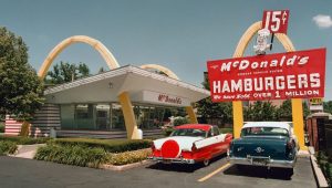
Above the lettering was a smiling chef mascot designed to make the logo more personable. On either side of the wordmark “McDonald’s”, also displayed “15¢” to convey their unbeatable price point.
It was around this time that the brothers came up with the Speedee Service system, which allowed them to sell hamburgers at half the price of their competitors – which became the focal point of this rebrand.
The entire inscription was in white color against a black background. Compared to the previous McDonald’s logo, this one had a less formal, fun vibe to it.
This version survived five years until…
1953-1961: McDonald’s “I’m Speedee” Logo
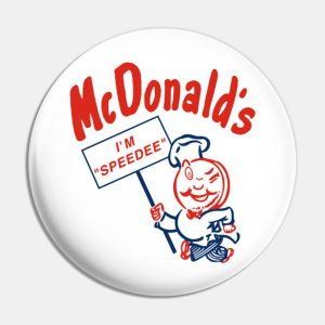
In 1953, the McDonald brothers decided to give their Speedee Service system a personality with a fun mascot. The winking chef was now the main feature of the McDonald’s logo. It also held a banner which read “I’m Speedee” with the brand’s name placed just above it.
Unlike the previous emblem, the “15¢” price point occupied very little space in the logo – just a small blue circle beside the mascot. This version helped the fast food behemoth differentiate itself from its competitors in terms of speed of service and price point.
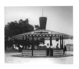
In 1953, the first franchised McDonald’s opened in Phoenix, Arizona. This is why the phrase “Coast to Coast” appears in the circular logo – to signify the brand’s expansion.
But what’s more interesting for you to know is that this Neil Fox franchise showcased the famous “golden arches,” which would later become the inspiration for the modern McDonald’s logo.
Dick McDonald was the one who came up with two semi-circles that he envisioned would attract the attention of hungry motorists. But it was set designer and architect Stanley Clark Meston who turned his vision into two 25-ft golden arches that ran on either side of the building.
This historic franchise still exists and operates to this day.
For the next five years, more franchises would open with the golden arches as their main architectural feature. The McDonald brothers were content with the slow but steady pace of growth.
But everything changed with the entry of Ray Kroc.
The Founder
In 1955, Ray Kroc – a former jazz musician, paper cup salesman, and radio DJ – became the franchise owner of the fast food restaurant. He met the brothers while selling milkshake mixers and quickly became interested in franchising.
He was a savvy businessman who was responsible for McDonald’s phenomenal success. In 1961, he bought the company for $2.7 million from Dick and Mac, which was a lot of money at that time. The brother not only lost out on royalties (since they had no formal agreement with Kroc) but also failed to uphold rights on the name ‘McDonald’.
This entire tale of how the brothers were pushed aside, how Ray Kroc took ownership of McDonald’s, and transformed it into a multinational corporation is the subject of the movie “The Founder”. (Michael Keaton does a phenomenal job of portraying the ruthless ambition of Ray Kroc!)
With the new boss came the next logo change!
1961-1968: The First ‘Golden Arches’ Logo
With Ray Kroc taking control of McDonald’s, redesigning the logo was only the next logical step. The mascot was completely done away with. The only wordmark retained was the restaurant’s name, and everything else was dropped.
But this time, the famous arches made way into the symbol. Those arches met at an intersection point, which represented how the franchises looked from an angle. It was not yet a clear ‘M’ that we see today, but it was the first McDonald’s logo that resembled the letter. You can also notice a line that runs diagonally across the arches.

The colors used for this insignia were yellow and red – which you would see that the brand sticks to over the years with only slight variations in shade and vibrance. This famous logo was designed by Jim Schindler, head of construction and engineering at McDonald’s.
The restaurant retained this logo for seven years.
1968-1975: The Classic Golden Arches Appear
This classic McDonald’s logo was not very different from the golden arches logo. Only now, the arches did not cross each other. Instead, they shared a common leg, which made a stylized, slightly more elongated ‘M’. The restaurant’s name in black ran through the bottom half of the typeface.
The arches were no longer outlined in red. They were now a brighter shade of yellow. Somehow, this shape also reminds us of delicious fries, which can be the reason why it sort of activates our taste buds, isn’t it?

And as you can notice above, the diagonal line is no longer present in this version of the emblem. You might remember this logo, as it is still used in many international restaurants and products of the brand.
1975-1992: The Red and Yellow Palette of McDonald’s Logo
A second version of the above logo came in the year 1975. This time, the inscription was placed on a square-shaped red badge with rounded corners. The color of the wordmark was changed to white to contrast with the red background.
This iconic logo is still in use today across various restaurants of the brand.
1992-1993: The Trapezoid McDonald’s Logo
In this version of the McDonald’s logo, the lettering ‘M’ looked more plumper and three-dimensional. The square background was removed and replaced with a red trapezoid beneath the symbol.
This classic ’90s logo housed the restaurant’s name inside the trapezoid. Many signs were erected to mimic this insignia and still exist today.
1993-2003: The First Minimalist McDonald’s Logo
For the first time in half a century, the name “McDonald’s” was completely dropped from the logo. The fast food chain had now gained enough popularity to be recognized just by its symbol. Here’s the picture of the 1993 McDonald’s logo:

The emblem was now a darker shade of gold with a shadow. By now, the company had realized that it already had iconic branding and thus would not make drastic changes to its logo going forward.
2003-2006: The “i’m lovin’ it” Logo
It wasn’t until a decade later that an inscription was added again to the logo. But it wasn’t the name of the restaurant. This time, it was the famous tagline “i’m lovin’ it” positioned below the golden arches. The slogan itself became as famous as the logo.
The emblem itself became plumper, which reminded us of the 1992 version – only different in its shadow.
2006-2018: McDonald’s Most Minimalistic Logo
In the 2006 version, the company removed all text, shading, and colors except yellow. All that remains are the iconic arches.

Throughout the years, the brand has mostly stuck to a custom sans-serif font, including the 2006 McDonald’s logo. The main reason why McDonald’s stripped its logo to its bare bones is to make it suitable for flat-screen displays.
You would see this logo plastered across early mobile campaigns and websites.
2018 – Present: McDonald’s ‘The Token’ Logo

The latest McDonald’s logo is reminiscent of the 1975 version when the brand first introduced the red, square badge behind the “M” symbol. Only this time, the shade of red is brighter, and there is no wordmark.
The official name of this logo is “The Token”. This powerful combination of vivid yellow and red invokes our appetite. Coincidentally, this modern and minimalist design also matches their fries packaging.
The symbol’s new corporate font has been named “Speedee,” which is a nod to the ‘50s mascot. This logo is primarily used in promotional media and packaging design.
Did McDonald’s Try to Get Rid of the Arches?
This may come as a shocker, but the McDonald’s bosses actually thought of removing the arches altogether. They even consulted psychologist Louis Cheskin for it. But Cheskin advised against removing the golden arches logo.
In his view, the arches resembled feeding breasts, which, subconsciously, in Freudian terms, trigger hunger. So, if not for Cheskin, the classic golden arches logo would not exist today!
Are McDonald’s Arches Always Golden?
The fast food chain, which now exists in 100+ countries with over 36,000 restaurants, has been loyal to its golden arches – with a few exceptions. In Sedona, Arizona, you would see the turquoise arches that blend into the local landscape – as it is required by law.
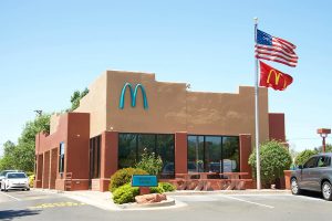
For the same reason, the McDonald’s restaurant in Monterey, California, features black arches while that in Champs-Elysées, Paris, has white arches.
Finally
McDonald’s has come a long way from a little hot dog stand in 1937 to one of the biggest fast food corporations today. Its success is owed, in many ways, to its iconic logo that surpasses any language barrier.
No matter where you are in the world, that classic “M” symbol is instantly recognizable. The best decision McDonald’s ever made was to stick with its golden arches ever since its first made appearance in 1961 with a few modifications over the years.
What it did was build solid brand identity and loyalty, which is why the McDonald’s logo doesn’t need any wordmark or brand name for recognition.
FAQs
1. Why did McDonald’s choose ‘M’ as their logo?
The lettering ‘M’ on McDonald’s logo represents the original golden arches of the first franchised restaurant and many subsequent ones. Like Apple’s apple and Nike’s swoosh, McDonald’s logo enjoys global recognition.
2. Who designed the McDonald’s logo originally?
The famous golden arches were the idea of Dick McDonald. They were incorporated as an architectural element in the first McDonald’s franchise in Phoenix, Arizona, to get the attention of passersby. It was designed by Stanley Clark Meston, who had previously worked as a set designer for Universal Studios. Inspired by the architecture, the golden arches logo was designed by Jim Schindler.
3. What’s the color of McDonald’s logo?
The brand has mostly been loyal to the gold and red palette for the logo. But there are exceptions. In Sedona, Arizona, the McDonald’s logo is in turquoise color because it is required by law to blend in with the landscape of that region.
4. Why did McDonald’s flip its logo?
In 2018 and 2019, as part of the Women’s Day campaign, McDonald’s flipped its iconic “M” logo upside down to represent “W” for women. They did it once again in 2024 to honor anime and manga culture and fan base. This campaign was called “WcDonald’s campaign”.
5. What’s the name of McDonald’s logo?
The 2018 McDonald’s logo is officially called ‘The Token’. But it’s more widely referred to as “the golden arches” logo.