Representing a bank that has maintained its reputation for over 190 years is no cakewalk. A logo carrying that kind of legacy has to evolve and adapt to new markets, audiences, and ambitions while still holding on to the trust it has built over generations.
The Scotiabank logo is a good example of exactly that. From its earliest company seal to an icon of one of Canada’s oldest financial institutions, each version reflects where the bank stood at the time and where it aimed to go next. This article traces that journey.
1832 – 1961: The Original Bank of Nova Scotia Seal
Scotiabank’s story starts in 1832, when it was known as the Bank of Nova Scotia. The bank opened its doors in Halifax, Canada, with one clear mission: to expedite trans-Atlantic trade.
From day one, the bank stamped its identity with a seal and referred to it as the first Bank of Nova Scotia logo. The seal centers a shield that splits into three sections: a sailing vessel up top, a codfish in the middle, and a plow with a sheaf of grain at the bottom. Three symbols telling a story of the industries that built Canada’s early wealth.
Few floral patterns frame the shield, while two bold rings wrap the outside, bearing the bank’s name and its year of incorporation.
1961 – 1963: Styled Moniker of Scotiabank Logo
For the very first time, the bank’s shorthand name, “Scotiabank,” appeared on its logo in 1961. The designer split it into two distinct fonts. They rendered “Scotia” in Spencerian script, a flowing 18th-century cursive style, which casts it as a reputable, trusted bank with a rich heritage.
If you look at the word “Bank” carefully, it would look similar to the magnetic ink figures printed on mechanized cheques. This is indeed what inspired this font, a hot new technology sweeping banks at the time.
And right below it? The bank’s full legal name appears in a clean, all-caps sans-serif typeface but in a much smaller size than the wordmark above. The use of black monotone gives this Scotiabank logo a classic look.
1963 – 1974: Scotiabank Logo with Globe Motif
What exactly triggered this Scotiabank logo change? By the mid-1960s, decision makers started to feel that the old logo didn’t do a good job of portraying that Scotiabank had an international presence. Therefore, the next logo change in 1963 was intended to emphasize that it wasn’t only a Canadian bank.
This redesign added a globe covered with latitudes and longitudes between the familiar wordmarks of the old Scotiabank logo of 1961. These wordmarks sandwiched the globe from left and right. The tagline “The Bank of Nova Scotia,” that previously sat below the textmark, was now gone. Notice that the words “Scotia” and “Bank” were still separated at this point.
On the globe, a white, rightward-aiming arrow gave a sense of forward movement. A cool, light shade of blue covered this “globe and arrow logo.”
1974 – 1987: REDefining the Scotiabank Logo
The year 1974 brought major changes in the Scotiabank logo design. Unlike before, the words “Scotia” and “bank” had an identical font and format. The design presented these words as one whole word in a proprietary sans-serif typeface.
Moreover, the rounded edges, which are quite visible in letters “S,” “c,” “a,” and “b,” looked profound in title case capitalization. A uniform stroke width provided a stable and consistent appearance.
Notice that the tagline “The Bank of Nova Scotia” made a comeback in this iteration. Interestingly enough, the globe imagery evolved into a “Flying S” logo, where a red ribbon-like element swirled around the globe, now shrunken with fewer grids.
A warm, striking shade of red that Scotiabank had just claimed as its official color was chosen for being bold, modern, and impossible to miss.
1987 – 1998: Boxed “Flying S” Logo
Over time, the bank experimented with its logo and introduced a new and evolved identity. The 1987-launched version flipped the script of its iconic “flying S,” turning it white and boxing it inside a square colored in Scotia red. The complete color reversal instantly made the emblem pop in a whole new way.
The wordmark sat either to the left of the emblem or right below it. The font carries the familiar customized sans-serif typeface as before, but in a lighter weight. This design gives a cleaner and more refined feel.
1998 – 2019: Modern Update of Scotiabank Logo
Scotiabank walked into 1998 by shedding what it no longer needed. After a decade, the bank decided to let the red box go. By stripping it away, Scotiabank freed the flying S, which moved to the left of the wordmark for the first time. This gave the logo a cleaner and more open feel.
Blink, and you’d miss the subtle sharpening applied to the sans-serif font. However, the biggest change happened with the color Scotia red. The warm orange-red that defined the brand for years matured into a deeper and richer red, or a “true” red.
2019 – Present: A Bold and Minimal Logo
The Scotiabank logo underwent its most ambitious overhaul in 2019. The bank completely revamped everything it had built over the years and redesigned it for a world that now lives on screens.
Bold and unmistakably sans-serif letters “Scotiabank” now carry equal weight. The font is built to look as clear and crisp on a phone screen as on a billboard, colored in an updated hue of “Scotia red.” A registered trademark symbol comes along at the end of the wordmark.
The “Flying S” got a serious makeover. It dropped the old globe etched with latitudes and longitudes and replaced it with a clean, solid red dot. The same mark doubles as the Scotiabank app logo and website favicon.
And then there is “Scotia,” a first in the bank’s entire history. For the first time, the shortened name appears as a standalone wordmark, purpose-built for smaller spaces like mobile apps, social media, and marketing materials where using the full name isn’t feasible.
Finally
Each Scotiabank logo preserves its over 190-year legacy. It’s fascinating how much history a logo can carry. The Scotiabank logo story stretches all the way back to 1832, when a simple seal bearing a codfish, a plow, and a sailing vessel identified the bank.
Whether a tweak, a font swap, or a color shift, every Scotiabank logo change carried a deeper intention beneath. The globe and arrow logo of 1963 declared its international presence. As the globe morphed into a “Flying S” emblem in 1974, it started portraying the brand in a confident manner with its unique color, “Scotia red.”
With time, numerous modifications in the symbol were made that led us to the present version – A bolder, simpler logo for Scotiabank’s future.
Other Scotiabank Logos
Some other emblems commemorate the bank’s achievements over time; these are:
The 1921 Coat of Arms
The original seal of 1832 that carried the bank’s image for more than 80 years transformed into a coat of arms in 1921. A. Scott Carter, a member of the Royal Architect Institute of Canada and a renowned heraldic artist, redesigned the seal.
In this “coat of arms” edition, the shield containing the fish, the ship, and the plow remained intact at the center, but a richer symbolism surrounded it. A stag wearing a collar with a maple leaf medallion, springing to the left of the shield, represented Canada.
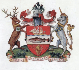
To the right, a unicorn, Scotland’s national animal, rears up proudly, wearing a medallion collar bearing St. Andrew’s cross. Above the shield, a knight’s helmet carries a thistle, the national plant of Scotland, crowning the entire composition. Together, they represent the Scottish colonial roots of Nova Scotia.
Anchoring it all at the bottom, a slash appears, carrying three words that would define the bank’s values for generations: Strength, Integrity, Service
“General Office” logo
While the head office remained at Halifax, Scotiabank opened its new ”general office” in Toronto in 1951 at 44 King St. West.
The landmark building didn’t just house the bank; it inspired a secondary logo as well. The publicity department captured the side frontal perspective of the building and placed its illustrated image at the center of a circle.
Flanking the left, the words “Publicity Department” appear stacked neatly. “PUBLICITY” up top in a bold, uppercase vintage serif, and “Department” sitting beneath it in a lighter, uppercase sans-serif.
The right side mirrored the same treatment, carrying the bank’s full name at the top, followed by the address of the general office. A solid black monochrome covers the entire composition.
Banque Scotia
In 1990, Scotiabank introduced a different marketing name in Quebec that easily conveys its nature of business for the French-speaking province. Although it still works as a legal name for the Bank of Quebec, the name BNE, an acronym for La Banque de Nouvelle-Écosse, got switched to “Banque Scotia” – and so did the logo.
Both the wordmark and the “Flying S” emblem at the right draw a clear parallel with the 1974 version in terms of color, font, and depiction.
Scotiabank Arena
As one of the busiest arenas in Canada, Scotiabank Arena hosts multiple events and ginormous crowds of spectators. Maple Leafs Sports and Entertainment renamed its owned arena from Air Canada Centre to Scotiabank Arena in July 2018 under a 20-year sponsorship agreement.
OneMethod, a creative studio, spiced up the Scotiabank Arena logo. Inspired by viewers and the neighborhood, the redesign presents the current version as an explosion of vibrant colors within the Scotiabank Arena.

Featured in a bold, structured sans-serif style, the words stack neatly, with “Scotiabank” sitting on the top and “Arena” right below it. Unlike the bank’s signature red, this logo plays freely with color from red to light blue, green, pink, purple, etc.
FAQs
1. Did Scotiabank change its logo?
Yes, Scotiabank changed its logo in 2019. The current logo comprises the bank’s name, “Scotiabank,” in titlecase sans-serif font, along with a registered trademark symbol that appears at the end of the logotype in deep red.
2. What is the color of Scotiabank?
The Scotiabank logo has an official color, which the bank refers to as “Scotia red,” a deep, rich shade of red.