Using animals as symbols is a time-honored and effective concept. You might’ve come across many crests or flags of royal houses and families that have used animals like horses, lions, and eagles to vivify their heraldry.
Many famous brands use animal logos to represent their identity. Each animal is carefully chosen, carrying meanings that words alone cannot convey. This article takes a closer look at 20 animal logos and captivating stories behind them.
1. Lacoste
Leading our list of famous animal logos is Lacoste’s crocodile. René Lacoste’s choice of the crocodile as the logo for his brand comes from a very captivating anecdote. In 1923, this young, gifted tennis player made a bet with his captain that if he won his next match, the captain would buy him a suitcase made of crocodile leather that he saw on a store display.
Rene didn’t win the match, but his determination won him a new nickname, “The Crocodile.” Little did he know that this was about to turn into something great.
For over 90 years, this legendary creature has been representing Lacoste. On 21st April 2026, the apparel brand launched its updated animal logo. Rather than recreating it from scratch, Lacoste worked with Commission Studio to create a brand identity that amalgamates Lacoste’s rich history with a modern feel.
Working on this approach, the reptilian goliath took a step back towards its earliest illustration, inspired by René Lacoste and created by Robert George. The roaring beast turns heads in a green that nods to the original hue. The crocodile is placed smartly; it works well with the wordmark but can also stand alone and hold its own. The red inside its gaping mouth became more prominent, conveying the freedom and playfulness that once defined Lacoste.
Lacoste added a few more hues that colored Lacoste’s history. Green, the main color, now appears in 3 different shades. The brand also accepted a clay color that is reminiscent of a tennis court and Farine, a soft off-white color mirroring the first blazer worn by René Lacoste.
The redesign brought back the serif style in its all-caps letters. The logotype rendered in Rene’s handwritten style looks elegant and personal, making this animal logo resonate and connect with the audience.
2. Puma
Can you share a more befitting symbol for a fleet-footed shoe brand than the agile Puma?
After the Dassler brothers parted ways, Rudolf Dassler decided to rename his company. Unlike his brother, Adolf Dassler, who formed Adidas using his name, Rudolf felt that the name “Ruda” did not sit well with the image he wanted to build. He envisioned a brand that made its wearer feel swift and spry.
To express this, he chose an animal that embodied nimbleness and a solid build. This decision led to the birth of PUMA and its iconic No. 1 logo – one of the most well-known animal logos.
It first emerged in 1967, featuring the silhouette of a puma jumping over the wordmark from its right side. The logo evolved over the course of time, keeping it fresh and relevant. The recent version of the No. 1 logo includes a wordmark in neo-grotesque sans-serif typeface and a detailed puma leaping over the logo, both rendered in black.
3. Peugeot
The majestic animal in the Peugeot logo fittingly represents this more than two-century-old automotive brand. The oldest car company in the world has built its legacy around the lion since 1810. The current version of the Peugeot lion logo that you see below surfaced in 2021.
Designers used white lines in various shapes and thicknesses to form the contour of a growling lion as seen from the side profile. The thick and sculpted mane stands out as the defining feature of the Peugeot logo. Above the lion imagery, the wordmark presents the brand name in uppercase sans-serif typeface.
All these elements are set within a black shield to provide a sharp contrast. And as you may have noticed, the Peugeot shield logo is consistent with many automotive brands around the world.
4. Red Bull
The Red Bull Soapbox Race, Flugtag, and cliff-diving shows have left a lasting impression on the growing generation of adrenaline junkies. These high-energy, risqué events perfectly represent the image of this power-packed drink manufacturer. The idea of reaching beyond the limit is what the brand preaches. After all, it’s only you against you, right?
The bull as a symbol perfectly matches the brand name, both literally and figuratively. But where did this Red Bull logo come from?
It all happened in the land of smiles when Austrian entrepreneur Dietrich Mateschitz, incidentally, encountered the Thai functional beverage KratingDaeng, created by Chaleo Yoovidhya. Knowing its potential, he reached out to Chaleo, and in 1987, they launched Red Bull.
Krating Daeng fueled the creation of Red Bull and its animal logo. The name itself translates to “Red Gaur” or “Red Bull” in English. The logo depicts two brawny bulls charging at each other.
They are about to hit head-on in front of a bright yellow circle. The bulls are colored red, which reinforces the brand name. Along with that, the design displays it in title case sans-serif typeface.
5. Ferrari
When it comes to car brands with animal logos, no one paints the town red better than Ferrari. The equine symbol of Ferrari has been running along with it from the start.
The saga says that it was Count Enrico Baracca’s wife, Countessa Paolina Biancoli, who persuaded young Enzo Ferrari to use the symbol that belonged to her beloved World War I martyred son, Francesco Baracca. He used to paint it on every plane he flew for good luck.
She was confident that the symbol would bring prosperity to Ferrari. And indeed she was right!
The famous “prancing horse,” or “Cavallino Rampante” in Italian, first appeared on the Ferrari 125 S in 1947. It was from there that the logo continued showcasing exclusivity, performance, and quality worldwide.
In 2002, the Ferrari logo was tweaked for modern times. The redesign eliminated the fine lines between each section of the Italian flag above. This version of the prancing horse is more muscular, and its right front leg is slightly lifted upward.
The dot on ‘i’ in the Ferrari wordmark is rectangular instead of circular. Moreover, the canary yellow background behind the horse appears more vibrant.
6. Qatar Airways
Qatar’s national animal, the Arabian Oryx, is the face of Qatar Airways. The airline revamped its livery and visual identity in 2006. In the latest version, the wordmark occupies a prominent position within the Qatar Airways logo, set in an uppercase serif font.
Besides the English lettering, you can also see the airline’s name in Arabic.
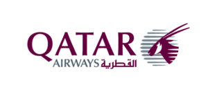
The image of an oryx, facing sideways, appears on parallel light gray strokes that form a circle. The oryx’s distinct facial markings add detail to the design. Moreover, the brand’s classic color palette of burgundy and light grey is a salient feature of the logo.
7. Lamborghini
Lamborghini is another famed Italian brand that has an animal logo on its high-performance luxury cars. In 2024, Lamborghini presented an improved version of its logo that could express the “brave,” “unexpected,” and “authentic” sides of its new purpose: “driving humans beyond.”
Embracing modernity, the bull’s dimensions shifted into a 2-D form. Designers gave depth to this 2-D emblem by incorporating negative spaces against golden highlights in its figure, making the image clearer.
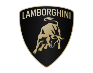
The bull seems to be in motion with its charging stance, swaying tail, and sight locked on its target. Above the being, the brand name appears in a broader, uppercase Lamborghini typeface.
The classic Lamborghini shield encases these two elements. When it comes to color, the brand uses black and gold as accent colors. Interestingly, the gold hue is much cooler.
However, for its virtual visibility, the famous car company chooses to present the bull solely without the wordmark and shield. Moreover, this version of the bull is rendered in black and white, which are also the primary hues.
8. Nestlé
Nestlé started in 1867 with one product: Farine Lactée, an infant cereal to reduce infant mortality. The founder, Henri Nestlé, envisioned a trademark that, apart from distinguishing his products from competitors, could also connect his name to the product.
The first Nestlé logo was inspired by the Henri family’s coat of arms, which featured a bird perched on a nest. It depicted a mother bird feeding her three chicks. Today, Nestlé is a conglomerate providing a wide range of food and beverage products, but its animal logo still conveys the same nurturing motherly love.
Nestlé’s current symbol has been modulated for the digital world. The 2018-launched logo comprises two chicks in a nest with their mother coddling them. The image heavily uses continuous and soft lines. Moreover, the addition of a fresh oak-brown color gives the logo extra warmth.
The logotype below presents the brand name in a title case and sans-serif style. A distinctive horizontal bar originates from N’s right stem, running above the letters “e” and “s,” adding a unique visual element. The macron above the final “e” makes Nestlé’s animal logo quite eccentric.
9. The Hartford
Art has a peculiar tendency to repeat itself via inspiration. Take the Hartford stag as an example; “The Monarch of Glen,” painted by Sir Edwin Landseer, remains an inspiration for the logo of the leading insurance company.
In 2025, the company disclosed its fresh visual identity. The stag appears in a minimal, solid black silhouette. This redesign skipped the detailing, which was prominent in the various versions. For the brand, the stag personifies strength, confidence, and stability. This rightward-facing stag is keeping an eye on its herd and staring boldly into the future.
Pentagram’s design team featured the stag in front of the brand name, as opposed to previous iterations. The wordmark appears fresh with the use of the “Trust Hartford Regular” typeface in the title case.
Designers also incorporated new primary colors, black, claret, and fuchsia, along with some additional colors, white and warm gray, to represent the brand.
10. Hermès
The logo of the luxury brand Hermes depicts a horse-drawn carriage with a groom wearing a hat and a tailcoat. It is inspired by the painting “Duc attelé, groom à l’attente” by French artist Alfred de Dreux.
The name translates to “hitched carriage, waiting groom,” which is precisely what the painting and the logo showcase. Hermès first adopted this logo in 1950, which was followed by a series of modifications.
The logotype below the symbol resembles the Memphis Bold typeface, but the lettering “PARIS” appears in a custom font. The logo appears in its signature orange hue, a color now synonymous with the brand. However, the color became the brand’s part by chance. In 1942, the Nazi-controlled France faced severe supply shortages.
While the cardboard boxes remained available, the brand could not source its usual packaging color. The only option available was the bold orange.
11. Penguin Books
Every bookish person can relate to the excitement when this bird arrives in paperback. The publishing house Penguin Books uses its namesake creature for the brand identity.
The waddly creature first appeared in 1935. It went through a series of iterations before taking its final form in 2003. Pentagram Design, the agency responsible for this redesign, gave the many different versions of the penguin logo floating around the world as the main reason behind this change.
The designer also stated, “Our refresh was very much based on the 1946 Jan Tschichold version.”
A prominent change is the penguin’s size. It got skimmed down for practical reasons. At this size, the Penguin logo appears a bit taller on a paperback’s spine as compared to its older version.
The penguin also stands upright instead of slouching and kicking its right foot. Its raised beak and big googly eyes give it a cheerful look. Moreover, an orange oval encloses this flightless bird mark.
12. Gulf Air
In Emirati culture, the falcons carry immense significance. The creature represents valor, nobility, and cultural heritage. Hence, featuring it as a logo for Gulf Air, the national airline of Bahrain, seems quite right.
In 2018, the airline launched a fresh brand identity. The designer crafted the well-defined falcon imagery from scratch. The blank spaces evenly balance the icon by shadowing some parts of the golden falcon while highlighting others. The intricate designs on the feathers further provide a subtle depth to the icon.
Designers at Saffron Consultants pair the soaring falcon with “GULF AIR” typography in Arabic (above) and English (below), all set in Gulf Air Sans. The Arabic type shines in a golden gradient, while the dark blue English type creates a striking contrast.
Interestingly, the falcon also inspired the creation of this custom typeface. For example, the crooked apex of the letter ‘A’ mirrors the tip of a falcon’s wing. Moreover, the fine shading that adds richness and texture to the letters mirrors the same detailing of falcon feathers.
13. Abarth
Carlos Abarth knew exactly what he wanted when picking a symbol for this brand – a scorpion. It was his zodiac sign, nearly impossible to replicate, and most importantly, it said everything about Abarth’s philosophy in one image: “small but mean.”
The Abarth animal logo turned out to be a perfect symbol for a car that punches way above its weight. Since its debut in 1949, the Abarth Scorpion has gradually evolved and refined into the sharp, modern badge we know today.
In 2007, Abarth began a new journey as an independent brand in the Fiat Group. With this change comes a restyled logo. This version presented the iconic scorpion tilted towards the left. Both its claws display above a diagonal line that separates the shield into red and yellow segments.
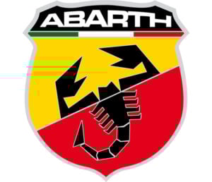
Sitting at the shield’s uppermost region, the wordmark “Abarth” appears against a black backdrop in an uppercase and new custom sans-serif font, which is similar to Microgramma Pro Bold Extended and Unison Pro Bold. Moreover, the letters at both ends are compressed. The Italian flag shifted from being the background of the text to sitting nearly underneath the brand name.
14. WWF (World Wildlife Fund)
So far, all animal logos are either inspired by depictions of animals in art and culture or by their characteristics, but the World Wildlife Fund logo has real-life inspiration.
A giant panda named Chi-Chi arrived at London Zoo in 1961, the same year WWF was founded. Its unique shape, color, and universal appeal convinced the founders to make her the face of the organization.
Sir Peter Scott, one of the founders, explained the reason behind this choice by stating, “We wanted an animal that is beautiful, endangered, and loved by many people in the world for its appealing qualities. We also wanted an animal that had an impact in black and white to save money on printing costs.”
In 2000, WWF revamped its iconic panda symbol, consisting of three elements: the panda icon, the WWF wordmark, and the containment shape.
The WWF initials occur beneath the panda in an exclusive WWF font typeface. Moreover, WWF made two small but clearly visible additions to the logo: the copyright and registered trademark signs.
15. Porsche
Porsche is yet another well-known car brand that proudly carries an animal on its badge. While it may share the horse symbol with a few other car companies like Ferrari, what sets it apart is the truly unique story behind how that horse ended up there.
It was the meeting between Ferry Porsche and US importer Max Hoffman that led to the conclusion that the Type 356 needed a proper seal of quality. Then, the advertising head Herrmann Lapper, with designer Franz Xaver Reimspieß, created the first logo. The emblem is a nod to Stuttgart, Porsche’s hometown.
Launched in 1952, the designer placed Stuttgart’s official horse crest, the Stuttgarter Rössle, with the city’s name at the center of a shield.
He further divided this shield into four parts. The top right and bottom left parts feature red and black stripes, while the remaining parts carry stylized antlers, three on each side. This element is drawn from the coat of arms of Württemberg-Hohenzollern. The brand name sits proudly above it all, tying the whole crest together.
In 2023, with the 75th anniversary of Porsche sports cars, the brand launched a new crest. This seventh iteration retains the essence of the original logo with some precise modernization.
The redesign replaced the bright gold hue with a muted metallic tone. A 3-D honeycomb structure distinctively marks the red stripes, while the antlers and horse imagery appear more refined than in the previous version.
16. Kingfisher
India’s most popular beer brand actually got its name and logo straight from the wild. The common kingfisher, a shy and colorful bird found in northern India, is the inspiration behind Kingfisher’s brand image.
In 2004, Kingfisher gave its vibrant bird a fresh look to keep the buzz going around the brand, coinciding with the launch of Kingfisher Airlines. One of the most noticeable changes is the bird itself.
The kingfisher was no longer sitting still and perched at the top; instead, it was in motion, embracing the winds. The redesign caught the bird beautifully in mid-flight.
Trailing the kingfisher, the flowing, ribbon-like streaks further accentuate the bird’s flight and its swift motion. The streaks also add glam to the logo. Designers crafted the wordmark beside the bird in a bold, decorative uppercase serif typeface.
The tagline beneath “Look up & see the beauty” in the title case and handwritten style encourages people to be present in the moment and enjoy the beautiful world around them.
17. John Deere
You know a logo is here to stay when it’s been representing a brand for more than a century and still looks sharp today. That’s quite the case with the leaping deer of John Deere. The logo has been the heart of the emblem from its origin in Moline, Illinois, to today, when it has become an equivalent of quality machinery in agriculture.
John Deere’s animal logo first got trademarked in 1876. The current logo has served as the brand’s face since 2000. A major change that occurred in this redesign was the stance of the deer. Designer Todd True noticed that the deer, which the company proudly referred to as the “leaping deer,” was landing, to be precise. He recreated the deer in an upward-leaping stance while staying true to the brand’s roots.
Moreover, the deer’s sharpened antlers, refined angles, and muscular build lend the logo a fresh, modern edge. The badge adopted a square shape with curved edges. A green background with a yellow outline neatly encases the deer. The brand name in a fresh, title-case sans-serif typeface completes the look.
18. Tunisair
Gazelles aren’t exactly known for taking flight, but Tunisair found a way to make that happen.
It represents Tunisair’s corporate identity. The antelope is a popular animal found across the country, which appears on the airline’s tail. The airline perceives Gazelle as an embodiment of grace, agility, and resilience. The being is an expression of the lightness of travel and richness of Tunisian culture.
The flag carrier of Tunisia adopted the animal logo in 1948, when the Tunisian government and Air France came together and set up the airline. The year 1990 turned out to be one of the most notable periods for Tunisair. The airline entered the modern era of aviation with two Airbus A30s and a refreshed emblem.
The redesign created the gazelle illustration by decisively arranging red stripes of varied thickness on a white background. It depicted the animal in a bounding motion. The Arabic text on the right, translating to “Tunisian Airlines,” holds the top position. The English wordmark follows below in a bold, uppercase neo-grotesque-style sans-serif typeface.
19. Lyle & Scott
For over 150 years, Lyle & Scott have blended Scottish heritage with golf elegance. The Scottish golden eagle first landed on the brand’s golf apparel in 1967. By 1980, the bird had made the brand’s logo its permanent home.
Lyle & Scott consciously chose the bird for their clothing brand, as it carries several representations that held real significance for them. The “eagle” in golf is a term for an exceptional score of two strokes under par on a single hole. This native bird of Scotland also depicts the brand values of courage, bravery, and determination.
In 2014, Lyle & Scott unveiled a modernized logo version, which features the golden eagle in a sleek and minimalistic style as a dominant element. The eagle soars in mid-air with its wings fully stretched upward and talons locked in strike position. The design delivers the eagle in blazing yellow.
The wordmark sits below the eagle in bold, strong uppercase letters. The ampersand gives a proper break to texts, which appear in condensed sans-serif typeface closely resembling Futura Bold and Gotham Bold. Two horizontal lines flank the text “EST 1874,” which carries a noticeably lighter and more spaced-out typeface.
20. MSN
When you think about famous brands with animal logos, a tech giant like Microsoft might not come to mind first. But that is precisely the MSN (Microsoft Network) logo. The Microsoft web portal has been using the butterfly as its symbol since 2000.
In 2024, MSN reintroduced the winged creature in a modern, minimalistic style. The brand splashed the butterfly with vivacious colors, creating an ombre effect. For better visualization of the emblem, both wings were enlarged in an appropriate proportion.
The redesign preserves the 2022 version’s wordmark. Displayed in a lowercase sans-serif style, the font draws a parallel to the Segoe UI typeface.
Finally
Various inspirations drive brands to adopt a particular animal for their visual identity. Sometimes the inspiration hits close to home, like the crocodile nickname given to René Lacoste of Lacoste and the scorpion zodiac sign of Abarth’s founder, Carlos Abarth.
Other times it imitates art, like in the case of The Hartford stag logo and Hermes’s horse, carriage, and groom. Animal logos also draw inspiration from family crests and coats of arms, as seen in the case of Nestlé’s logo and Porsche’s logo.
FAQs
1. Which brand has an animal logo?
Major brands such as Ferrari, Nestlé, Red Bull, Qatar Airways, Lamborghini, and John Deere have animal logos.
2. Which clothing brand has an animal logo?
Clothing brands often showcase their brand image through animal logos. Some of these brands are Lacoste, Hermès, and Lyle & Scott.