Triangles are one of the most widely used shapes in corporate logos. One such famous triangular symbol is the PNC Bank logo.
In this article, we’re going to take a trip down the memory lane and explore its history – right from its inception in 1959 to modern times.
You’ll discover why PNC chose their iconic triangular symbol, why it stopped using it for a decade, and then re-embraced it in early 2000s.
1959 – 1990: The Pittsburgh Triangle
The history of PNC Bank dates back to 1865, but the acronym ‘PNC’ didn’t originate until 1959 when Fidelity Trust Company and Peoples First merged to form Pittsburgh National Bank. This merger gave birth to the first triangular icon with the wordmark ‘Pittsburgh National Bank’ right below it.
As you can see below, the triangle was inverted, formed by the contexture of three trapezoids. Designers took inspiration from the Pittsburgh’s Golden Triangle, a.k.a Downtown Pittsburgh where the company is headquartered and still operates to this day.
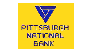
Now, let’s talk about the design specifics of the first PNC bank logo. The blue-colored wordmark was arranged in a descending manner, from top to bottom. And as you may notice, the same color featured in the downward triangle as well.
On the other hand, a vibrant yellow was chosen as the color palette for the square-shaped background, which gave the logo some contrast. Needless to say, this Pittsburgh National Bank logo was a striking vision for anyone who saw it.
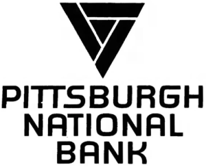
For the print version, however, the company used a monochromatic symbol which was otherwise identical to the original icon.
1990 – 2000: A Unique PNC Bank Logo
The next merger came in the year 1982, which was also the largest in U.S. history. Pittsburgh National Corporation merged with Provident National Corporation, having ‘PNC’ as their acronym.
Later in the 1990s, the corporation started to integrate its banks and other associated firms under the name of PNC Bank.
For the next logo, designer Joe Finocchiaro got rid of the iconic triangle and focused on the wordmark ‘PNC Bank’ instead. He used Fry’s Baskerville font type for this new PNC Bank logo.
The words were distinguished by using a different color-fill technique. The acronym was filled with solid black color, whereas the word “Bank” was outlined in black with no interior fill.
Moreover, the absence of any shape in the PNC Bank icon indicates that the brand aimed to project a consolidated image since the triangle was earlier associated with Pittsburgh National Bank.
2000 – Present: Progressive New Identity
As the bank pursued new ventures and acquisitions, it felt a need to rebrand itself. In 2000, PNC Bank Corp changed its name to PNC Financial Services.
Likewise, the PNC Bank symbol also changed. Did you notice the triangular emblem made its comeback? But this time with a tweak.

Three identical abstract patterns joined to shape the triangle which now appears in white color. Unlike the first version of the PNC Bank symbol, this triangle was upright but slightly tilted towards the left. A Willpower Orange (#FF5400) circle is encasing the shape.
The landmark acronym in Super Blue (#002FCD) is placed to the right of the symbol and written in a classic serif typeface. In this iteration, they decided to drop the wordmark ‘Bank’ altogether and go with a minimalistic appeal.
This logo has been the face of the PNC bank ever since with no reforms after 2000s.
Finally
The very first PNC bank logo shares an emotional connection with the brand’s inception place – The Golden Triangle, Pittsburgh. In 1990, the brand’s logo matured with its serious typography and straightforward representation.
It rebrands itself again at the threshold of a new millennium. This version of the PNC Bank symbol introduced new colors and a refreshed, slightly tilted triangular insignia.
This evolution story of the PNC Bank logo shares how the company stayed loyal to its regional identity while also pursuing enormous growth through several mergers in its over 150+ years of history.
FAQs
1. What does the PNC Bank logo mean?
The logo of the PNC Bank is a triangle that pays homage to the place where the brand was born – the Golden Triangle in Pittsburgh. Otherwise known as the Downtown Pittsburgh.
2. What are PNC Bank’s colors?
The current PNC Bank logo uses Willpower Orange (#FF5400) for the circular backdrop encasing a white triangle, and Super Blue (#002FCD) for the typography.
3. What is PNC in full?
The ‘PNC’ in the PNC Bank logo stands for both Pittsburgh National Corporation and Provident National Corporation, which merged and created the PNC Bank in 1982.