Our lives revolve around one thing – the phone.
Today, our phones have become more than just devices; they are a necessity. And what’s a phone without a good mobile network?…nothing.
This article shares the events of the evolution of the Bouygues Telecom logo, France’s third-oldest mobile network provider.
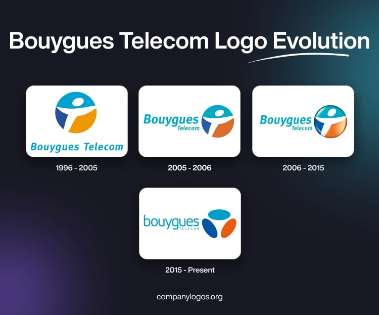
1996 – 2005: The ‘White Man’ Logo
Martin Bouygues carried on his father, Francis Bouygues’s legacy by expanding the Bouygues Group into telecommunications with Bouygues Telecom in 1994. Although the company was created in 1994, it did not begin operating commercially until 1996.
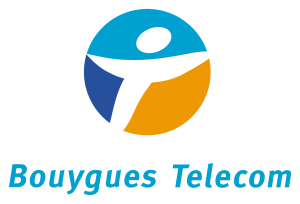
The first logo was circular in shape, with a humanoid figure present in the middle, known as “The White Man.” A semiotics enthusiast like you might have a clue that brands use a human figure in a logo or mascot to create a sense of relatability and trustworthiness in consumers.

You’ll notice that the outline of ‘White Man’ divided the circular backdrop into three segments of dark blue, a lighter blue, and orange. The oval head of this stylized figure rested on the light blue segment.
The brand played it safe with the choice of a customized, bold-italic sans-serif font type for the wordmark beneath. Moreover, they used the light blue color for the wordmark.
2005 – 2006: The New Millennium Icon
As Bouygues Telecom reached a new millennium, the logo got a bit of a makeover, too. The change in color palette was quite noticeable. A muted brown gradient replaced the yellow/orange gradient.
The font was a mix of Meta Bold and Meta Italic typefaces. A significant change that you may notice is the font layout. ‘Bouygues’ took center stage, with ‘Telecom‘ tucked right below it. Both were aligned to the left side of the logo. Sadly, this logo lasted for only a year.

2006 – 2015: 3D Bouygues Telecom Logo
Like Apple and Google, the Bouygues Telecom logo also got drenched in the wave of three-dimensional treatment, and the icon reemerged with a revamp in 2006.
The 3D design of the Bouygues Telecom logo had a glossy and smooth finish. You might feel the brightness in the gradient. This brightness gave the logo a visual depth. Likewise, the brightness of the inscription was also changed, which goes well with the logo.
Besides this update, the 2006 version didn’t differ much from the 2005 one.

2015 – Present: A Contemporary Icon
In 2015, Bouygues Telecom adopted a new visual identity. The company discarded its 3-D symbol for a flatter and more understated design.
Sadly, nothing lasts forever. The famous anthropomorphic figure, ‘White Man,’ had to go, and three analogous ovals took its place. The oval placements are reminiscent of the ‘white man’ impression. The color palette followed a similar matte pattern, but with a richer matte tone.

Interestingly, you can observe that they chose a font placement pattern similar to the 2005 version. Of course, this comes with some substantial changes. The ‘B’ in the dominating lettering ‘Bouygues’ is in small caps. The ‘telecom’ inscription beneath, which is much smaller in proportion, is in all capital characters.
The font used in the latest Bouygues Telecom logo is a customized geometric typeface, which makes the typography easy to read and recognize. This modified sans-serif font has taken elements of similarity from fonts like Futura and Eurostile. The characters are clean with well-rounded edges.
Finally
The evolution of the Bouygues Telecom logo shows how brands try to keep up with changing trends and times. What started as an offshoot division of Bouygues Group is now one of France’s largest full-service communication providers.
The “White Man” of the very first icon welcomed consumers with open arms. As the technology evolves, so does the logo. From a 3D glossy look to a minimal pebbles-shaped logo, the company largely stuck to its original color palette.
FAQs
1. What does Bougues mean?
The name of the major French Telecom provider is derived from its parent company, Bouygues Group, which is ultimately an inherited name of the group founder, Francis Bouygues.
2. Who owns Bouygues Telecom?
Bouygues Telecom’s stake is currently owned by Martin Bouygues, Olivier Bouygues, and their families. A few stakeholders of the company are its employees as well.