As a technology company, Hexaware Technologies offers IT, consulting, and business process services to global enterprises in areas such as cloud computing, artificial intelligence, data analytics, cyber security, and enterprise platforms. It was founded in 1990 and is based in Navi Mumbai, India. It has built a strong reputation for delivering technology solutions that enhance efficiency, drive innovation, and accelerate business outcomes.
The company has a strategic vision centered on modernising legacy systems and enabling digital-first enterprises. The evolution of the Hexaware Technologies logo is consistent with the growth of the company, which the article will explore, among other details.
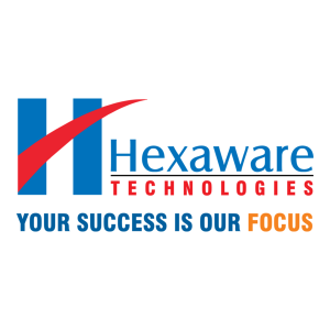
The Genesis of the Hexaware Technologies Logo (2001 – 2017)
The initial logo featured a large red swoosh mark intersecting the thick vertical bars of the letter “H”. It appeared alongside the wordmarks “Hexaware” and “TECHNOLOGIES” in two levels. The wordmark “Hexaware” in a title case in blue appeared on top and was written in a sans-serif typeface, with a marked “tail” in the letter “a”.
The word “TECHNOLOGIES”, on the other hand, in red uppercase, was mentioned below with pronounced spacing between the characters. Below the wordmarks and the swoosh emblem lay the corporate tagline “YOUR SUCCESS IS OUR FOCUS” in uppercase, and the word “FOCUS” appeared in orange.
(2017 – 2023)
The 2017 logo iteration featured a slanted, multicoloured “H” letter with the “Hexaware” wordmark. The logo design aimed at conveying the powering of human-machine collaboration and the company’s transition towards artificial intelligence, innovation, and automation.
The logo consists of small dashes and circles arranged in an abstract “H”. In fact, the left vertical bar of the letter “H” was crossed by a red dash that looked like a tiny cylindrical element. Another red circle sat on top of the right vertical bar, followed by a yellow circle to the right. Below the H-shaped graphical symbol was mentioned the wordmark “Hexaware” in a black title case. The multicoloured “H” symbol evoked a rich legacy, energy, and fearlessness.

(2023 – Present)
The current Hexaware logo has been given a clean and streamlined look. The wordmark style has been retained, and it appears in a multitude of colours. These include various shades of blue, honey, black, white, and canary yellow, among others. The wordmark has been rendered in the Manrope font in medium or semi-bold weights. The other fallback fonts are Helvetica Neue or Arial Regular.
The Elements of the Hexaware Technologies Logo
Font
The wordmark used in the Hexaware Technologies logo uses bold, clean, geometric, and modern Manrope and Heebo fonts in medium or semi-bold weights to convey a contemporary and professional look. The other fonts that could be used are Helvetica Neue Light or Arial Regular.
Colour
The colours used to depict the Hexaware Technologies logo come in various shades of blue, white, black, and yellow.
Finally
The evolution of the Hexaware Technologies logo reflects the journey, growth, and expanding global identity of the company. The logo’s evolution signifies the company’s transition from a traditional IT service provider to a future-focused tech leader. It presents a visual identity that resonates with global presence, technological excellence, and a commitment to shaping the digital future.