Intuit Inc. is a leading global financial technology company that develops software solutions to simplify personal finance, small business accounting, and tax management. It came into being in 1983 and is based in Mountain View, California. Intuit has become a trusted name in digital finance through its innovative products such as QuickBooks, TurboTax, Credit Karma, and Mailchimp.
Over the years, the company has transformed traditional, paper-based financial tasks into intuitive and automated digital experiences. It thus empowered individuals, entrepreneurs, and accountants to manage money more efficiently. It has a strong focus on artificial intelligence, automation, and user-centric design and continues to shape the future of financial accessibility. It helps millions of users to make confident financial decisions in an increasingly digital world. The article explores the various logo changes of Intuit, among other details of the company.
The Genesis of the Intuit Logo (1983 – 2008)
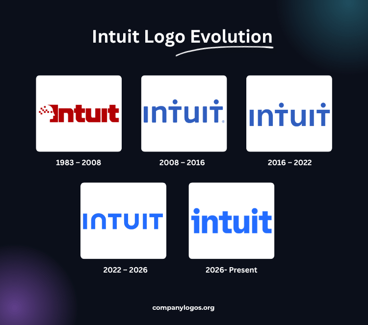
The original Intuit logo featured the brand name with the silhouette of a person’s head visible in its left side view. The person’s head featured multiple red squares to represent the thought process that often leads to intuitive breakthroughs. The brand name is written using a bold and massive typeface with sharp angles.
The letters of the wordmark appear as monolithic, while the red pixel squares appearing in the head seem to dissolve into thin air. The pixelated square elements and the monolithic geometric shapes of the letters convey the idea of technological precision.
(2008 – 2016)
The redesign of 2008 was done by the design firm Lippincott. It was much simpler, as it featured just the brand name in blue. Here, although the silhouette of the human face was missing, two dots appeared above the letters “T”. These looked like silhouettes of people with stretched arms. Besides, the letters of the logo were in mixed cases – “I” and “T” in uppercase, while “u” and “n” were depicted in lowercase.
(2016 – 2022)
In 2016, certain tweaks were made to the previous iteration. For instance, the colour became a little darker. Also, the letter ends have got square angles instead of the rounded ones earlier.
(2022 – 2026)
In the current logo iteration, the dots over the letter “T” were removed. The letterforms became more dynamic and easier to read. The dark blue colour in the previous logo was changed into a lighter and brighter shade. Besides, the shapes of the letters “N” and “U” mirror each other.

2026-Present: New Intuit Logo Integrating ‘Intuit Intelligence’
Intuit marked its transition into an integrated network with a new corporate brand identity, unveiled in September 2026. In collaboration with Intuit’s in-house design team, the design agency JKR (Jones Knowles Ritchie) christened this rebrand as ‘Intuit Intelligence.’
Essentially, ‘Intuit Intelligence’ signals that the brand is bringing its individual software products into a platform that blends AI and human expertise, conveyed through visible changes to its iconography, wordmark, and other elements.
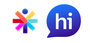
Here’s what the Intuit favicon and app icon now look like:

The first ‘i’ of the new wordmark is pretty contrasting with the other one. The leftward-extending arm below the suspended title looks like the numeric ‘1’. The letters ‘n’ and ‘u’ maintain balance in the lettermark by manifesting as vertical ambigrams/invertible pairs of each other.

JKR formulated the new typeface with type designer Jeremy Mickel of MCKL Type Foundry & Design Studio. They named it ‘Tally’.
Interestingly, depending on the digital touchpoint, the wordmark can take many forms, from a fixed logo to a variable interface element. Across the brand’s product experiences, the ‘i’ can tell you who is helping you. In the case of AI, the ‘i’ will morph into a dynamic or animated form called ‘The Propeller’. However, if it transforms into a cheerful greeting, ‘hi ’, that means a human expert is helping you.
A fresh color palette brightens the logotype, with electrifying superblue as the primary color. For software, it uses blueberry as an anchor pigment that brings all the products under one umbrella framework.

On the JKR’s website, this overhaul is mentioned with a statement: “For 40 years, Intuit has helped people put money back in their pockets and make confident financial decisions across TurboTax, Credit Karma, QuickBooks, and Mailchimp. But Intuit changed: its products started working together-less do-it-yourself, more done-for-you. From the outside, you wouldn’t see it.”
The agency further added that, “So we brought seven years of change into one connected story. A new wordmark becomes an iconic symbol, activating into Intuit Intelligence: AI and human experts working together across Intuit products. We built a system around it all and a site that brings it all together. Now. One Intuit.”
The Elements of the Intuit Logo
Font
The wordmark representing the Intuit logo is based on a design that has been conceptualised by in-house designers in collaboration with a San Francisco-based studio, Moniker SF. The typeface used is clean and modern and a custom variant of Avenir Next. Also, the font closely resembles IDroit Regular and is characterised by the distinct letter “N” that looks like an inverted “U”.
Colour
The Intuit logo is designed using the colour blue, which signifies trust and stability.
Finally
The Intuit logo and its various iterations show how the company transformed itself from a software startup to a global leader in financial technology. The logo stands as a symbol of trust, innovation, and financial empowerment. It represents a continuously evolving platform that is dedicated to helping individuals and businesses thrive in an increasingly digital financial world.