Snowflake is a modern cloud-based data platform company known for transforming how organisations store, manage, and analyse data at scale. It was founded in 2012 but began operating in 2014. Based in Bozeman, Montana, Snowflake introduced a highly innovative architecture that separates compute and storage. This allowed users to elastically scale resources independently and pay only for what they use. The platform supports a wide range of workloads, including data warehousing, data lakes, data engineering, real-time analytics, AI/ML workloads, and secure data sharing across teams, partners, and applications.
Snowflake plays a critical role in the global data economy and is trusted by enterprises across industries such as finance, retail, healthcare, and technology. Its vision is of a connected data ecosystem that continues to push innovation forward. Thus, Snowflake is positioned as a leader in the evolution of cloud data platforms. The article delves into the evolution of the Snowflake logo, among other details, of the company.
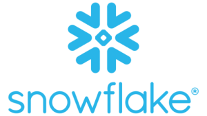
The Genesis of the Snowflake Logo (2014 – Present)
The Snowflake logo combines the image of a snowflake and the brand name. The graphical image of a snowflake is shown in the vibrant shade of azure. It is a geometric representation of a snowflake with sharp angles and symmetric arms that look like arrows directed inwards. A rhombus lay at the core of the emblem to symbolise the crystalline structure of a real snowflake.
To the right of the graphical emblem or below is written the brand name in a sleek, grotesque, lowercase typeface in azure blue. The letters of the wordmark are characterised by smooth lines with rounded ends to convey clarity and simplicity. The overall logo evokes a brand image that is forward-thinking and trustworthy.

The Elements of the Snowflake Logo
Font
The Snowflake wordmark is written using a grotesque thin typeface in lowercase. The typeface is similar to Averta Standard Light by Kostas Bartsokas. Besides, the ends of the letters are rounded and smooth.
Colour
The Snowflake logo is designed using a vibrant azure colour scheme against a white background.
Finally
The Snowflake logo has remained the same since the founding of the company in 2014. The logo represents a promising cloud-native startup that has transformed into a global leader in data platforms. The refined geometry of the Snowflake logo reinforces its core values of precision, flexibility, and innovation. The Snowflake logo is not only a visual mark but also a representation of the company’s role in redefining how the world stores, processes, and shares data.