When it comes to luxury and innovation, very few brands can raise a toast to Alexander McQueen. This British fashion designer (1969–2010) was a visionary whose bold creativity, flawless tailoring, and theatrical runway shows revolutionised the fashion industry. Founded in 1992, McQueen is often referred to as the “enfant terrible” or “bad boy” of fashion. He seamlessly fused traditional craftsmanship with dark romanticism, technology, and avant-garde artistry. This fashion house specialised in men’s and women’s clothing, shoes, perfumes, and accessories.
Alexander McQueen rose from humble beginnings on Savile Row to become the head designer at Givenchy and later founded his globally renowned label. He pushed boundaries with designs that were provocative, emotional, and unforgettable. His legacy continues to influence contemporary fashion and has established him as one of the most influential and innovative designers of the modern era. As we delve into the history and evolution of its emblematic insignia, or logo, we reflect on the creative genius of its founder, Lee Alexander McQueen, among other details.
The Genesis of the Alexander McQueen Logo (1992 – 2018)
The journey of the Alexander McQueen logo began in the early 1990s, when the brand was founded by the British fashion designer Lee Alexander McQueen. The original logo was marked by a simple yet powerful design featuring the brand name in a sleek, uppercase font.
It featured the brand name in black uppercase in two levels. A distinctive characteristic of this logo was the letter “c” inscribed within the bigger letter “Q”. Further, the size of the first name “ALEXANDER” was considerably smaller than the surname “MCQUEEN” to achieve balance and create a sense of unity.

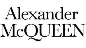
(2018 – Present)
The logo was tweaked in 2018, eight years after the passing of its founder. It differs from the previous version and reflects the changing dynamics of the fashion industry. In this iteration, the first name “Alexander” is written in a title case to convey a soft and modern impression.
The surname “McQUEEN” is written in a larger size, and all letters are in uppercase, except “c”. The placement of the letter “C,” unlike in the previous iteration, symbolises the new path chartered by the brand. The letters “U” and “E” in the surname have their serifs joined at the top. Overall, the logo continues with its creative legacy and yet maintains a modern appearance.
The Elements of the Alexander McQueen Logo
Font
The logotype uses a traditional custom serif typeface with classic proportions. Similar typefaces to this one are Baskerville Nr 1SH or Song ASC Traditional Light.
Colour
Among fashion logos, the pairing of black and white emerges as the most extensively employed colour scheme. In this regard, the Alexander McQueen logo adheres to this prevalent preference without deviating. Besides, the combination evokes a sense of excellence, precision, and professionalism.
Finally
The evolution of the Alexander McQueen logo shows the brand’s ability to adapt, innovate, and pay homage to its founder’s indelible legacy. Right from its humble beginnings in the early ’90s to its current status as a symbol of haute couture, the logo has transcended mere branding and has become an integral part of fashion history.