Bespectacled or sunnies wearer, no matter what your tribe, stylish yet durable eyewear is what everybody yearns for. Marchon Eyewear, Inc. fulfills this demand with its premium-quality collection of prescription and fashionable eyewear through either licensed partners, such as Calvin Klein, or in-house brands such as Dragon and Marchon NYC.
The following article will give a closer view of the evolution journey of the Marchon Eyewear logo. Even though time has erased much of the brand’s logo history, a few reports from the United States Patent and Trademark Office (USPTO) helped us piece together the known versions before 2008.
1983 – 1988: Earliest Marchon Eyewear Logo
When Jeff White, Larry Roth, and Al Berg founded Marchon Eyewear, Inc. in 1983, they never imagined that their dream of building a global eyewear company would turn into reality. The brand that began at a tiny office in Plainview, New York, has come a long way since then, with a presence in over 20 countries.
First used in 1983, this version of the Marchon Eyewear logo displays the wordmark in a highly expressive and hand-written style. Title case capitalization complemented black cursive letters. Its irregular forms, paired with a brush-like texture, give it a signature feel.
This first trademarked logo of Marchon Eyewear is no longer in use.
1988 – 2008: Marchon Eyewear Logo Goes Minimal
Marchon Eyewear, Inc. started gaining traction with its innovative and purpose-driven products, such as Flexon (1988) and Airlock (2001). The upgrade of the brand’s headquarters to Melville, New York, ensured that the brand grew but remained connected to its roots.
To represent a mature brand, a logo must mature as well, which leads us to this version. The 1988 Marchon Eyewear logo, as per a USPTO report, appeared more structured and professional than its predecessor.
The logo carried a minimalist style, which most companies now prefer. The brand featured its name in an uppercase, sans-serif typeface that shares familiarity with fonts like Helvetica Neue and Gotham. The letters stood out in dark gray, with balanced proportions and generous spacing.
2008 – Present: A Refreshed Identity
Marchon Eyewear opened up a new chapter after being bought by Vision Service Plan, a leading vision care insurance provider, in 2008 for $735 million.
The current Marchon Eyewear logo proudly presents this takeover. In the logotype, the brand name takes up a larger portion, which emerges in a clean, bold sans-serif font. A geometric, minimal style persists in this version too.
The tagline, “a vsp vision company” below the wordmark, reflects the ownership. The new Marchon logo design includes this tagline in a lowercase sans-serif typeface. The lightweight lettering and tight spacing allow the brand name to shine. Moreover, designers chose dark gray as the primary hue for the monochromatic textmark.
Finally
The evolution of the Marchon Eyewear logo shares the growth trajectory of the brand. The symbol transitions from expressive, personal beginnings to a confident corporate minimalism.
The early handwritten-style logo experienced a deliberate shift toward a clean geometric wordmark. This gradual embrace provides clarity, visual balance, and a more professional look.
Other Marchon Eyewear Logos
For a few diverse operations, the eyewear company uses a different brand identity.
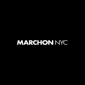
Marchon NYC
This extension of Marchon provides vision-based eyewear that is stylish, functional, and insurance-friendly.
The Marchon NYC logo displays its wordmark in an uppercase, sans-serif font in white against a black background. The heavier weight of the word “MARCHON” distinguishes it from the lighter “NYC.” The design establishes a visual synchronization while emphasizing the brand’s urban and contemporary identity.