In these times where functionality beats extravaganza, saying “less is more” will never be irrelevant.
Every designer is now aware of the power that a minimalist brand symbol holds. When brands reach maturity, they often turn to minimalist logo designs that speak for themselves. You just need to look at the symbol – and you know which brand it represents.
Read on to discover 20 famous minimalist logos – some thriving from their genesis, while others reaching their maximum potential, so brands no longer tweak them much.
1. Apple
When you hear the word “Apple”, the half-bitten fruit symbol of the tech conglomerate comes to mind first, and the Newtonian fallen apple later (that literally was the first Apple logo – talk about tacky!). It’s fair to say that both the company and its minimalist logo have tasted the zenith of fame among the general public.
The current all-black Apple logo was introduced back in 1998 and has remained the primary logo ever since. Even though some metallic versions were released in the 2000s, they never became the company’s main emblem.
Which other brand has a logo that is also a literal graphical representation of its name? It just makes perfect sense!
2. Nike
The famous footwear and apparel brand, Nike, has arguably the most minimal logo on this list. Its classic checkmark, popularly known as the “Swoosh,” was first introduced in 1971. At that time, it was featured along with the wordmark ‘Nike’.
In 1992, the independent swoosh became the main Nike logo. The Nike swoosh starts as a clean brush stroke, widens in the middle, and narrows toward the end. This minimal 2-D symbol comes in a black color palette.
3. Uber
The logo for the famous ride-hailing company Uber expresses simplicity in a modern format. The brand launched its simple wordmark logo in 2018.
Although the “u” is lowercase, the designers scaled up its arms, making it appear like a capital “U.” The curved parts of the letters “b” and “e” were designed with the same circular proportions, creating a balanced, harmonious look for the logo.
The choice of a basic black palette gives these elongated letters a clean look.
4. Facebook
There is always a deep sense of nostalgia when you come across Facebook. Part of that is because the Facebook logo has largely remained unchanged since its inception. The popular social media app uses a simple yet instantly recognizable smallcase ‘f’ icon encased in a blue circle.
You can notice the slanted right end of the cross stroke adds a bit of funk to the design. The design house “Moving Brands” labelled the typeface used in the logo as Facebook Sans.
5. Netflix
If there’s a logo that instantly triggers your dopamine, it’s the Netflix logo. The popular streaming giant uses the red wordmark logo as its primary symbol. It’s what greets you when you first switch on Netflix, followed by the minimal ‘N’ icon with its addictive “Ta-Dum” audio identity.
The color used in the logo is officially called the Netflix Red (E50914). The use of Gotham Book and Gotham Bold inspired typefaces for the logotype creates a theatrical impact.
Looking closely at the base of these letters, you’ll notice that they are not equally aligned. Instead, they are notably arched. This detail gives the Netflix logo a panoramic appearance.
6. Fendi
Continuing our list of popular minimalistic logos, Fendi is another notable addition. The haute couture brand introduced its simple wordmark logo in 2013. The refined font type introduced a rounded, unsharpened style, making words look broader and fuller.
The fashion house uses uppercase letters that resemble the ‘Basic Commercial Soft-Rounded Pro Bold’ typeface for its brand name. Beneath the logotype, the brand represented its homeland, Rome, spelled in Italian.
7. Aesop
As tricky as it is to pronounce the name, the logo of the Australian cosmetics brand, Aesop (pronounced as “ee-sop”), is relatively simple. In 1987, Aesop introduced an ahead-of-time brand identity that continues to linger like the fragrances of its products.
The Aesop logo mirrors the same minimalism found in its product packaging. The brand presents its name as the logo, which appears in the title case. A classical serif typeface perfectly adorns the logo.
Some structural modifications, such as slightly curved indentations at the ends of each letter, a macron (horizontal bar) on ‘e,’ and irregular letter weights, combined with charcoal grey fonts, make the logo unique.
8. FedEx
Creating a minimalistic logo is tougher than it seems. On top of that, only a few can leap up into the category of the exceptional ones. Accoladed with over forty design awards, the FedEx logo speaks for itself.
People often recognize the brand “Federal Express” by its shortened form “Fed” and “Ex”, which the logo represents. In 1994, FedEx unveiled this famous wordmark logo along with the launch of its website.
The adhered characters ‘d’ and ‘E’ can be differentiated by colors purple and orange, respectively. Lindon Leader, the designer of this logo, suggested this famous color combination used in this title-case wordmark. The fonts appear weighted and structured, reflecting a combination of two typefaces: “Univers 67” and “Futura Bold.”
Can you find an arrow in the logo? Apparently, there is a rightward-pointing arrow present in the white space between the last two characters, ‘E’ and ‘x.’ The use of negative space in a logo to portray a company identity is truly noteworthy, isn’t it?
9. Gucci
There are several logo versions of the high-end fashion brand Gucci, but the one that became popular is this minimalistic lettermark logo.
After decades of influence in fashion, Gucci has reached a point where its name alone can create a buzz among people, which is why its corporate logo spells the brand name in a simple and clean sans-serif font.
The authoritative feel is perfectly delivered through black-paletted uppercase lettering. The identical “Cs” and “G” create a visual symphony. Each character is widely spaced, giving a structure and weight to the logo. The inconsistent font thickness and architectural stylization give the Gucci logo a debonair look.
10. X (Twitter)
Many of you had expected this transformation when Elon Musk acquired Twitter. In 2023, the brand replaced the blue Twitter bird with a white X symbol on a black backdrop. The color scheme can also be reversed depending on the intended use across different platforms.
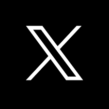
The ultraminimalistic two-dimensional “X” looks chiselled. The designer’s finesse appears in its left stroke, which resembles a narrow, elongated parallelogram. The logo uses a simple one-letter character in a modern, techno-oriented style. This minimal design works as a plus point for the brand, where a single word captures its entire identity.
11. Snapchat
Whether you’re a filter fanatic or a selfie lover, this app will surely rule your phone’s memory. The modern, minimalist logo design of Snapchat is easily recognizable. The (now) faceless ghost “Chillah” in a classic yellow box is Snapchat’s classic, refreshed in 2019. The social networking app’s primary logo includes both the brand’s wordmark and its ghost logo.
The brand name follows a simple mix of two font styles, “Program Nar OT” and “Ghost Sans”, in an uppercase lettering. The wordmark is Black, and the Ghost is in White with a broader black outline on vibrant Snapchat Yellow (#FFFC00). A negative space between ‘P’ and ‘C’ breaks the monotonous flow. The ghost logo’s proportions are relatively smaller than the logotype scales.
12. Calvin Klein
If any brand has truly experimented with a minimal logo outlook, it is Calvin Klein. In 2020, the famous fashion house refreshed its logo. This recent update introduces the black-colored wordmark in a well-tested title case capitalization style.
The typeface “condensed sans-serif Futura” is another familiar element that complements the lettering in the Calvin Klein logo. Designers also associate this typeface with “ITC Avant Garde Gothic Pro Book.” Some characters’ smoothness balances out with others’ edginess to create the finished look.
13. Shazam
Imagine walking through a food court in a mall. You hear a piece of music you really like, but can’t seem to place your finger on its name or the artist. That’s what true helplessness feels like. Luckily, there’s an app for situations like this. Shazam not only eases the journey of music discovery but also widens your horizon of music experience.
Shazam’s logo is another great example of minimalist logos. It showcases a circular logo housing the letter ‘S’, which looks like two interlocked Us. This circular mark appears in a blue ombré gradient, starting with a Royal Blue (#2255FF) hue at the bottom and fading into Hero Blue (#0088FF) at the top.
To the right of the icon, the logotype “SHAZAM” adopts the LL Circular typeface, bringing the whole look together.
14. OpenAI
You may have used generative AI at some point for academic, professional, or trivial reasons. One of the greatest inventions of this century impacts our lives every day. OpenAI, the creator of ChatGPT, updated its logo in 2025.
The company now uses a simple wordmark to represent itself.
The symmetry and precise spacing of the letters help the logo scale well. OpenAI also introduced the OpenAI Sans typeface, recognized for its perfectly rounded “O.” The OpenAI logo, shown in black, captures minimalism beautifully.
15. Discord
Discord began as a messaging service for gamers to coordinate, but it has since transformed into a platform for people to connect over shared interests. Like its many unique features, the new Discord logo adds freshness with its simplicity. In 2021, Discord rolled out its new logo to celebrate its 6th anniversary.

Designers freed Clyde, the app’s smiley symbol, from the rectangular chat bubble and softened its two sharp antennae into a more rounded edge, as previously the sharper features did not appear well on the finer prints. The antennas look more like Clyde’s shoulders in the latest version.
Besides the logo, the wordmark features a customized font ‘Ginto’, which gives it a playful look. The brand also uses a fresh color palette, Blurple (#5865F2), which is a shade between purple and blue.
16. NVIDIA
Nvidia, a well-known tech company specializing in GPUs (graphics processing units), introduced its simple and clean logo in 2006.
The NVIDIA “all-seeing” eye on the top splits into two equal squares: a white one and a brighter green one. The white square contains the green half of the eye and vice versa. Underneath the symbol, the wordmark features uppercase letters except ‘n’. Moreover, the typeface used resembles ‘Handel Gothic’.
17. H&M
Many of you still own rugged H&M jeans that simply won’t wear out. That’s the power of pocket-friendly, quality fashion. They say an easy way to determine a brand’s reach is by finding how well-known its logo is, and the H&M logo fits the bill. The brand adopted this logo in 1999, which is an abbreviated form of “Hennes and Mauritz”.
The designers capitalized the handwritten letters and set them in an italic style. A slight elongation makes the monogram logo clearer and refined. The much smaller size of the ampersand creates a balance in overall composition.
18. Quora
Try finding an answer to any of your questions on Quora. No matter how absurd it sounds, you will receive an answer. In 2015, the major question-answering platform adopted a logo that can easily represent them to every user across all screens. This primary logo in a high-contrast red is based on the Baskerville typeface.
Quora’s design team worked with Commercial Type, a digital type foundry, to create the new wordmark. They adjusted the size of Q’s tail to make it slightly more elongated. The individual letters are more spaced out.
Moreover, the terminals of ‘r’ and ‘a ’ seem perfectly aligned compared to the previous version. Designers have also opened up the hollow space in ‘Q’ to make it more prominent, as it continues to be the primary brand icon for Quora.
Overall, the wordmark appears more visually harmonious across different screen sizes. It was not the case with the previous version, which appeared cluttered and noisy due to angled letters, especially on smaller screen sizes.
19. Mazda
Keeping up with other automotive brands, Mazda also redesigned its logo in 2025 to make it suitable for digital environments. This means the new Mazda logo now looks flatter and more minimalistic.
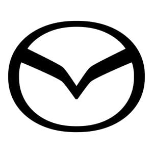
Mazda’s primary logo is its oval emblem that encloses a ‘V-shaped’ or winged structure. This new version is inspired by the 1997 iteration, where the ‘V-shaped’ structure actually represents the letter ‘M’ created in the form of gliding wings.
20. Medium
Simplicity in visual identity is not limited to product-based brands. The Medium logo is another example of a famous minimal logo. The wordmark that declares this online publishing platform was refreshed in 2017.
The logotype uses a custom serif typeface that seems to be influenced by high-contrast editorial fonts, giving it a refined feel. The characters’ sharpness at the end and harmonious curve gave the logo a print-media aesthetic.
This thoughtful inconsistency of stroke weight, when mixed with the black palette, fulfills Medium’s tone as an esteemed online publication platform.
Finally
As the identity of the modern branding world shifts from maximalism to simplicity, a new wave of minimalism becomes evident across brand visual identities. Beyond aesthetics, brands prefer minimalist logos because they scale easily and reduce issues like distortion or loss of clarity. Minimal designs also adapt more effectively across digital platforms.
Companies like Apple, Nike, Gucci, and Mazda often rely on black-and-white palettes to maintain a clean and sharp appearance. In contrast, brands such as Facebook, Netflix, Snapchat, and Discord use distinctive colors to strengthen recognition and preserve their brand identity.
FAQs
1. What is a minimalist logo?
A minimalist logo often uses a simple brandmark to convey its identity. Some companies may use a wordmark as their primary logo, while others may combine the wordmark with their icon. Overall, powerful minimalist logos embody the essence of ‘less is more’ and often indicate a brand’s maturity and global recognition.
2. What are some famous minimalist logos?
Some brands with famous minimalist logos are Apple, Nike, Uber, Gucci, FedEx, Netflix, and X (Twitter).