Zoff is a leading Japanese eyewear brand founded in 1993 by its parent company, Intermestic Co. Ltd., in Tokyo. The company is known for pioneering the concept of fast-fashion eyewear in Japan. It has made stylish, high-quality glasses accessible through transparent pricing and quick service. The brand’s name has been derived from “Z” (the last letter of the alphabet to symbolise new beginnings) and “off” (discount). The name reflects the vision of the company to challenge traditional eyewear pricing and make fashionable glasses affordable for everyone.
With its signature “Zoff Blue” colour and its friendly husky mascot, Zoff has built a strong brand identity that resonates with younger consumers. Beyond Japan, the company has expanded internationally, opening stores in China, Hong Kong, and Singapore. The article delves into the evolution of the Zoff logo over the years, among other details about the company.
The Genesis of the Zoff Logo (2001 – 2020)
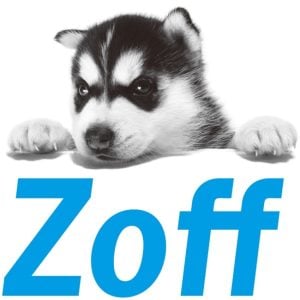
Although Zoho was established in March 1993, it was only in 2001 that its first brand identity was introduced. It featured a Siberian husky as a mascot and a simple and slightly italicised wordmark “Zoff”. The wordmark was rendered in blue using a typical sans-serif typeface in title case.
(2020 – 2021)
The 20th anniversary logo was introduced in mid-2020 with the concept “Eye Performance”. It featured the words “Thank you! 20th Anniversary” in three levels in italics and using a sans-serif typeface, alongside the brand name to the left.

(2021 – Present)
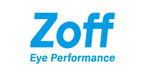
In 2021, the husky mascot was redesigned to commemorate the 20th anniversary of the brand. The mascot was replaced with an illustration in blue and white to maintain visual continuity. The rest of the elements of the previous logo, including the words “Eye Performance” as a tagline, were retained.

The Elements of the Zoff Logo
Font
The Zoff eyecare logo features a clean, modern font that is simple and highly legible. The typography appears to be sans-serif with straightforward, minimalistic letters designed to convey accessibility and style.
Colour
The Zoff logo uses a bright blue shade to convey a sense of trust, reliability, and freshness. The blue colour also resonates well with the brand’s modern and approachable image. Besides, the colour suggests professionalism while remaining friendly.
Finally
The Zoff logo is minimalist in its design, and it successfully balances simplicity with sophistication and functionality with aesthetic appeal. Through its clean typography, strategic colour usage, and versatile applications, the logo has supported Zoff’s growth and has been its visual identity from a single Tokyo store to an international eyewear retailer spread across hundreds of locations.