Zebronics is a leading Indian brand in several business domains, such as consumer electronics, IT peripherals, gaming, and lifestyle accessories. It was founded in 1997 by Rajesh Doshi in Chennai and is known for its wide range of affordable and innovative products.
The article delves into the evolution of the Zebronics logo, among other details.
The Genesis of the Zebronics Logo (1997 – Present)
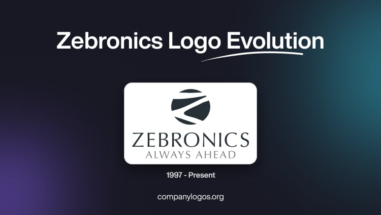
The original logo design, which continues to this day, features the zebra-stripe pattern as its emblem.
To the right or below the emblem, depending on the type of layout, is written the wordmark “ZEBRONICS” in black uppercase and in a sans-serif typeface with rounded letters. Further, below the wordmark appears the tagline “ALWAYS AHEAD” in grey and in a smaller size.

The Elements of the Zebronics Logo
Font
The wordmark in the Zebronics logo is written using a, modern sans-serif typeface.
Colour
The Zebronics logo is rendered in black and white and is used for contrast.