Vivaldi is a highly customisable, privacy-focused web browser launched in 2015 by Jon von Tetzchner, who was the co-founder and former CEO of Opera. It was created as a response to the simplification of mainstream browsers. In fact, Vivaldi aimed to restore and expand advanced features for power users while remaining accessible to everyone. Built on the Chromium engine, the browser ensures compatibility with modern web standards.
The Vivaldi logo has evolved alongside the browser and reflects changes in design philosophy, company identity, and user expectations over time. While the core “V” has remained, its style has shifted to reflect the maturity of the company and the unique character of the browser.
The Genesis of the Vivaldi Logo (2015 – 2017)
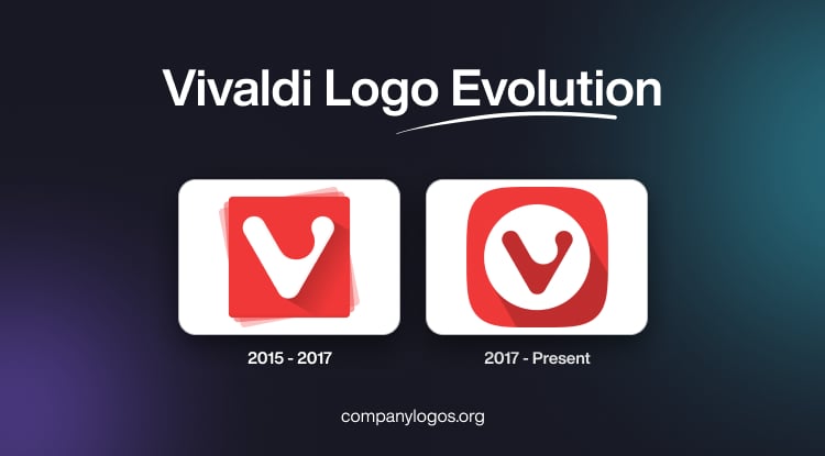
The original Vivaldi logo was created by external designer Sean O’Grady. It featured a rounded skeuomorphic “V”, which was an approachable and memorable image that helped establish brand identity during the early phase of Vivaldi, following the legacy of Opera. The “V” mark was placed inside the red background with glossy shadows and gradients. In fact, the “V” mark symbolised flexibility and friendliness and was chosen to be recognisable and to reflect the user-focused, customisable nature of the browser.

(2017 – Present)
The current logo was designed in 2017, and it retained the signature rounded and skeuomorphic “V”, but in a more minimalist and flat style. The logo was simplified and modernised in its appearance to reflect the playfulness of the browser. It did away with the heavy gradients and shadows of the original logo, as they made the logo tricky to be used across platforms. The current “V” mark in red has a rounder silhouette and a cleaner geometry. It is placed inside a white circle, the two of which are further enclosed within a red square with rounded corners.

The Elements of the Vivaldi Logo
Symbol
The Vivaldi logo does not have a traditional wordmark but a graphical emblem with a bold and playful design. The central element of the logo is the stylised white “V”, drawn in a smooth, rounded form. The letter almost resembles a hand-painted or brush-like stroke. This gives the letter “V” a friendly, approachable, and human feel and conveys Vivaldi’s philosophy of being a browser made for people, not corporations. The “V” is not based on any standard font but is instead a custom logomark.
Colour
The Vivaldi logo has a colour palette comprising vibrant red and white. The colour red conveys energy, passion, and creativity. The white-coloured “V”, on the other hand, signifies clarity, openness, minimalism, and trust. Also, the stark white colour of the letter “V” stands out to symbolise freedom of choice.
Finally
The Vivaldi logo and its iteration reflect the browser’s philosophy, “adaptability without losing identity”. The original logo with a glossy, skeuomorphic “V” badge changed to a cleaner and flatter design in 2017. The logo has been refined to suit modern design standards while staying instantly recognisable. Also, by maintaining the essence of the original logo while adapting its design, Vivaldi has crafted a distinctive brand. The Vivaldi logo resonates with its mission of empowering users and embracing creativity in the browser space.