Vaseline is an American skincare brand that manufactures a range of products based on petroleum jelly. It was founded in 1870, when chemist Robert Chesebrough introduced his petroleum jelly product in Brooklyn, New York. Currently owned by Unilever, the brand comprises products such as body creams, soaps, lotions, deodorants, and cleansers. The article explores the various logo variants of Vaseline, among other details of the company, over the years.
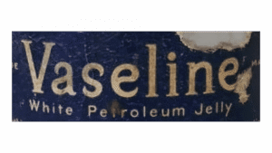
The Genesis of the Vaseline Logo (1870 – 1872)
The original Vaseline logo featured the word “Vaseline” in large, bold white or slightly golden letters. It was often accompanied by the phrase “White Petroleum Jelly”. The thin and curly letters, especially the “e” and “s”, had curves. The background was a deep, textured blue, which evoked a sense of trust and medicinal reliability. The serif font was authoritative and straightforward and reflected the product’s clinical roots.
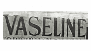
(1872 – 1928)
The first logo change showed a more minimalist design, with “VASELINE” rendered in monochrome, metallic, uppercase letters. The blue backdrop was removed, which led to a stark, modern impression that focused solely on the brand name. The weathered look of the letters in small serifs hinted at the brand’s heritage and durability.
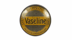
(1928 – 1969)
The logo took on a golden-yellow colour where the brand name was displayed on a yellow stripe using a bold, elongated font, centred within a circular badge. The circular border mentioned “CHESEBROUGH MFG CO.” and “PACKED IN LONDON ENG. AND” to highlight its manufacturing origins and growing international presence. This design exuded a regal, classic feel and emphasised Vaseline’s reputation and global reach.
(1969 – 2004)
In 1969, Vaseline embraced a cleaner and more contemporary look without the roundel. The logo featured the brand name in a crisp navy-blue sans-serif font on a white background, with smooth, rounded letters. This shift reflected the brand’s emphasis on purity, gentleness, and modernity. The design’s simplicity and clarity made it easily recognisable and memorable.
(199? – 2006) (Lotion, Asia), (2000 – 2009) (Shampoo, Philippines)
Another logo was devised to appear on specific Vaseline products, namely, lotion and shampoo, in Asia. Devoid of serifs, the logo featured the brand name in white title case against a deep blue background for visual clarity.

(2004 – 2006)
The logo of 2004 introduced a gradient from deep to lighter blue, thereby creating a three-dimensional effect. The bold, white “Vaseline” text featured a subtle shadow to add depth and a sense of sophistication. This update aimed to communicate the brand’s reliability and signalled a move toward a more dynamic, contemporary identity.
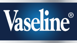
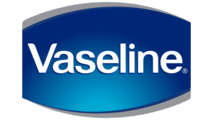
(2006 – 2018) (United States), (2006 – 2020) (International)
In 2006, the logo adopted a curved, container-like shape, with a richer blue gradient and a luminous centre. The logotype appeared in the middle of the arched design using a classy sans-serif typeface. This design with a flat grey outline showed the physical packaging of Vaseline products and emphasised purity and innovation. The spotlight effect and curved form made the logo more visually engaging and modern.
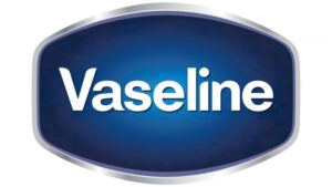
(2018 – Present) (United States), (2020 – Present) (International)
The current Vaseline logo features a sleek, silver-edged design with a deep, uniform blue background. The ellipse-shaped logo shows the brand name in white title case against a subtle gradient. Further, the metallic edge of the ellipse adds a modern, tech-inspired touch. This design balances timelessness with contemporary appeal. It ensures instant recognition and reinforces Vaseline’s status as a trusted global brand.
The Elements of the Vaseline Logo
Font
The visual identity of Vaseline uses a simple, traditional, and stable sans-serif typeface. It is similar to the fonts of Langtone Heavy and Hypersans. The letters in the logotype appear vivid and dynamic, thanks to the play of a light grey shadow and a slight gradient.
Colour
The Vaseline logo employs a blue and white colour palette to convey attributes, such as professionalism, expertise, and reliability. They reflect the brand as trustworthy and protective.
Finally
The Vaseline logo has undergone a remarkable transformation over more than 150 years. The logo variants show shifts in design trends, consumer expectations, and the brand’s expanding global footprint. The logo changed from its authoritative, medicinal origins to its current sleek, modern identity. It has consistently embodied the core values of Vaseline – trust, healing, and care. Today, the Vaseline logo stands as an instantly recognisable symbol of skincare excellence.