Vans is a California-based company that manufactures sports shoes, fashion accessories, and clothing. Established on March 16, 1966, by brothers Paul and Jim Van Doren as well as Gordo Lee and Serge Delia, the company was called The Van Doren Rubber Company initially. The logo of the company has changed just once after its design, which this article talks about, in addition to exploring other details about the company.
The Genesis of the Vans Logo (1966 – Present)
The first-ever Vans logo was conceived by Marc Van Doren, a 13-year-old and the offspring of one of the founders of the company. He devised a stencil intended for painting skateboards. James Van Doren promptly took notice of this graphical element and affixed it to the heel of Style 95 sneakers. Subsequently, the company owner made the strategic decision to mass-produce skateboard shoes.
This logo features the wordmark “Vans” in a black, bold, and thick uppercase sans-serif typeface and is known for an unconventional touch. For instance, it has a long horizontal line above the letters “A”, “N”, and “S”. Originating from the apex of the “V”, this line bears a visual resemblance to a mathematical root sign. This distinctive design evolved into a hallmark of the brand’s visual identity.
(2016 – Present)
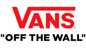
In 2016, Vans introduced an updated version of its logo. It featured the “Off the Wall” slogan in black uppercase and within quotes, which the company embraced in 1976. The term “Off the wall” was a common slang phrase among skateboarders at the time. This refined image maintains a lot of the original aspects of the first Vans logo. The V still has an elongated arm stretching over the top of the other letters in the company’s name.
However, the letters in a sans-serif typeface have been straightened and sharpened to give the image a more sophisticated look. The colour palette is also updated, with the “Vans” wordmark appearing in a bright red shade on a white background. Underneath the main logotype, we see the company’s slogan, which features in many of the brand’s advertising campaigns.
The Elements of the Vans Logo
Symbol
The current Vans logo features the brand’s name in bold letters within a red rectangle. It shows the iconic “Off the Wall” slogan placed underneath in black.
Font
The typeface used in designing the Vans logo is strong, geometric, all-caps sans-serif, which is closely related to Helvetica but customised for the brand.
Colour
Since its inception, Vans has used different colour schemes. In the 1960s, the logo appeared as a blue wordmark on a white tag. Later, the introduction of the van-shaped logo brought in vibrant red hues. After a period of using a black-and-white palette, Vans adopted the now-familiar red-and-white combination, with black added for the slogan in the current version.
Finally
The Vans logo demonstrates the brand’s capacity to appeal to and fit in with various demographics. Vans has upheld its dedication to individuality and self-expression throughout its history. The logo reflects the brand’s journey and captures the spirit of defiance, originality, and inventiveness that have defined Vans throughout the brand’s existence in the rapidly evolving fashion and young culture scenes.