TVS Motor Company is an Indian manufacturer of motorcycles, scooters, mopeds, and auto rickshaws that was established in 1978. The brand is renowned for producing vehicles that are economically priced, fuel efficient, and robust in performance. The logo of the TVS Motor Company is a powerful symbol that reflects the brand’s rich heritage, dynamic spirit, and commitment to progress in the Indian and global two-wheeler industry.
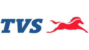
The logo primarily consists of two key elements: the acronym “TVS” in bold blue letters and a striking red horse in mid-gallop. The article delves into the evolution of the TVS logo, among other details of the company.
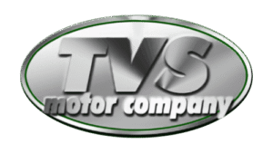
The Genesis of the TVS Logo (Before 2015)
The original TVS logo was created in 1978 when the company started manufacturing motorcycles in collaboration with Suzuki. Since then, the logo has evolved but consistently maintained its core elements symbolising speed, reliability, and innovation. The original logo featured the name of the company in two levels enclosed within a solid oval.
Designed in shades of metallic grey with a gradient, the upper level featured the company’s name, the abbreviated “TVS” in monolithic uppercase. The lower level showed the wordmarks “motor company” in bold lowercase. Both wordmarks in the upper and lower levels were displayed in italics. The letters “m” and “y” in the lower level partially touch the edges of the oval.
(2015 – Present)
The current logo consists of two parts: the abbreviated monolithic wordmark and a bright red horse emblem. The red horse appears in full gallop to the right with its flowing mane and widely spread legs in full glory. The tail too appears to be streaming in the wind. The galloping horse emblem emphasises active movement, speed, and intensity. The white colour separating the mane and tail is subtly introduced to bring harmony to the emblem. The italicised wordmark in a blue uppercase serif typeface symbolises authority and professionalism.
The Elements of the TVS Logo
Font
The TVS wordmark is rendered in uppercase using an italicised serif font. It is characterised by bold, thick lines. The monolithic letters of the logo showcase the reliability and reflect the confidence of customers in the brand’s technology.
Colour
The colour palette of the wordmark is blue, while that of the leaping horse emblem is red. It reflects the progress and speed of the brand.
Finally
The TVS Motor logo is more than a brand mark; it is a visual narrative of the company’s journey from a regional automotive player to a global two-wheeler powerhouse. The galloping red horse paired with the authoritative blue “TVS” letters encapsulates the brand’s ethos of speed, progress, reliability, and innovation.