Choosing a shape as the first identity of a brand can be puzzling. A logo should not only depict a brand’s emotional history but also its future aspirations. One such popular shape is a triangle that balances both aspects.
A triangle can denote many things. In math and science, the shape (delta) means change or difference from the past to the present. Rarely do we come across shapes that denote stability with progression.
In this article, we’ll explore famous triangular logos that have stood the test of time.
1. PNC Bank
PNC Bank is one of the most influential and largest banking institutions in America. Hailing from the Pittsburgh region, PNC introduced its current triangular logo in the year 2000.
As you may notice, the Pittsburgh Golden Triangle-inspired structure is confined in an orange circle. These three uniform blade or shaft-like shapes are placed such that they resemble a single strip twisted into a triangle. This PNC logo triangle is facing upward and angled slightly to the left.
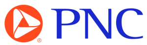
Moreover, the name “PNC” is placed on the right. This blue text represents the short form of a major merger between two banks that gave birth to the PNC Financial Services.
2. Alchemy
A leading blockchain development platform, Alchemy also features a triangular logo.
The geometric formation of the Alchemy logo gives it a distinctive look. Launched in 2017, the symbol features proportionate trapezoids arranged to form an equilateral triangle. The light purple hue really helps the logo to pop out.
Alongside the triangle logo, the brand name in a Neue Montreal typeface goes well with the black font color.
3. Google Drive
Google announced new symbols for its Workspace on 6th October 2020, which included Google Drive.
The triangular emblem of this cloud-based storage app is composed of a total of six visual elements. Designers at Google arranged three inverted triangles of colors, dark green, dark red, and dark blue, in a clockwise fashion. Moreover, they stacked three trapezoids between these three triangles, presented in yellow, light blue, and light green colors.
The color scheme of Google Drive’s triangular logo matches that of other Google Workspace apps, delivering a unified experience.
4. Axis Bank
Previously recognised by the name of UTI Bank (Unit Trust of India), Axis Bank is one of the top three private banks in India. Unveiled to the public in 2007, the bank features a triangle-shaped logo that also resembles the letter ‘A’ – the initial of Axis Bank.
Paired with the icon is the company’s wordmark in uppercase, customized “Axis Font”.
5. Airbnb
The Airbnb logo, famously known as Bélo, is another triangle-shaped logo first introduced in July 2014. The symbol carries several references that reflect Airbnb’s values.
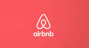
For example, the oval structure at the centre resembles a humanoid face, representing people welcoming with a warm wave. Simultaneously, the loop can also be seen as a location pin or a destination: a core aspect of the brand. The triangular shape also illustrates an upside-down heart and Airbnb’s monogram.
A lowercase wordmark beneath the symbol with a pink-red gradient backdrop makes the logo more vibrant and lively.
6. Mitsubishi
Mitsubishi, a Japanese automobile manufacturer, is well-known for its rhombus or diamond brandmark. Its logo is influenced by the three stacked rhombus seal of the Iwasaki family (founders of Mitsubishi), and the three oak leaves crest of the lord of the Tosa Clan (the Yamauchi family).
Mitsubishi refreshed its current logo in 1985. Three bright-red diamonds meet at the center by their pointy edges. Together, these diamonds form the larger red-and-white triangle.
7. Guess
Inspiration can come from any place. Guess’s famous triangle logo is a perfect example of that. Both the name and the logo of Guess, a popular clothing brand, are inspired by McDonald’s advertising campaign back in the ‘80s.
In 1981, when the Marciano brothers came across McDonald’s appetizing slogan “Guess what’s in our new Big Mac?”, it inspired them to christen their apparel brand as ‘Guess’ and the equally iconic question mark visible in its inverted triangular logo.
The dot of this question mark is also displayed as a smaller, upright triangle surrounded by numbers 1201 and 1203, the suite numbers of their first office in downtown LA.
Talk about nostalgia!
8. Delta Airlines
Delta Air Lines launched its current logo ‘widget’ on 30th April 2007.
The single shade of Delta red, with a shadowy hue applied to the right side of the symmetrical paper-plane-like logo, makes it appear three-dimensional. The smaller triangle beneath it shows similar characteristics. Both shapes together form a larger, equilateral triangle of Delta Air Lines.
The wordmark ‘Delta’ on the right appears in uppercase Priva Four typeface rendered in Delta Blue. Designers have made sure to keep ample space between the letters to create an impact.
9. DLF
The logo of real estate company DLF Limited is composed of several small triangles. A total of nine equilateral triangles are stacked in such a way that an inverted triangle sits between two upward-facing triangles. Together, they all form a pyramid-like structure.
The company’s acronym appears as the logotype, set in a bold, slightly italicized sans-serif typeface.
10. HSBC
At first sight, the HSBC logo may appear hexagonal rather than triangular. In 1983, Graphic designer Henry Steiner added two triangles to the bank’s original 1890s house flag, one on each side to form the iconic HSBC logo that we are familiar with today.
Call it a hexagon or an open envelope, the logo wouldn’t be what it is today without the addition of the two triangles on either side.
Potterheads, does it remind you of Mrs. Weasley’s howler as well?
In 2018, this distinctive shape was placed before the bank’s name, set in a bolder, simpler typeface.
11. Bass Brewery
Did you know that the world’s first registered logo is also a triangle?
Trademarked in 1875, the UK-based Bass Brewery’s logo features a red triangle. It was so famous that the major artworks of the time featured Bass Brewery bottles bearing the triangle logo.
Under the red triangle symbol, you can see the hand-scripted, cursive brand name displayed as well.
12. Adobe
The current logo for Adobe Inc. draws inspiration from the 1982 Marva Warnock design. For this 2025 rebrand, the focus was on the brand name ‘Adobe’. The crossbar of ‘A’ resembles the base of an upright triangle, which is why the new Adobe logo is on our list of famous triangular logos.
Designers used this ‘A’ both in the wordmark ‘Adobe‘ and as a standalone icon. Mother Design explained the rebrand on its website, “The intention behind this shift was to confidently spotlight the Adobe name, rather than require numerous mental connections between logos, wordmarks, and lockups.”
13. Prada
You’ve seen the triangular Prada logo on its clothing, accessories, and special campaigns. Even though it’s not the primary corporate symbol, the logo oozes luxury, as it has been associated with the brand since 1913.
The inverted Prada triangle consists of the brand name, the place of origin (Milan, Italy), and the year of its first use. The crown and shield beneath are neatly arranged at the bottom vertex of the triangle.
14. ABP News
Previously known as Star News, ABP News launched its current logo in 2020.
The new ABP News logo is simple and minimal. Designers rendered the triangular arrowhead symbol in bright red and removed the 3-D effect of the previous icon. The channel name appears in lowercase English, while the word “news” appears in Hindi.
15. The Academy of Motion Picture Arts and Sciences
The Academy of Motion Picture Arts and Sciences is famous for its Annual Awards ceremony, popularly known as “The Oscars.” The new logo was introduced in 2013, which incorporates a triangular element.
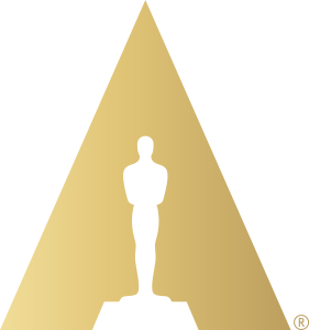
The primary color choice for the logo is the Academy gold and white. Against the three-sided sunlit background is the image of the Academy Award of Merit statuette, which we better know as the “Oscar.”
16. Dodge
Dodge’s “Fratzog logo” made a comeback in 2022. What sounds like an alien species, Fratzog is actually the triangular logo that the American automobile brand uses for its gas and electric cars.
Three sagittate-shaped forms create a triangle in the Dodge logo. The hollow space where their inner ends meet resembles a guitar pick. Designers rendered the logo’s outline in neon red against a black background.
17. DS Automobiles
The premium car brand DS Automobiles’ logo has a triangular element too. The initials ‘DS’ are visible in a sculptural and chrome-metallic form. The triangular ‘D’ looks like a stealth bomber about to head-on collide with the Boomerang-shaped ‘S.’
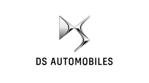
The wordmark ‘DS Automobiles’ beneath the brandmark appears in uppercase, geometric sans-serif typeface.
18. Google Play
In 2021, Google updated the logo of its famous digital distribution platform, Google Play, also known as the Play Store amongst Android users. The logo is a sideways-pointing triangle with non-pointy corners.
The triangle-shaped logo features classic Google colors: yellow, red, green, and blue. The tip of the triangle is in yellow, while the two arms are in green and red, and the remaining triangular part is in blue. The symbol also looks similar to a “play” button, visually linking the icon with the name of the app store, Google Play.
19. Adidas
The Adidas logo is one of the most recognizable triangular logos. First featured on athletic equipment in 1980, the Adidas triangle logo features three stripes arranged in ascending order, with the leftmost stripe the shortest.
In 2022, Adidas reintroduced the logo as the “Performance logo,” a new and core brand mark. These black bars on the white represent “products that are born from sport and built for life.” The common starting base and the slanting positioning of these three iconic stripes together create an outline of a triangle.
20. Avid Technology, Inc.
The digital-media–focused tech brand adopted a simple yet recognizable symbol in 2009. The logo is composed of several geometric elements that reference the company’s origins in video editing.
Triangles representing the “up,” “down,” and “fast-forward” buttons combine to form familiar letter shapes, spelling the company’s name ‘Avid’. The three triangles, facing different directions, and a vertical lozenge are in a vibrant purple color.
Finally
These well-known triangular logos depict how a shape can tell different brand stories in so many ways. In the case of PNC Bank, Avid Technology, HSBC Bank, Adobe, and Guess, the triangle showcases the brands’ concrete beginnings.
Whether it’s the sky-high aspiration of Delta Airlines, the structurization of the Academy logo, or the multi-faceted representation of Airbnb, the triangle-shaped logos convey them all effortlessly.
FAQs
1. Which companies have triangular logos?
Many companies across different verticals have triangular logos, such as Prada, Adobe, Delta Air Lines, Google Play, Airbnb, and more.
2. Which sports brand has a triangle logo?
Famous sports brand Adidas has a three-striped “performance logo” that looks like a triangle.
3. Which clothing brand logo is a triangle?
The luxury clothing brand Prada has a triangular logo.