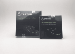
Trezor is a leading cryptocurrency hardware wallet brand that was developed by the Czech company SatoshiLabs. It was launched in 2014 and was the world’s first hardware wallet designed to provide a secure and user-friendly way to store and manage digital assets. The name Trezor means “vault” or “safe” in Czech and Slovak, and it reflects its core purpose. In other words, protecting private keys and safeguarding cryptocurrencies from online threats.
Importantly, unlike software wallets that are exposed to malware and hacking attempts, Trezor devices store private keys offline. They allow transactions to be securely signed without ever revealing sensitive data to potentially compromised computers. Its open-source firmware and software emphasise transparency, trust, and community-driven security.
The article delves into the various logo changes for Trezor, among other details of the company. Every logo iteration of Trezor showcases the journey of the company into becoming a strong, safe, and trustworthy name in the realm of cryptocurrency.
The Genesis of the Trezor Logo (2013 – 2016)
The first logo of Trezor was the iconic padlock symbol paired with a “TREZOR” wordmark in monochrome to emphasise security. The wordmark also included the line “The Bitcoin Safe” to reinforce the lock metaphor and the brand’s focus on security.

(2016 – 2017)
The 2016 logo edition saw the wordmark changed from “TREZOR The Bitcoin Safe” to simply “TREZOR”. Besides, the text “The Hardware Bitcoin Wallet” was changed to “The original hardware wallet.”
(2017 – 2023)
In 2017, Trezor effected a logo refresh that made the lock symbol cleaner, sharper, and more precisely crafted. The letters of the accompanying wordmark were made slightly thinner and taller for improved readability. Besides, the “TREZOR” wordmark was aligned to the height of the lock to ensure a better visual balance.
Old (left) and New (right)
(2023 – Present)
The latest Trezor logo features a minimalist padlock with a clean geometric design to emphasise security. Also, the wordmark “TREZOR” is written using a strong sans-serif typeface.
The Elements of the Trezor Logo
Font
The Trezor logo uses a custom sans-serif typeface that features slightly thinner and taller letters compared to the original. It has improved legibility and visual balance when paired with the lock symbol. The geometric and clean letters reflect the brand’s focus on security, modernity, and simplicity.
Colour
The Trezor logo has two types of colour options: black on white for light backgrounds and white on black for dark backgrounds. The monochrome colour palette conveys professionalism, clarity, and trustworthiness, which are the key values of the crypto security space. There is also a deep green background colour to reinforce themes of growth, security, and stability.
Finally
The evolution of the Trezor logo chronicles how the cryptocurrency hardware wallet industry matured over the years. So, from the original “TREZOR The Bitcoin Safe” to today’s minimalist security icon, each logo iteration has strengthened the brand’s core message: uncompromising security through innovative design. The evolution of the Trezor logo shows Trezor’s transformation from a “hobby project for friends” to a global standard-bearer for cryptocurrency security.