Miele is a German appliance manufacturer known for its sterling quality, timeless design, and engineering excellence. It was founded in 1899 by Carl Miele and Reinhard Zinkann in Herzebrock, Germany, and has remained family-owned for more than a century. It started with manufacturing cream separators and washing machines and has grown into a global leader in high-end domestic appliances and commercial equipment.
Its product portfolio spans dishwashers, ovens, washing machines, vacuum cleaners, and laboratory technology. The Miele logo is one of the most recognisable in the global appliance market. It is characterised by its bold typography and distinctive red-and-white palette. The article delves into the various Mielo logo iterations undertaken by the company, among other details.
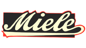
The Genesis of the Miele Logo (1899 – 1949)
The original Miele logo featured the brand name in a pale yellow colour and used a cursive handwritten style. The brand name was set against a black rectangular background with a thin red outline.
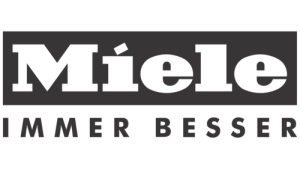
(1949 – 2007)
The first logo change saw the brand name written in white in a massive form and set against a horizontally stretched black rectangle. The brand name was executed using an extra bold serif typeface, and the dot above the letter “i” was replaced by a small slanted rectangle. Further, the brand name was accompanied below by the tagline “Immer Besser” written in black uppercase and in a traditional sans-serif typeface. The tagline was set against a white background, thereby creating the best contrast.
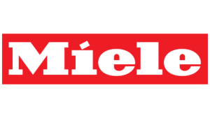
(1949 – 2018)
In another logo iteration during the latter part of 1949, the company introduced the now-iconic red rectangular background with white lettering. This design without the tagline made the logo more visible and distinctive. The bold red symbolised energy, strength, and innovation, while the white letters communicated clarity and trust. This was also when the slightly condensed serif font became standardised. The dot above the “i” was designed as a perfect square rather than a circle, thereby giving the logo a distinctive and modern touch for the time.
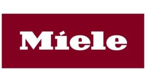
(2018 – Present)
In 2018, the previous logo design was retained, but with a bigger rectangular background and a different colour shade. The scarlet red background of the previous logo was replaced by burgundy, thereby adding luxury, exclusivity, and seriousness to the logo.
The Elements of the Miele Logo
Font
The Miele wordmark is written using a custom bold serif typeface that balances tradition with authority. The wide letters of the wordmark are short and monolithic and have serifs on all the letters except “e”.
Colour
The Miele logo is designed using the colour palette of bold red and white to symbolise passion, precision, and purity.
Finally
The evolution of the Miele logo illustrates the company’s philosophy of refinement over reinvention. So, what began from simple serif beginnings has turned into the burgundy rectangle. The Miele logo embodies reliability, premium quality, and timeless design. Its stability over more than a century shows the enduring reputation of the brand as one of the world’s leading manufacturers of high-end domestic appliances.