You can love him or hate him, but you can’t ignore Elon Musk, and his company carries a similar aura.
Founded as Tesla Motors by American entrepreneurs Martin Eberhard and Marc Tarpenning, the company has evolved into a futuristic brand inspired by the work of the Serbian-American scientist it is named after.
This fascinating journey is reflected in its logo as well. Let’s explore how the Tesla logo captures this wave of change.
2003 – 2017: Shield Styled Symbol
In July 2003, Martin Eberhard and Marc Tarpenning laid the foundation for Tesla. Their expertise in electrical engineering and computer science, respectively, resulted in another big inception – Tesla Motors after their first brainchild, the Rocket eBook.
The designers at RO studio created it to look more like a classic sports car’s logo, like Porsche or Lamborghini. Therefore, the old Tesla logo took the form of a shield-like badge, featuring the brand’s name along with its uniquely stylized initial.
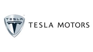
The custom font used inside the shield puts a futuristic spin on a classic sans-serif style.
The letters inside the shield are heavily stylized, with stretched horizontal strokes, especially noticeable in the S and E, and broken vertical strokes in letters like E and A. Sharp edges and generous spacing make the wordmark clean and readable.
The external ‘Tesla Motors’ wordmark of the original Tesla logo uses a minimal, uppercase sans-serif typeface, reflecting a clean and restrained design approach.
Here’s an interesting fact. The design of the initial ‘T’ was actually inspired by the cross-section of an electric motor. The staff indicates a pole passing through the rotor, and the curved horizontal bar illustrates the gap between each stator.
You will notice that over time, this registered wordmark with that distinctive ‘T’ symbol became a key part of the Tesla emblem.
2017 – Present: A Consolidated Tesla logo
Over the next decade, Tesla expanded its reach beyond electric vehicles, moving into clean and efficient energy solutions for the U.S. masses.
In 2017, the company publicly reflected this shift by changing its name from Tesla Motors Inc. to Tesla Inc., a transition that can be seen in the Tesla symbol as well. The logo phased out its bulky armor and acquired a modern look.
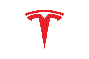
Apart from the shield emblem, the brand also discontinued the lettering “Motors” from the wordmark. The major elements that remained were the peculiar ‘T’, which appeared in bright red, cool grey, and white colors.
You can see the red Tesla logo on the company’s website and social media platforms. Meanwhile, the cool grey and white versions are prominently featured on the cars.


Besides the ‘T’ symbol, Tesla also uses its ultra-modern uppercase “Tesla” wordmark as a secondary logo in black, cool grey, and white color variations.

The black ‘Tesla’ wordmark appears most often on the company’s website and on the rear of select Tesla models.

The cool grey and white ‘Tesla’ wordmark logos are also featured as physical badges on the vehicles and occasionally on branding and other promotional events.

Finally
Since the brand’s beginning in 2003, the typography and the initial have carried an avant-garde flair. Tesla incorporated its electric-motor-inspired “T” and modern wordmark into a knightly shield, along with the name ‘Tesla Motors’.
As the brand expanded beyond cars, it dropped both the shield and the “Motors” inscription that tied it too closely to automobiles, and retained only the logo and typography as its visual identity.
The Tesla logo has not changed dramatically over the years. One reason may be that Tesla is still relatively young compared to its decades and even centuries-old competitors. As a result, the logo continues to reflect a sense of freshness and forward momentum.
Other Tesla Logos
As Tesla launches new vehicle lines, it also introduces distinctive logos that give each product a unique identity and help create a long-lasting impression.
Here are some other interesting Tesla logos:
Tesla Model 3 Logo
In 2016, Tesla revealed its first line of electric cars for a broader demographic – Model 3. For this line, Tesla unveiled a logo in which the name ‘Model 3′ was written in a slim and structured sans-serif font with sharp contours. Clean curves paired with gentle angular strokes give the letters a balanced, even weight.
The copious spacing between words and an extravagant ‘3’ sets a modern and minimal tone. The Tesla Model 3 logo appears on a rear plate, which owners can remove or customize.
At the launch event, Tesla initially used three horizontal bars stacked on top to represent the model line. However, the company later continued with the numeric version, likely to avoid a strong visual resemblance to Adidas’s iconic three stripes.
Tesla Semi Logo
In 2017, Tesla announced its plans to launch a battery-powered line of semi-trailer trucks called SEMI.
However, the logo associated with this high-performance, energy-efficient electric Class 8 truck did not surface publicly until 2025, when Tesla shared a video from its Gigafactory Nevada production facility on Twitter (now X).
This symbol appears at the end, where the name “SEMI” is presented in a sleek, almost utopian manner. The elongated letterforms, narrow proportions, and sharper curves work together to complement the neon-white color palette.
The most eye-catching element of the logo is the letter “E,” rendered as three laterally stacked horizontal lines. The typography follows a contemporary, uppercase sans-serif style, reinforcing its association with Tesla.
Tesla Cybertruck Logo
Whether it’s vehicle design or logo, everything about this Tesla line is, umm, different. The Cybertruck (trademarked as “cybrtrk”) logo was revealed when its concept was shown in an event in Hawthorne, California, in 2019.
Tesla has created a distinctive white colored wordmark for the pickup. The graffiti-inspired letters left a droopy trail at the end of strokes. The characters overlap and look cluttered, which makes the wordmark difficult to read.
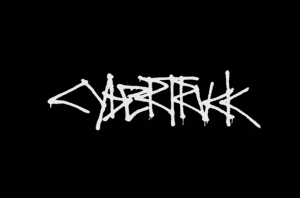
Several letters add to the confusion. The vertices of Rs and K resemble C, while U almost looks like a V. The capitalization is inconsistent as well: letters like c, b, and k appear in lowercase, while the rest are in uppercase.
Franz von Holzhausen, Tesla’s design chief, stated, “There are no Tesla badges on the Cybertruck.” He further described the Cybertruck as “its own product, its own brand.”
This approach is evident in the vehicle’s design, as there is no external logo on the body. The Cybertruck logo appears only on the touchscreen display when the vehicle is powered on.
Tesla Robotaxi Logo
AI integration is a huge step towards automated driving, and a major car trailblazer like Tesla couldn’t keep its hands off trying this field.
Tesla announced plans to launch its own line of autonomous vehicles, which includes Robotaxi – an automated Model Y of Tesla currently operating in Austin, Texas. The Robotaxi logo reflects a distinctly contemporary aesthetic, with a spray-droplet effect that gives it the feel of urban mural art.
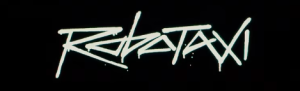
The funky lettering resembles interlocking jigsaw pieces, with one word fitting neatly into the spacing of another. The word looks clear and follows the same mixed capitalization pattern. The Os and the counter of A have an uncanny resemblance.
For its Golden two-seater driverless cab range – Cybercab, Tesla introduced a logo. The lettering looks hand-scrawled, almost like an etching onto metal rather than a carefully engineered logo.
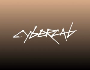
The sharp angles, erratic strokes, and uneven lines are visually enticing. The elongated lines with pointy ends, mixed capitalization, and overlapping forms look intentionally unfinished and raw. The logo uses a flat white against a dark, earthy gradient background.
Tesla has not yet secured trademarks for Robotaxi or Cybercab. The USPTO (United States Patent and Trademark Office) considered ‘Robotaxi’ too generic and ‘Cybercab’ conflicted with existing cyber-related trademark claims. However, the company still uses these names prominently to promote its autonomous vehicle concepts.
Tesla’s Roadster Logo
On 3rd February 2026, two trademark applications were submitted by Tesla Inc., which might be the plausible logo for its upcoming next-generation Roadster.
One application shows a sleek design, where three streamlined lines are arranged to look like an outline of a car, a sports car to be precise. I will let you guess which one it could be.
The top panoramic line represents the car’s roof. The other two depict the hood and the design crease of a car, respectively.
The second trademark logo filed by Tesla is the lettering “ROADSTER”. This design focuses on the styling of the name. The all-capital letters name is in a stylized, italic sans-serif typeface. This logo carries a grayish hue, and the words are placed in a geometric pattern.
The angular cuts in the alphabet almost look like a grooved tyre-mark impression left on the sand.
Tesla has long teased the new Roadster’s launch for this year. In this situation, these new logo filings are only making us more impatient.
Tesla Plaid
Tesla launched the special plaid badge to distinguish its variants of the Model X and Model S automobiles. The term “Plaid” references the sci-fi parody Spaceballs, where “plaid speed” represents the starship’s ultimate speed level – a nod consistent with Elon Musk’s pop-culture humor.
The symbol is entirely graphical. Red, white, and silver lines intersect over a black background, forming a dense, tunnel-like plaid grid. The horizontal lines meeting at the centre visually convey the idea of a speed trail.
FAQs
1. What is the meaning behind the Tesla logo?
The ‘T’ in the Tesla logo is the brand’s initials. Its design originates from a cross of an electric motor, where its vertical arm looks like a pole that passes through the rotor, and the curved horizontal bar looks like the gap between each stator.
2. Did Elon Musk design the Tesla logo?
Not Elon Musk, but RO Studio was the creator behind the Tesla logo. Interestingly, they also created the logo for another Musk brand, SpaceX.
3. Is the Tesla logo just a T?
Apart from the stylised T, the brand also uses its wordmark for the logo on its various digital platforms and on the rear and interiors of the vehicles. The words have prominent horizontal strokes, sharp edges, and generous spacing. The salient feature of the symbol is E, which is represented with three horizontal lines stacked vertically.
4. How old is the Tesla logo?
Tesla rolled out its logo in 2003, when the company first came into existence.
So, all the articles on this topic suggest that the first Tesla logo was designed in 2003 when Tesla was founded, but I don’t think that’s the case. I don’t think they developed their branding until slightly later. At least, when I was working for Tesla in 2006, my Tesla Motors mug (which I still have) does not feature their logo, and I think that’s because when it was made, they hadn’t yet developed their branding.