Temenos is a leading provider of banking software solutions in the world. It is known for transforming the way financial institutions operate and engage with their customers. Founded in 1993 and based in Geneva, Switzerland, the company specialises in developing core banking platforms, digital banking systems, and payment solutions.
It also develops analytics tools tailored for banks, credit unions, fintechs, and wealth management firms. Over the years, Temenos has positioned itself as a key innovator in the financial technology (fintech) space. It has been helping organisations modernise their legacy systems, enhance operational efficiency, and accelerate digital transformation. The Temenos logo has undergone several changes since its inception in 1993, which the article delves into, among other details of the company.
The Genesis of the Temenos Logo (???? – 2016)
Although the company was founded in 1993, there is no official document available of its original logo. The one mentioned in this column consisted of a graphical emblem and a wordmark. The graphical emblem featured a hexagon in a bluish-white colour palette with the map of the world in dark blue. To its right below was mentioned the wordmark “TEMENOS” in blue uppercase in a thin and elongated sans-serif typeface.

(2016 – 2018)
The logo during this period featured the hexagon in blue and the contours of various countries in solid white with a gradient. However, the typography of the wordmark remained the same as the earlier one.

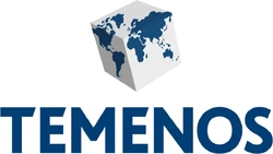
(2018 – 2022)
The 2018 logo iteration saw the revival of the hexagonal graphical emblem with a white background and clear contours of the countries in blue. The bold and thick wordmark “TEMENOS” below the emblem in dark blue shone in a strong visual contrast against a white background. Further, the letters “T” and “E” of the wordmark had their right ends cut diagonally off the top horizontal bar.
(2022 – Present)
In May 2022, Temenos undertook a massive change in its brand identity, and a logo change was also a part of it. Designed by Principle, the logo did not have any graphical emblem, unlike its predecessors. The logo used a hand-crafted sans-serif typeface in lowercase with contemporary styling and smoother curves. Besides, the logo had a bright colour palette of classic Temenos blues.

The Elements of the Temenos Logo
Font
The Temenos logo features a text-based logotype in lowercase to reflect the technological identity and global presence of the company. The logotype is written using a bold, sans-serif typeface to convey professionalism, clarity, and innovation. The geometric and minimalist font style aligns with the brand’s focus on digital efficiency and precision. Besides, the logotype ensures strong legibility across platforms.
Colour
The Temenos logotype is written in a deep shade of blue, a colour that is commonly associated with trust, reliability, intelligence, and stability. These attributes are valued in the banking and fintech sector.
Finally
The Temenos logo and its various iterations tell us about the journey of the company from a core banking software provider to a global leader in digital financial technology. As the company grew and expanded internationally, the logo incorporated a more distinctive identity, especially the globe graphic. It represented global reach, connectivity, and the company’s role in powering banks worldwide. The logo stands as a symbol of global innovation, digital transformation, and trusted banking excellence.