Skip to content
Home » Famous logos » The History and Evolution of the Telus Logo

The History and Evolution of the Telus Logo

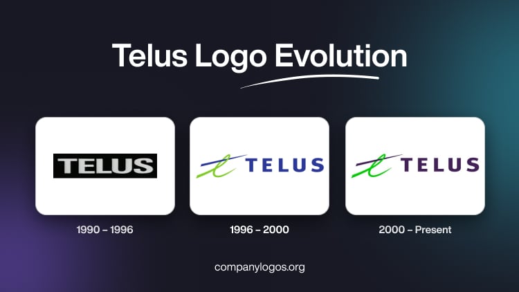
Telus Logo Evolution

Telus Corporation is one of Canada’s largest telecommunications companies. Its history is marked by transformation, strategic mergers, and technological innovation. It began its journey as a provincial telephone provider and went on to become a national technology leader. The logo of Telus Communications Inc. reflects the progression of the company, and the article offers a ready reckoner to the same.

The Genesis of the Telus Logo (1990 – 1996)

Telus was established in 1990 after the privatisation of Alberta Government Telephones (AGT). The initial logo was a straightforward, bold wordmark “TELUS” in white sans-serif uppercase letters set against a black rectangular background. This minimalistic design projected modernity, clarity, and reliability. It emphasised the company’s confidence and focus on straightforward communication services. The absence of symbols or embellishments highlighted the brand’s trust in its name as a mark of quality and innovation.

Telus Logo (1990 – 1996)

(1996 – 2000)

In 1996, as Telus began expanding beyond Alberta, the company introduced its first major logo redesign. This new logo designed by Kenneth Love for Lippincott & Margulies featured a stylised blue and green “l” symbol alongside the company’s name in a bold, uppercase sans-serif typeface. The blue colour of the wordmark represented trust and communication, while the green symbolised growth and innovation.

The addition of a green swoosh or a stylish “l” in lowercase brought a sense of motion and dynamism. It reflected Telus’s ambitions as a progressive and forward-moving company. This period marked the transformation of Telus from a regional to a national player, especially after its merger with BC Tel in 1999.

Telus Logo (1996 – 2000)

(2000 – Present)

The turn of the millennium saw Telus unveil its current logo, which coincided with its acquisition of Clearnet Communications. The design features a sleek, italicised wordmark in purple with a curved green line. It resembles a brushstroke, that is, crossing the “l” in “Telus”. The use of lowercase letters and the flowing brushstroke convey approachability, innovation, and connectivity. The green element continues to symbolise growth and sustainability, while the blue underscores reliability and professionalism.

This minimalist yet dynamic logo has become synonymous with Telus’s brand identity. The italicised font, custom-designed for the company, closely resembles contemporary sans-serif typefaces like Helvetica Neue Italic, thus giving the brand a modern, friendly, and professional appearance.

Telus Logo (2000 – Present)

The Elements of the Telus Logo

Font

The wordmark used in the Telus logo is Helvetica Neue, which portrays clean lines without any serifs.

Colour

The colour palette used in the logo consists of three colours, namely white, light green, and a shade of purple.

The History of Telus

Telus was established in 1990 as a result of the privatisation of Alberta Government Telephones (AGT), which had served Alberta since 1906. The Alberta Government created Telus Communications as a subsidiary, and through an initial public offering, it changed from a Crown corporation to a publicly traded company. The new entity was headquartered in Edmonton, Alberta. During its early years, Telus focused primarily on providing telephone services within Alberta. In 1995, AGT rebranded as Telus and consolidated its identity as a modern telecom provider while remaining regionally focused.

A key moment in Telus’s history came in 1999, when it merged with BC Telecom (BC Tel), which was the dominant carrier in British Columbia. This $8 billion merger created the second-largest telecommunications company in Canada that rivalled Bell Canada. This marked a significant shift in the industry, for it broke down traditional provincial boundaries and responded to deregulation pressures. The new company initially operated as BCT. before adopting the Telus name. It then relocated its headquarters to Vancouver, British Columbia.

In 2000, Telus acquired Clearnet Communications, a move that majorly expanded its wireless network and subscriber base nationwide. This acquisition, which was valued at approximately $6.6 billion CAD, was instrumental in establishing Telus as a national player in the wireless sector.

Telus continued to diversify its offerings by launching Koodo Mobile in 2008 to target the discount wireless market. It acquired Public Mobile in 2013 to further strengthen its position in the value segment. Throughout this period, Telus invested heavily in network infrastructure and technology. It introduced high-speed internet, IPTV, and data services to its portfolio.

In recent years, Telus has expanded beyond traditional telecommunications. The company launched Telus Health, which became the largest health IT provider in Canada. It established Telus Agriculture & Consumer Goods to diversify its revenue streams. The 2022 acquisition of LifeWorks for $2.3 billion CAD further scaled its health and wellness services globally.

Telus has also been at the forefront of network innovation. It rolled out gigabit internet and led Canada’s 5G network expansion. By 2024, Telus served over 19 million customer connections across its various services. This reflects both organic growth and successful strategic investments. Today, Telus is recognised for its innovation, customer service, and commitment to expanding connectivity and technology solutions across Canada.

Interesting Facts About Telus

  • Telus Corporation offers services such as internet, television, telephony, and wireless through subsidiaries like Telus Communications and Telus Mobility.
  • Telus was originally formed in 1990 by the Alberta government to privatise Alberta Government Telephones (AGT). This made it a unique example of a major telecom company with public sector roots.
  • Telus became the sole telephone provider in Alberta after acquiring Edmonton Telephones Corporation in 1995. In 1999, it merged with BC Tel and expanded its reach to become Canada’s second-largest telecom provider after Bell.
  • The company’s headquarters are in Vancouver, British Columbia. The Telus Garden building is an important architectural landmark in downtown Vancouver. It featured sustainable design elements like solar panels and a curved wooden canopy.
  • Telus isn’t just about phones and the internet. It owns Telus Health, which has become the largest healthcare information technology company in Canada. The company has invested over $2 billion in digital health ventures and operates medical clinics and electronic medical record services.
  • Through Telus Digital, the company offers customer service outsourcing and IT services worldwide, with contact centres in countries such as the Philippines, the UK, Guatemala, El Salvador, Bulgaria, and Romania.
  • Telus Mobility is the second-largest wireless carrier in Canada. It serves over 10 million subscribers and operates advanced networks, including 5G+.
  • Since 2008, Telus has operated Koodo Mobile, which is a popular brand targeting younger consumers like students. It offers flexible and affordable mobile plans.
  • Telus is known for its investments in technology and infrastructure, as well as its commitment to sustainability. The company’s buildings and operations often incorporate green technologies and eco-friendly practices.
  • Telus emphasises customer satisfaction and employee development, which has helped build strong brand loyalty and a highly qualified workforce.
  • With annual revenues exceeding CA$15 billion and a workforce of over 100,000 employees as of 2024, Telus is a major player not just in Canada, but globally.
  • The main competitors of Telus are Rogers Communications and Bell Canada.

Finally

The Telus logo has evolved from a simple, authoritative wordmark to a dynamic, modern emblem that reflects the growth and innovation of the company. Its current design, paired with nature-inspired marketing, has established Telus as one of Canada’s most recognisable and trusted brands. The logo’s evolution is a visual narrative of Telus’s journey, that is, from regional roots to national leadership in telecommunications and technology.

Leave a Reply

Your email address will not be published. Required fields are marked *