Telia Company is a leading digital communications provider across the Nordic and Baltic regions. Its roots can be traced back to 1853 with the establishment of the Royal Electric Telegraph Agency (Telegrafverket) in Sweden. For over a century, the company operated as a state-owned telecommunications provider. It was only in 1993 that Telegrafverket was corporatised and renamed Telia.
This marked the company’s transition into a modern and competitive telecom operator. The logo of the company has evolved over a period of time and chronicles the journey of the company. The article deals with the evolution of the Telia Company logo since its inception, among other details.
The Genesis of the Telia Company Logo (19?? – 1993)
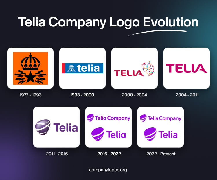
The original logo of the Televerket company, the predecessor of Telia, featured an ornate crown in black with a rounded top and a flat bottom. Beneath the crown appeared a 5-pointed star in black surrounded by 8 short and thick zigzag lines (4 on each side) symbolising the transmission of signals. The whole logo elements were enclosed within an orange square.

(1993 – 2000)
In 1993, Televerket gave way to Telia, thereby necessitating a logo change. The new logo carried the old logo design in white and added the wordmark “telia” in bold, white lowercase. These were enclosed within a horizontally oriented rectangle in deep blue with a small red band to the left.

(2000 – 2004)
The 2000 logo iteration was part of a rebranding of the company. Designed by Interbrand, the new logo featured the wordmark “TELIA” to the left and several pulsating dotted circles in various sizes and colours. The wordmark “TELIA” was written in a customised serif typeface in maroon colour. The bottom part of the letters “E” and “L” were slightly bent, while “L” and “A” were fused together. The dotted circles conveyed the movement and paths for communication.

(2004 – 2011)
The 2004 logo iteration removed the pulsating dotted circles but retained the style of the wordmark. However, the colour was changed to magenta.

(2011 – 2016)
Another rebranding occurred in 2011 when TeliaSonera introduced the now-iconic purple pebble logo, designed by Landor Associates. The pebble-shaped emblem symbolised “connection,” “innovation,” and an approachable, modern business identity. The bold purple colour of the logo set it apart from its blue and red branded competitors.

(2016 – 2022)
In 2016, TeliaSonera changed its name to Telia Company and presented an updated brand profile. Here, Telia Company became the name of the parent company, while Telia became the consumer-facing brand that Telia Company began using to sell its services. Interestingly, both brands (Telia Company and Telia) were updated with new logo variants.
Designed by Wolff Olins, the updated design of the pebble emblem in both the logo variants gave it a more layered, three-dimensional, and “liquid-like” appearance in violet. The refreshed identity aimed to project Telia as a digital pioneer.


(2022 – Present)
The latest iterations for both brands (Telia Company and Telia) retain the previous design and its colour palette. The only change has been made to the style of the wordmark(s). The letters appear thinner, and the ends of their horizontal bars are shown with straight vertical cuts, instead of being slightly rounded and pointed as earlier. The latest logo variants have been designed to accommodate omnichannel marketing and digital-native environments.


The Elements of the Telia Company Logo
Font
The Telia Company logo uses a custom-designed, bold sans-serif font, which is clean, geometric, and highly readable. The font ensures the brand’s name remains distinct and clear across all digital and physical formats. Besides, the bold and soft contours complement the logo’s pebble symbol.
Colour
The Telia logo is designed using a vibrant and rich purple colour palette to communicate creativity, innovation, and distinction in a crowded telecommunications market. The colour is distinctly visible in both the pebble icon and the wordmark.
Finally
The evolution of the Telia Company logo is a story of continual adaptation. It started with classic state insignias and adapted to futuristic digital forms. The branding captures significant milestones in the company’s and the region’s telecommunications history. The Telia Company logo symbolises the ambition of the company to be at the forefront of digital society.