Skip to content
Home » Famous logos » The History and Evolution of the Telefónica Logo

The History and Evolution of the Telefónica Logo

Telefónica Logo Evolution

Telefónica, the Spanish telecommunications company, was founded in Madrid in 1924 as Compañía Telefónica Nacional de España (CTNE). It owns several subsidiaries, such as Movistar (Spain), Lyon (the USA), O2 (Europe), and Vivo (Brazil). The flagship brand offers a slew of telecommunications services, namely, fixed and mobile telephony, internet, and cable TV.

The logo of Telefónica has undergone a few changes over the years. These changes show the evolution of the company from a national operator to a global telecommunications powerhouse. The evolution of the Telefónica logo reflects broader shifts in technology, corporate strategy, and international expansion. The article discusses the various logo changes undertaken by Telefónica since its inception, among other details.

The Genesis of the Telefónica Logo (1924 – 1984)

The original Telefónica logo featured a stylised map of Spain and included representations of the Balearic and Pitius Islands. The map in monochrome was enclosed within two concentric circles, and the name of the company was mentioned along the circumference. This design underscored the Spanish roots of the company and its mission to connect the nation. The logo remained largely unchanged for decades. It symbolised stability and continuity during Telefónica’s era as Spain’s sole telephone operator.

Telefónica Logo (1924 – 1984)

(1984) (June, July)

This period saw the introduction of the “T” logo design using dots or small circles. Designed by Taula de Disseny, the first iteration of the same featured the letter “T” made up of ten dots or circles in light green colour. The vertical bar of the letter “T” was made up of 6 dots or circles in parallel, while the top bar was made up of 4 dots or circles in a single line. The green dots or circles represented growth, innovation, and a networked world.

Beneath the dotted “T” emblem appeared the wordmark “Telefónica” in an uppercase modified ITC Avant Garde typeface. Also, a green dot was placed at the top of the letters’ “N” and “I”.

Telefónica Logo (1984) (June, July)

(1984) (July, November)

The next iteration was made in the same year and by the same designer. Here, the green dots forming the letter “T” were enclosed within a blue circle. The blue circle conveyed unity, global reach, and inclusivity. The rest of the logo elements remained the same.

Telefónica Logo (1984) (July, November)

(1984 – 1993)

Another logo iteration to appear in 1984 retained the emblem but tweaked the brand name beneath. Here, the wordmark “Telefónica” was displayed in a title case, and the glyphs of individual letters were slightly altered. This logo also saw the addition of the accent mark in “Telefónica” to reinforce the brand’s Spanish heritage.

Telefónica Logo (1984 – 1993)

(1993 – 1998)

The 1993 logo iteration saw the blue circle transformed into an iridescent multicoloured ellipse encircling the slanted and dotted green “T”. Designed by Estudio CIAC, the gradient of the slightly slanted ellipse was changed from yellow to orange, blue, and purple. This was done to symbolise diversity, technological progress, and the expanding spectrum of services offered by Telefónica. Also, the top bar of “T” formed by small circles or dots from the left were show to be decreasing in size. The italicised wordmark written using a Gill Sans MT typeface remained clean and black.

Telefónica Logo (1993 – 1998)

(1998 – 2010)

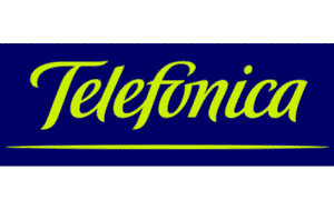
As Telefónica expanded internationally, it adopted a more approachable and human-centric logo in 1998. Designed by Ian Brignell for Diefenbach Elkins, this logo featured the brand name in a flowing, cursive handwritten style in yellow-green against a dark blue rectangular background.

The brand name had a yellow-green underline as well. Interestingly, the designer had removed the accent mark. The design was friendly and dynamic and reflected the transformation of Telefónica into a multinational telecommunications powerhouse driven by data and content.

Telefónica Logo (1998 – 2010)

(1998 – 2021)

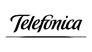
In another iteration of the 1998 logo, the colour palette of the brand name was changed from yellow-green to deep blue against a white background.

Telefónica Logo (1998 – 2021)

(2010 – 2021)

The 2010 update, designed by Interbrand and Doyle Dane Bernbach, retained the essence of the previous design. However, it emphasised the sleek and stylised wordmark in a dark teal colour scheme. The focus was on simplicity, digital readiness, and global recognition. The logo now became a corporate logo with calmer colours.

Telefónica Logo (2010 – 2021)

(2021 – Present)

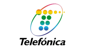
In 2021, Telefónica unveiled a new logo inspired by the 1984 design to mark its centenary. The updated logo features an emblem and a wordmark. The emblem consists of five spheres in blue forming the letter “T”, where each represents a pillar of the company. These are telecommunications, technology, talent, transcendence, and transformation.

To the right of the emblem was placed the brand name in an upright sans-serif typeface. The spheres also symbolise the five key geographies where Telefónica operates: Spain, the United Kingdom, Germany, Brazil, and Hispanic America. This modern, digital-friendly design is flexible, simple, and human. It reflects Telefónica’s commitment to innovation and inclusivity while honouring its legacy.

Telefónica Logo (2021 – Present)

The Elements of the Telefónica Logo

Font

The wordmark used in the latest Telefónica logo is written in a modern title case using a clean geometric and upright sans-serif typeface. The similar fonts would be TT Hoves Pro DemiBold or Pepi SemiBold.

Colour 

The colour used in designing the latest Telefonica logo is a vivid shade of blue to evoke a sense of reliability, protection, motion, energy, and professionalism.

The History of Telefónica

Telefónica was established in Madrid on April 19, 1924, as Compañía Telefónica Nacional de España (CTNE), with the aim of organising and providing telephone services across Spain. The company was created during a period of rapid technological change and was initially supported by the Spanish government and International Telephone and Telegraph (ITT). The latter held a major stake in its early years. The first president of the company was Estanislao de Urquijo y Ussía, who oversaw the initial years of the company.

In its early years, Telefónica focused on expanding Spain’s telephone infrastructure. It did so by laying long-distance lines and introducing innovations such as underground cables. By the late 1920s and 1930s, Telefónica had become the country’s leading telecommunications provider. During that period, it played a crucial role in national communication, which included restoring service during emergencies like the 1925 Christmas Lottery broadcast.

In 1945, the Spanish state increased its stake in Telefónica to 79.6%, thereby effectively nationalising the company and establishing its position as Spain’s sole telephone operator. In the following decades, Telefónica expanded its services, such as introducing satellite communications in 1967 and launching Europe’s first Special Data Transmission Network in 1971. By 1978, Telefónica had installed its 10 millionth phone.

The 1990s marked a turning point as Spain began liberalising its telecommunications market. Telefónica was partially privatised in 1995, with full privatisation completed by 1999. During this period, Telefónica expanded aggressively into Latin America and Europe by acquiring operators in Brazil, Argentina, Chile, and other countries. The company launched digital mobile services under the Movistar brand and introduced internet and broadband services, such as Infovía and ADSL.

In 1987, Telefónica began trading on the New York Stock Exchange. It continued to diversify by offering mobile, broadband, and digital TV services. In the 21st century, Telefónica has focused on digital transformation and has invested in areas such as cloud computing, cybersecurity, and IoT solutions. The company launched its 5G network in Spain in 2020 and formed strategic partnerships, such as with Netflix, to enhance its service offerings. Telefónica has also streamlined its operations, wherein it sold non-core assets like its Telxius towers to focus on key markets and innovation.

Today, Telefónica operates in over 20 countries across Europe and the Americas, with major brands including Movistar, O2, and Vivo. It remains one of the world’s largest telecom companies, employs over 120,000 people, and generates significant annual revenues. In recent years, ownership changes have included Saudi Arabia’s STC Group becoming the largest shareholder in 2023.

Interesting Facts About Telefónica

  • Telefónica was founded in Madrid on April 19, 1924, as Compañía Telefónica Nacional de España (CTNE). The company has been at the forefront of telecommunications for more than 100 years.
  • Telefónica is consistently ranked among the largest telephone operators and mobile network providers globally. It operates in over 20 countries across Europe and the Americas.
  • In 1928, Telefónica facilitated the first transatlantic telephone call between Spain’s King Alfonso XIII and the U.S. President Calvin Coolidge. It did so by using a combination of copper wire, land cable, and radio transmission, which was a technological feat of its era.
  • The Telefónica building at Gran Vía 28, which was inaugurated in 1929, was Europe’s first skyscraper and remains a landmark in Madrid.
  • For much of the 20th century, Telefónica held a monopoly over Spain’s telephone services. The company maintained this dominant position until the liberalisation of the Spanish telecom market in 1997.
  • Telefónica began satellite communications in 1967 and launched Europe’s first Special Data Transmission Network in 1971.
  • Telefónica operates under several well-known brands, such as Movistar (in Spain and Latin America), O2 (in the UK and Germany), and Vivo (in Brazil).
  • It was the first Spanish company to be listed on the London Stock Exchange (1985) and began trading on the New York Stock Exchange in 1987.
  • In 2023, Saudi Arabia’s STC Group became Telefónica’s largest shareholder, and the Spanish government announced plans to acquire up to a 10% stake through its state holding company SEPI.
  • Telefónica introduced Spain’s first public telephone service in the 1920s and was instrumental in rolling out mobile telephony. It started with providing car phones in the 1970s and later launching MoviLine and Movistar.
  • Telefónica rapidly expanded across Latin America and Europe in the 1990s. It acquired operators in countries such as Brazil, Argentina, Chile, and the UK.
  • The company’s centenary has been marked by a series of cultural initiatives and the creation of Fundación Telefónica, which supports social and technological projects.
  • In 1925, Telefónica laid down Madrid’s first long-distance telephone line. And in 1926, it installed the city’s first underground telephone network.
  • Telefónica’s influence on Spain’s urban landscape includes not only its Madrid headquarters but also modern structures like the Telefónica Tower in Barcelona.

Finally

The Telefónica logo has evolved from a national symbol to a modern and globally recognised emblem. Each logo redesign has captured the spirit of its era, that is, whether emphasising national unity, technological progress, or global connectivity. The current logo, with its five circles, bridges the company’s past and future. It embodies both its rich heritage and ongoing transformation as a leader in digital innovation.

Leave a Reply

Your email address will not be published. Required fields are marked *