Tele2 is a Swedish mobile services provider that was founded in 1993 in Stockholm. The company has become an important telecommunications provider across Europe and Russia, which is known for its disruptive spirit and customer-centric approach. Over the years, the Tele2 logo has evolved to reflect the company’s growth, mergers, and changing brand identity. The article takes a detailed look at the history and evolution of the Tele2 logo.
The Genesis of the Tele2 Logo (1993 – 2007)
When Tele2 was established in 1993, its initial branding focused on simplicity and clarity. The original logo featured a geometric wordmark in black with two square dots in blue on either side. The wordmark was written using an extra-bold stencil font with the digit “2” displayed in an enlarged format.

(2007 – Present)
In 2007, Tele2 introduced a new logo that marked a significant shift in its visual identity. The updated logo featured a bold, uppercase “TELE2” wordmark with a distinctive design element. The digit “2” appeared to leap forward and take a prominent and dynamic position. This design choice conveyed a sense of movement, progress, and rebellion. It reflected Tele2’s role as a challenger in the telecommunications market.
The black-and-white colour scheme added to the logo’s assertive and modern look. It helped Tele2 stand out in a competitive industry. The bold but angled logo shows a sense of motion with the digit “2” appearing to leap forward, while the rest of the letters fade into the background. The black colour of the palette symbolises stability and confidence, while white symbolises simplicity and purity.

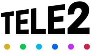
(2021 – Present)
The 2021 redesigned logo made a few subtle changes to the previous iteration. The letters of the wordmark were written using a bold, geometric, solid font. They were turned a little to create a sense of motion. Beneath the wordmark appeared six solid dots in a rainbow-esque colour scheme – from calm orange to crimson red.
The Elements of the Tele2 Logo
Font
The wordmark that forms the visual identity of Tele2 is written in a stencil sans-serif typeface. It is similar to fonts such as Stencilla Regular and Basic Stencil JNL.
Colour
The logotype uses a monochrome colour palette, which aligns with the square shapes of the letters forming the wordmark. Besides, the black and white combination makes the visual identity bright and recognisable across platforms.
Finally
The Tele2 logo and its various iterations show the journey of the company from a disruptive newcomer to a leading European telecom provider. Each phase of logo development reflects strategic shifts – whether it’s the bold leap in 2007 or the premium, unified identity after merging with Com Hem. Today, Tele2’s visual brand stands as a testament to its commitment to innovation, simplicity, and customer focus.