Swisscom AG is the leading provider of telecommunications services in Switzerland and is one of the largest in Europe. Founded at the end of the 1990s as a successor of Postal Telegraph and Telephone, or PTT, it claims to own 60% of the market share in mobile services and 67% for broadband.
The logo of Swisscom reflects the technological progress made by the company and its transformation from a state-run service to a modern digital innovator. The logo evolution is a story of adaptation, modernisation, and the pursuit of relevance in an ever-changing communications landscape. The article delves into the evolution of the Swisscom logo, among other details of the company.
The Genesis of the Swisscom Logo (1850 – 1924)
The roots of Swisscom can be traced back to the Swiss postal, telegraph, and telephone services (PTT). The original logo designed in 1850 featured a red shield with a golden cross surrounded by intricate drawings, laurel leaves, a horn, ornate elements, and a five-pointed star. These elements were placed inside an oval and set against a cream-coloured vertical rectangle as the backdrop.

(1924 – 1928)
The 1924 logo was a rehash of the previous logo. The simplified logo in monochrome had many of the ornate details removed. The laurel leaves, cross, and horn were retained, and the cross was surrounded by a halo.

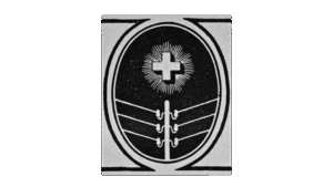
(1928 – 1930)
In 1928, a modernised version of the logo was introduced. It had telegraph poles with wires in off-white colour replacing the horn. Although the cross and the halo were retained, the laurel leaves were removed. The elements were set against a black oval backdrop with two outlines. The oval was further placed within a vertical rectangle in grey, and there were thick black lines at the top and bottom of the rectangle meeting the thick outer edge of the oval.
(1930 – 1937)
The 1930 logo had a geometric appearance. It had a wide pure white cross placed inside a red square. The same was further placed within a larger black vertical rectangle. At the top of the red square appeared the golden-coloured horn with slight black accents. Interestingly, this logo was used by the postal division, while the telegraph or telephone division used the logo with the telegraph pole.

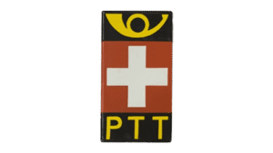
(1937 – 1941)
In 1937, the logo saw the addition of the acronym “PTT” to mark the unification of the three services. So, the previous logo was redesigned by including the acronym “PTT” at the bottom of the black but rather slender vertical rectangle. The slight black accents to the golden horn were removed to make the overall logo minimalist.
(1941 – 1982)
In the 1941 logo, the golden horn was dropped, and the logo focused on the national insignia of Switzerland and the “PTT” acronym.

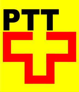
(1982 – 1994)
The 1982 logo variant brought a contemporary graphic style. Here, the redesigned logo played with the Swiss cross and the PTT acronym to reflect a more modern and streamlined organisation. Designed by Martin Altenburger and Adrian Frutiger, the logo dropped the black and red geometric figures. In their place was seen a white cross with a thick red border. The top part of the cross was completed by the two “Ts” from the acronym “PTT” in black.

Another variant of the logo with a bright yellow background was also designed during the period.
(1993 – 1997)
In the early 1990s, the telecommunications division of the company was separated from the postal services division to form two entities – Telecom PTT (later Swisscom) and Swiss Post. As a result, the 1993 logo saw the addition of the word “Telecom” in thick, bold, uppercase and written in a Frutiger typeface to the previous logo design. This symbolised the company’s growing focus on digital communications and innovation.

(1997 – 2007)
In 1997, the telecom division was privatised and rebranded as Swisscom. The new logo featured the new name in blue lowercase. Below the new name “Swisscom” were placed several red vertical rectangles of increasing thickness to form a dynamic pattern. The design balanced the human side of technology with the reliability expected from a traditional Swiss company.

(2007 – 2025)
In December 2007, Swisscom announced a major rebranding exercise. It consolidated the various sub-brands (Fixnet, Mobile, Solutions, Bluewin) under a single, unified Swisscom brand. The new logo was a significant departure from previous designs. It featured a dynamic, three-dimensional emblem with blue, red, and purple tones to symbolise solidarity, innovation, and digital transformation.
The new logo emblem appeared to be inspired by the human cardiovascular system. It embodied the idea of continuous dialogue and connection with customers, employees, and partners and reflected the company’s shift toward a multimedia, digital future.

(2025 – Today)
The latest Swisscom logo retained the idea and style of the previous version while making it more confident and attractive. The colours of the emblem were made brighter, and the emblem itself was placed to the left of the brand name in lowercase.

The Elements of the Swisscom Logo
Font
The lowercase wordmark of the Swisscom logo uses a custom, modern sans-serif typeface. The typeface is characterised by rounded lines for most letters, except for “w”, which retains sharper angles. This choice of typeface reflects Swisscom’s commitment to innovation and accessibility.
Colour
The Swisscom logo employs a blend of blue, red, and purple colours. The blue colour symbolises trust, reliability, and technological expertise. The red colour represents warmth, passion, and the Swiss national identity. And finally, the purple colour adds a modern, innovative twist to the palette. It reflects creativity and digital transformation.
Finally
The logo history of Swisscom is about following the trends in graphic design and visually chronicling Swiss telecommunications. It has adapted to new eras, technologies, and customer expectations while staying rooted in Swiss values and trust.