South African Railways (SAR) has played a vital role in the economic and social development of South Africa since its inception in the early 20th century. It was established in 1910 after the unification of the country’s colonial rail systems. In fact, SAR became the state-owned entity responsible for operating and managing the national railway network. The railway system facilitated the movement of goods and passengers across vast distances and supported the growth of industries such as mining, agriculture, and manufacturing.
Over the years, the network has undergone several transformations. These include the reorganisation of SAR into Transnet. There is sketchy information about the various logo changes made by South African Railways. The article attempts to trace the evolution of the South African Railways since its inception in 1910, among other details.
The Genesis of the South African Railways (SAR) (1910 – 19??)
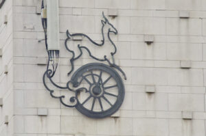
The original logo of South African Railways featured a wheel motif symbolising the wheel of a railway engine in green with an antelope astride it also in green. The wheel was attached to a hollow ornate structure that symbolised the piston. Incidentally, there is no record of any wordmark accompanying it.
(19?? – 1980s)
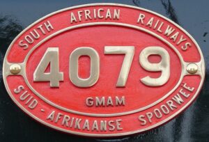
The next logo change saw the geometric shape of an ellipse carrying the insignia of the South African Railways along the edges, especially at the top and bottom. The wordmarks and the outlines were mostly engraved in metal, while the background was mostly red. Also, the centre of the ellipse featured numbers depicting the locomotive and class. These numbers used to change for every locomotive.
(1980s – Present)
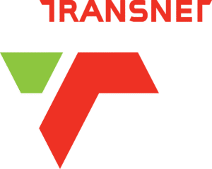
During the eighties, the South African Railways was restructured into Transnet. The logo featured the combination of a graphical emblem and the wordmark. The emblem consisted of two graphical elements – a smaller inverted trapezoid in green and a wide two-dimensional stripe in red. At the top of this emblem appeared the wordmark “TRANSNET” in red uppercase, where the horizontal bars on top of the letters’ “T” were incomplete and had diagonal cuts at their ends.
The Elements of the South African Railways Logo
Font
The logo used by the South African Railways, especially the Transnet and Spoornet, uses a modern sans-serif typeface. The typeface reflects a shift towards a contemporary and business-oriented image.
Colour
The traditional logos used by the South African Railways employed gold, yellow, green, and black to symbolise national identity. However, the latest logos, especially under Transnet and Spoornet, use colours such as green, red, black, and white.
Finally
The South African railway logo has evolved to adopt sleek, modern corporate identities. Each transformation reflects broader changes in South African society, governance, and the global context in which its railways operate. While the logo’s visual language has shifted, it continues to symbolise the vital role of rail in connecting the country’s people and economy.