Soneva was founded in 1995 by Sonu and Eva Shivdasani, visionaries who pioneered the concept of barefoot luxury and sustainable tourism in the Maldives. Their first resort, Soneva Fushi, set a new standard for luxury hospitality. It blended environmental responsibility with high-end experiences. The brand’s name itself is a portmanteau of the founders’ first names to symbolise their personal commitment and philosophy. The article explores the Soneva logo and other details about the company.
The Genesis of the Soneva Logo (1995 – Present)
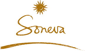
The Soneva logo displays the sun emblem at the top and the brand name in a minimalist aesthetic. The design is intended to evoke a sense of tranquillity, exclusivity, and connection to the natural world. Designed using earthy tones, the sun emblem is followed by the brand name in a handwritten, stylish, and playful bespoke typeface below. A small arc in the same earthy tone is displayed at the bottom to underscore the brand name.
The Elements of the Soneva Logo
Font
The Soneva logo employs a clean and elegant serif font to convey sophistication without ostentation.
Colour
The Soneva logo displays an earthy colour palette, which evokes the feel of the sand, sea, and lush greenery of its locations.
Finally
The Soneva logo is more than a visual mark—it is a reflection of the brand’s philosophy, history, and ongoing commitment to luxury with a conscience. It tells the story of a brand that has remained true to its roots while continually innovating and adapting to the changing landscape of luxury hospitality.