Skullcandy is a renowned American audio brand known for its bold design, vibrant colours, and youth-oriented appeal. It was founded in 2003 by Rick Alden in Park City, Utah, and it revolutionised the personal audio industry by blending fashion, lifestyle, and technology. The brand quickly became synonymous with energetic, bass-driven sound and stylish headphones and earbuds that catered to music lovers, athletes, and gamers alike.
The brand focuses on individuality and self-expression, and its products are influenced by pop culture and have streetwear aesthetics. Beyond sound quality, the brand is known for affordability and innovation. It has introduced features like wireless connectivity, noise cancellation, and custom sound tuning.
Skullcandy stands as a symbol of creativity and rebellion in the audio world. It appeals to a generation that values both performance and personality in their listening experience. The article explores the various logo changes undertaken by Skullcandy, among other details of the brand.
The Genesis of the Skullcandy Logo (2003 – 2007)
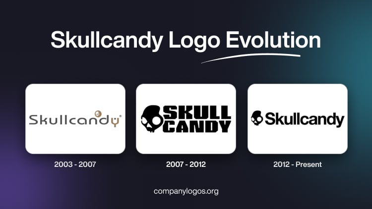
The original Skullcandy logo featured a logotype in a modern and rounded sans-serif typeface and in a dark grey colour palette. However, the last letter “Y” in the form of a slingshot was shown in orange. Appearing in a title case, the letters “n” and “d” of the logotype had the white skull emblem drawn on an orange circle.

(2007 – 2012)
The 2007 logo iteration in a monochrome colour palette showed the skull emblem alongside the brand name in two levels. The brand name was executed using a strong, bold, and geometric sans-serif typeface with several cuts and straight angles.

(2012 – Present)
The current logo has retained the design style of the previous iteration and shows the skull mask motif followed by the brand name in a title case.

The Elements of the Skullcandy Logo
Symbol
The symbol of the Skullcandy logo is a skull mask that represents the brand’s rebellious spirit. Designed in the colours of black and white, the skull mask symbol showcases important attributes represented by the brand, such as a young audience and the rebellious spirit.
Font
The Skullcandy wordmark is written using a Helvetica Neue typeface where the letters are characterised by bold, clear, and neat letters.
Colour
The Skullcandy logo is designed using a monochrome palette of black and white to evoke a sense of trust and confidence.
Finally
The evolution of the Skullcandy logo reflects how the brand grew from a daring newcomer in the audio industry to a global symbol of individuality and youth culture. Its logo, whether the more rugged designs of the early days or the refined and minimalist skull emblem seen today, has stayed true to the brand’s rebellious and creative spirit.