Skip to content
Home » Famous logos » The History and Evolution of the Singtel Logo

The History and Evolution of the Singtel Logo

Singtel Logo Evolution

Singtel, or officially Singapore Telecommunications Limited, is one of Asia’s leading communications technology conglomerates and a major player in the global telecommunications landscape. Based in Singapore and established in 1879 as the Oriental Telephone and Electric Company, Singtel has a rich legacy. It offers a diverse range of services, such as mobile and fixed-line telephony, broadband, digital television, and enterprise ICT solutions.

It has operations and investments that are spread over twenty countries, such as Australia, India, Indonesia, and the Philippines. The Singtel logo has evolved over a period of time and chronicles the journey of the company. The article delves into the various logo changes undertaken by the company, among other details.

The Genesis of the Singtel Logo (1882 – 1955)

The forerunner of Singtel was the Oriental Telephone & Electric Company, or OTEC, and its original logo reflected the same. It featured a vertical scroll-like banner with ornate embellishments. At the centre of the logo was placed a red and pink rotary dial telephone on a shield and a crown atop, surrounded by a floral wreath. The whole logo was decorated in an abundance of red and pink shades.

Singtel Logo (1882 - 1955)

(1955 – 1974)

In 1955, the OTEC network was taken over by the government and renamed the Singapore Telephone Board, or STB. The logo featured the abbreviation “STB” in a sans-serif typeface in uppercase against a coffee-coloured background. A trident-shaped graphic looking like a bird in flight formed the foreground in black.

Singtel Logo (1955 - 1974)

(1974 – 1979)

The 1974 logo design featured two ellipsoids with both orange (outer) and red (inner) outlines. At the centre of the ellipsoids was the intersection of two thin black lines, horizontally and vertically. The word “telecoms” was written as an extension to the horizontal line, and the letter “s” was slightly bigger than the rest of the letters.

Singtel Logo (1974 - 1979)

(1979 – 1989)

The 1979 logo was designed to mark the centenary of the telephone service in Singapore. It featured an emblem comprising an ellipsoid divided into two halves facing each other. The letter “T” stood in the middle of the two ellipsoids with the horizontal bar arched downwards to look like a telephone receiver. Beneath the emblem was mentioned “Telecoms” in black lowercase.

Singtel Logo (1979 - 1989)

(1989)

The 1989 logo was designed when the company was renamed Singapore Telecom. It featured the previous logo design with the word “Telecoms” replaced by “Singapore” “Telecom” in two levels in bold black.

Singtel Logo (1989)

(1992 – 1997)

In 1992, the Telecommunication Authority of Singapore was divided into three companies. These were the reconstituted Telecommunication Authority of Singapore, Singapore Telecommunications Private Limited, and Singapore Post Private Limited. The 1992 logo featured an emblem comprising a tilted ellipse in black and two red squares of unequal dimensions.

These elements were meant to be symbols of global connectivity and technological innovation. The colour red signified energy and strength, while the modern typeface expressed accessibility. The brand name “Singapore Telecom” was mentioned two levels to the right of the emblem in a custom serif typeface.

Singtel Logo (1992 - 1997)

(1997 – 2015)

The previous logo was redesigned with a few changes. Although the emblem comprising a tilted ellipse and two squares of unequal dimensions remained, the wordmark “Singapore Telecom” in two levels was replaced with a single wordmark, “SingTel.” The serif-rich wordmark in black had two letters, “S” and “T,” capitalised.
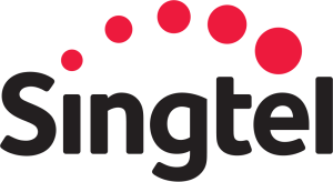
Singtel Logo (1997 - 2015)

(2015 – Present)

On 21 January 2015, Singtel unveiled its first major rebrand in 16 years. It marked a significant transition for a company from a traditional telecom provider into a multimedia and ICT (Information and Communications Technology) services powerhouse. The most distinctive change is a dotted red arc crowning the logotype “Singtel.” This arc represents Singtel’s ongoing transformation and continuous innovation.

The stylised “t” in “Singtel” is now lowercase, which symbolises an embrace of heritage and a friendlier, more approachable identity. Here, Singtel retained its recognisable red and black colour palette. It stands for energy, passion, and strength, and it enables creating a visual link to earlier designs while signalling a step forward.

Singtel Logo (2015 - Present)

The Elements of the Singtel Logo

Font

The current Singtel logo uses a custom modern sans-serif typeface. Fonts similar to the one used in designing the Singtel logo include DIN and Ubuntu Bold. However, Singtel has often relied on versions of Helvetica Neue Light for web presence and marketing. The font used in the Singtel logo displays bold styling with rounded edges and a friendly, modern feel.

Colour

The Singtel logo features a colour combination of red and black, where red is characterised by an arc of dots to symbolise energy, innovation, and dynamism. Black, on the other hand, constitutes the wordmark and conveys reliability, strength, and professionalism.

The History of Singtel

The origins of Singtel, or Singapore Telecommunications Limited, can be traced back to the establishment of the Department of Telegraphs in 1879. The same year saw the city launch its first private telephone exchange with just 50 lines. This made Singapore one of the first East Asian cities to adopt such technology. In the following decades, telecommunications services in Singapore expanded rapidly.

Between 1883 and 1907, there were private and foreign entities, including the Oriental Telephone and Electric Company (OTEC), operating Singapore’s first telephone exchanges. A significant leap in connectivity came with the opening of the Central Telephone Exchange on Hill Street in 1907. In 1955, the Singapore Telephone Board (STB) was set up after the government acquired domestic telephone infrastructure. This consolidated operations and brought local telephone services firmly under national control.

As Singapore’s economy developed, the need for coordinated, reliable communications led to further institutional changes. In 1974, the Singapore Telephone Board merged with other entities to form the Telecommunications Authority of Singapore (TAS). It integrated local and international telecom services and aligned the sector with national development goals.

The TAS era was marked by a strong commitment to modernisation. For instance, the 1980s saw the organisation introduce technology upgrades, such as telex, payphones, satellite communications, and, most significantly, Singapore’s first mobile phone network in 1989.

The move toward corporatisation and privatisation gained momentum in the early 1990s. In 1992, the TAS was transformed into Singapore Telecommunications Limited (SingTel), and in 1993, SingTel went public. It was the largest initial public offering in Singapore at the time. This restructuring separated telecommunications from postal services and defined Singtel’s independent corporate identity and accelerated its evolution. During the mid-1990s, Singtel launched broadband internet services, which cemented its place at the forefront of the digital revolution in Singapore and paved the way for technological leadership.

Singtel’s ambitions soon extended overseas. In 2001, it acquired Australia’s Optus and positioned the company as one of the region’s telecommunications powerhouses. The following years saw Singtel continue to innovate. For instance, it launched Singapore’s first 3G network in 2003, rolled out 4G LTE in 2011, and started standalone 5G services beginning in 2020. The group also diversified internationally by investing in providers across India (Bharti Airtel), Thailand (AIS), and other Asian markets.

In recent years, Singtel has focused on digital transformation. It has expanded its enterprise ICT capabilities, entered into digital banking and data centre operations, and fine-tuned its portfolio to focus on core strengths. Today, Singtel is recognised as one of Asia’s leading communications technology groups. It operates across numerous countries and provides essential services to millions of customers.

Interesting Facts About Singtel

  • Singtel is one of Asia’s leading communications technology groups, with over 770 million mobile customers across 21 countries. These include regional associates such as Bharti Airtel (India), AIS (Thailand), and Telkomsel (Indonesia).
  • Singtel is more than just a mobile network operator; it is heavily involved in cybersecurity, digital marketing, cloud computing, data centres, and ICT services. Its subsidiaries, like Trustwave (cybersecurity) and Amobee (digital marketing), reflect its transition into digital tech.
  • Singtel traces its roots back to 1879, when it began as part of the colonial telephone network. It was incorporated as the Telecommunication Authority of Singapore (TAS) in 1974 and later corporatised and renamed Singtel in 1992.
  • Singtel is listed on the Singapore Exchange (SGX) and is a component of the Straits Times Index, but Temasek Holdings, the Singapore government’s investment arm, remains its largest shareholder.
  • Singtel owns Optus, the second-largest telecommunications company in Australia, which it acquired in 2001. This strategic purchase expanded Singtel’s reach in the Asia-Pacific region.
  • Singtel has forged strong international alliances. It’s part of the Bridge Alliance, which is a partnership of major Asian, Middle Eastern, and African operators that offer seamless roaming and enterprise solutions.
  • Singtel was among the first in Singapore to launch 5G services and has invested in emerging technologies like AI, edge computing, and robotics through its innovation arm, Singtel Innov8.
  • Singtel is a major owner/operator of submarine cables, which connect Asia to Europe and the U.S. Its infrastructure is critical to regional and global internet connectivity.
  • Singtel has committed to net-zero emissions by 2050 and is actively investing in green energy, sustainable supply chains, and eco-friendly network infrastructure.
  • Singtel has received numerous accolades over the years, which include being ranked among Asia’s Top 50 Brands and winning multiple awards for customer service, innovation, and sustainability.

Finally

The journey of the Singtel logo is a story of Singapore’s growth. The logo iterations show how the company rose from a colonial telegraph office to become a global leader in communications and digital technology. Each logo change marks a new chapter of embracing change, innovation, and commitment to connecting people across Asia and beyond.

Leave a Reply

Your email address will not be published. Required fields are marked *