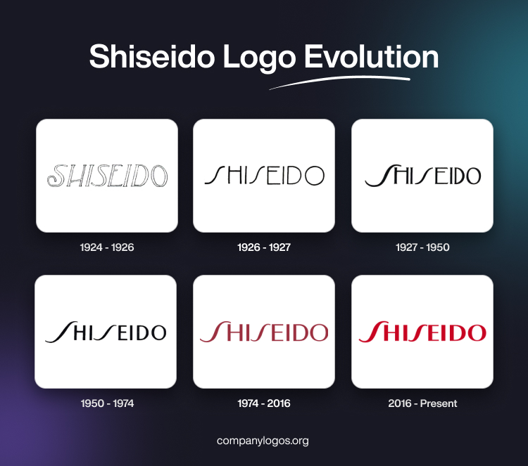
Shiseido is one of the world’s oldest and most influential beauty brands. It has built a visual identity that is both iconic and enduring. The evolution of its logo reflects Japan’s modernisation, the company’s embrace of both tradition and innovation, and a commitment to timeless beauty. The article shows how the Shiseido logo has changed over time, since the year of its inception.
The Genesis of the Shiseido Logo (1924 – 1926)
The original logo was crafted in 1872, but there is no documentation for the same. The first logo change occurred in 1924 and was designed by Toro Yabe. It featured the company name in a custom serif typeface in uppercase, where only the outline of the letters was displayed in a slanted position. The middle bars of both “H” and “E” were not displayed in their original position but slightly lower and upper.

(1926 – 1927)
The next logo was designed by Shinzo Fukuhara in 1926 and was known for its peculiar wavy style of writing the letter “S”. The middle bars of the letters “H” and “E” were placed high above the centre. The letters were markedly thin and did not show any sophistication.

(1927 – 1950)
The 1927 logo was a refinement of the previous logo with the letters rendered in old. The curvaceous letters “S” appeared as show stealers.

(1950 – 1974)
The 1950 logotype was designed by Mitsugu Maeda and was almost the repeat of the previous logo with some subtle changes. For instance, the letters were markedly shorter without serifs. Also, the middle bars of the letters “H” and “E” appeared in the middle only.

(1974 – 2016)
The 1974 logo was designed by Ayao Yamana, and it more or less retained the previous style but in different colours – crimson and lilac. The first letter “S” was elongated and tilted to the right. In fact, both “S” appeared like stylised waves.

(2016 – Present)
The current logo is a repeat of the previous logotype with subtle changes, such as the thickening of lines of individual letters and embracing the bright red colour.

The Elements of the Shiseido Logo
Font
Shiseido’s visual identity is deeply rooted in the principles of Asian aesthetics and the Japanese appreciation for elegance. The brand’s minimalist wordmark is written in a custom sans-serif typeface. This typeface is characterised by its clean, wide contours and conveys a sense of refinement and sophistication.
Colour
The signature red and white colour palette of the brand embodies both power and beauty. It serves as a visual metaphor for Shiseido’s core values. Depending on the product line or packaging, this palette is sometimes adapted to monochrome, silver, or gold tones to ensure versatility while maintaining a cohesive identity.
The History of Shiseido
Shiseido was founded in 1872 by Arinobu Fukuhara, a former chief pharmacist for the Imperial Japanese Navy. Inspired by Western medical practices, Fukuhara opened Japan’s first Western-style pharmacy in Tokyo’s Ginza district, naming it “Shiseido”. The name is derived from a passage in the Chinese classic I Ching, which means “Praise the virtues of the great Earth, which nurtures new life and brings forth new values.” This philosophical grounding in the harmony of nature and science became central to the company’s identity.
In 1897, Shiseido launched its first cosmetic product, Eudermine, a softening lotion based on Western dermatological science. Still sold today, Eudermine marked the company’s entry into the beauty industry and paved the way for its future as a cosmetics innovator.
During the early 20th century, under the leadership of Arinobu’s son, Shinzo Fukuhara—a trained artist and photographer—Shiseido began to prioritise aesthetics and design as essential elements of its brand. In 1916, the company launched its Camellia logo, symbolising beauty and refinement. Around the same time, it established the Shiseido Design Department, which began producing product packaging and advertising with strong Art Nouveau and later Art Deco influences.
In 1923, Shiseido opened its first chain store, and by 1927, it had expanded into full-scale cosmetics production. Shinzo’s artistic vision helped define Shiseido’s identity as a brand that blends traditional Japanese minimalism with modern Western sophistication.
By the 1930s, Shiseido had become a widely recognised brand across Japan, especially popular among urban middle and upper classes. However, the outbreak of World War II disrupted the company’s growth. Marketing and product development were halted, and Shiseido’s manufacturing facilities were repurposed to support the war effort. Following the war, the company quickly resumed operations and began rebuilding its business and brand.
In the postwar period, Shiseido emerged as a key player in Japan’s rapidly growing economy. It introduced scientifically advanced skincare products and began international expansion, opening its first overseas branch in Taiwan in 1957. During the 1960s, the company established a presence in Hawaii and the mainland United States. These moves laid the foundation for Shiseido’s positioning as a global luxury beauty brand.
The 1970s marked a strategic evolution in Shiseido’s branding. In 1974, the company introduced a modernised logotype with a distinctive, flowing serif style. Around this time, Shiseido also invested heavily in research and development, creating advanced dermatological products and opening state-of-the-art laboratories. It expanded into new global markets, including Europe, Southeast Asia, and the Middle East. Shiseido also became a pioneer in beauty education, establishing its own schools and training programmes to professionalise the industry.
During the 1990s and early 2000s, Shiseido accelerated its diversification strategy. It launched new product lines and brands such as Benefique, Maquillage, Anessa, and Senka to target different consumer demographics. The company also expanded its global footprint by acquiring international brands like NARS and Clé de Peau Beauté. This era saw a strong emphasis on sustainability and research, with efforts to develop environmentally friendly packaging and scientifically driven product innovations. Shiseido’s headquarters in Ginza became a modern architectural symbol of the brand’s fusion of tradition and innovation.
In the 2010s, Shiseido embraced the digital era by investing in artificial intelligence, biotechnology, and personalised skincare. The company began to promote a more holistic approach to beauty, placing greater emphasis on inclusivity and environmental responsibility. It adopted a new corporate mission, “Beauty Innovations for a Better World”, to guide its long-term vision. In 2021, Shiseido restructured its business to focus more heavily on skincare, selling off several non-core brands to sharpen its premium product portfolio.
Today, Shiseido is not just a cosmetics company—it is a cultural institution. It has consistently advocated for gender equality, sponsored art and design through its Shiseido Gallery (established in 1919 and Japan’s oldest corporate gallery), and contributed to global wellness through scientific research. Its long-standing legacy of merging art, science, and social values continues to define its presence in the beauty industry.
Interesting Facts About Shiseido
- Shiseido was founded in 1872 and is Japan’s first Western-style pharmacy. It is also one of the oldest cosmetics companies in the world, with a rich heritage that spans over 150 years.
- The name “Shiseido” comes from the Chinese classic I Ching, which means:
- “Praise the virtues of the Earth, which nurtures new life and brings forth new values.”
This reflects the brand’s philosophy of combining nature with science. - Before it became a cosmetics powerhouse, Shiseido introduced the first toothpaste in Japan, called Fukuhara Sanitary Toothpaste, in 1888.
- Shiseido’s Eudermine was introduced in 1897, and it was among the first skin-softening lotions in Japan. Its modern version is still sold today.
- The brand has always emphasised artistic design. In 1916, it established the Shiseido Design Department and, in 1919, opened the Shiseido Gallery. It is now the oldest corporate art gallery still in operation.
- Shinzo Fukuhara, who is also the son of the founder and Shiseido’s second president, was a trained photographer and artist. His artistic influence helped shape the brand’s elegant and modern visual identity.
- In the early 20th century, Shiseido was one of the first companies in Japan to use Katakana characters in advertising. It made the products more appealing and modern to urban consumers.
- Shiseido began its international expansion as early as the 1950s. It opened branches in Taiwan (1957), Hawaii (1962), and the U.S. mainland (1965). This was long before globalisation was common for Asian brands.
- In addition to its own lines, Shiseido owns or has owned major global beauty brands including NARS, Clé de Peau Beauté, Laura Mercier, and bareMinerals.
- Shiseido has multiple global research centres and has filed hundreds of patents related to dermatology, skin regeneration, and anti-ageing technology. It’s known for its fusion of Eastern holistic approaches with Western science.
- The brand has developed pioneering beauty tech such as optical sensors that read skin conditions and AI-powered diagnostics that provide personalised skincare recommendations.
- Shiseido has long supported women’s empowerment, both in its consumer messaging and corporate culture. It promotes women to leadership positions and supports work-life balance initiatives in Japan.
- Shiseido is committed to environmental responsibility. It has introduced eco-friendly packaging, refillable containers, and sustainability-focused product lines. It has also pledged to reach carbon neutrality by 2026.
- Shiseido doesn’t just see beauty as skin-deep. The brand promotes a holistic view of beauty. It encompasses wellness, emotional well-being, nature, art, and innovation as part of its corporate values.
Finally
The Shiseido logo and its various iterations chronicle the journey of the company from a Tokyo-based pharmacy to a global beauty powerhouse. Each logo iteration reflects a blend of traditional Japanese artistry and forward-looking design. Whether it’s the camellia symbol of the early 20th century or the sleek wordmark of today, the Shiseido logo remains a powerful representation of elegance, innovation, and enduring beauty.