Shenzhou International Group Holdings Limited is one of the largest vertically integrated garment manufacturers in Asia. It is known for its partnerships with global brands like Nike, Uniqlo, Adidas, and Puma. While the company’s operational and strategic evolution is well documented, not much is known about the changes to its corporate logo. In fact, the current logo has remained the same since the inception of the company in 2005. The article describes the logo of Shenzhou International, among other details.
The Genesis of the Shenzhou International Logo (2005 – Present)
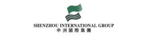
The Shenzhou International logo has not changed since the company came into existence in 2005. There is no documentation of any major logo changes. The current logo features a stylised emblem and two wordmarks. The emblem consists of a wavy flag‑like shape in green above three curving grey stripes. This abstract “flag and waves” motif suggests motion and forward progress.
The colour palette is dominated by a medium green to symbolise growth and sustainability and neutral grey. The company name is rendered at the bottom of the emblem in a clean, bold all‑caps sans‑serif typeface. Both the English name (“SHENZHOU INTERNATIONAL GROUP HOLDINGS LIMITED”) and the Chinese name are typically set in simple, modern fonts to convey clarity and professionalism.
The Elements of the Shenzhou International Logo
Font
The Shenzhou International logo consists of an emblem and wordmarks in both English and Chinese. The English wordmark stating the brand name is written using a straightforward sans‑serif font in uppercase. The Chinese name, on the other hand, is set in a standard Chinese font without embellishment. It matches the clean aesthetics of its English counterpart. It appears Shenzhou uses a proprietary or modified font to ensure the wordmark is unique yet legible.
Colour
The primary colour of the Shenzhou International logo is green, with the accent stripes in grey/charcoal. The colour green evokes growth, nature, balance and sustainability. The green colour of the logo likely reflects its emphasis on textile innovation and eco‑friendly practices. The grey waves add contrast and a high‑tech feel. In fact, the grey tones are associated with balance, stability and sophistication. Together, the green-and-grey palette gives a fresh yet dependable impression.
Finally
The Shenzhou International logo shows the journey of the company from a local OEM manufacturer to a world-leading, sustainability-focused garment enterprise. The logo has not changed since the inception of the company and is considered relatively understated compared to consumer brands. The current logo projects a sense of reliability, internationalism, and forward-thinking qualities that define Shenzhou International today.