Shangri-La Hotels and Resorts is a popular chain of hotels with a presence in more than 75 countries. It was founded in 1971, with its first property opening in Singapore. From its inception, the brand has been closely tied to Asian heritage and emphasised sincerity, authenticity, and warm hospitality. The logo reflects these values with its distinctive “S” mark and a typeface that conveyed both elegance and tradition. The logo encapsulates the brand’s commitment to heartfelt service and luxury inspired by its Asian roots. The article delves into the evolution of the Shangri-La Hotels and Resorts over the years.
The Genesis of the Shangri-La Hotels and Resorts Logo (1971 – 2021)
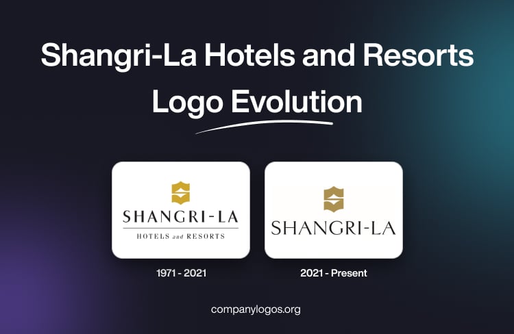
The original logo of Shangri-La Hotels and Resorts featured the letter “S” in a stylised format. It was designed to evoke imagery inspired by Asian culture. It also aligned with the brand’s inspiration from the mythical paradise Shangri-la as described in Lost Horizon written by James Hilton. The letter “S” aimed to reflect hospitality, serenity, and Asian heritage.
The letter “S” was followed by the brand name “Shangri-La Hotels and Resorts” written in a typeface inspired by Asian calligraphy. In the logo, the word “Shangri-La” was written in a bigger size in black uppercase. Beneath the words were written “Hotels and Resorts” in a combination of uppercase and lowercase and separated by a thin line.

(2021 – Present)
In 2021, to mark its 50th anniversary, Shangri-La revised its logo. It was not merely a cosmetic update but a strategic move to reflect the brand’s journey with its guests and its vision for the future. The refreshed logo was designed to pay tribute to the brand’s roots. At the same time, it embraced a more contemporary and forward-looking identity.
In the 2021 logo iteration, the iconic “S” mark was retained to preserve the powerful brand equity that was built over five decades. The “S” symbol adopted a new golden colour to symbolise the warm glow of sunrise. The choice of colour signalled optimism, renewal, and the start of a new era for the brand. The typeface was modernised, and it drew inspiration from Asian calligraphy. This provided a fresh and contemporary look and reinforced the brand’s deep connection to its Asian heritage and traditions.
The refreshed logo has done away with the words “Hotels and Resorts”. This strategic decision reflects Shangri-La’s belief that its brand represents more than just physical locations. In fact, it embodies a feeling, an experience, and a source of joyful moments for guests.

The Elements of the Shangri-La Hotels and Resorts Logo
Font
The current Shangri-La Hotels and Resorts logo features a refined typeface that draws inspiration from Asian calligraphy. This modernised font was introduced to celebrate the 50th anniversary of the brand in 2021. The redesign aimed to create a stronger connection to the brand’s Asian heritage and traditions while also presenting a more contemporary, elegant, and sophisticated look. The calligraphic elements in the typeface evoke a sense of history and tradition and reinforce the roots and commitment of Shangri-La Hotels and Resorts to heartfelt Asian hospitality.
Colour
The signature “S” mark in the logo appears in a new golden colour. This colour is specifically chosen to evoke the warm glow of sunrise and to symbolise optimism, renewal, and the promise of new beginnings. The golden tone adds a sense of luxury and warmth to the brand’s identity and aligns with the brand’s philosophy of delivering joyful and uplifting experiences to guests. The refreshed colour palette is a key element in conveying the brand’s evolution while staying true to its core values.
Finally
The logo of Shangri-La Hotels and Resorts is reflective of the brand’s journey from a single hotel in Singapore to a global leader in luxury hospitality. The refreshed logo, which was unveiled for the 50th anniversary, retains the essence of the brand. It signals a renewed commitment to innovation, guest experience, and the timeless values of Asian hospitality.