Skip to content
Home » Famous logos » The History and Evolution of the ServiceNow Logo

The History and Evolution of the ServiceNow Logo

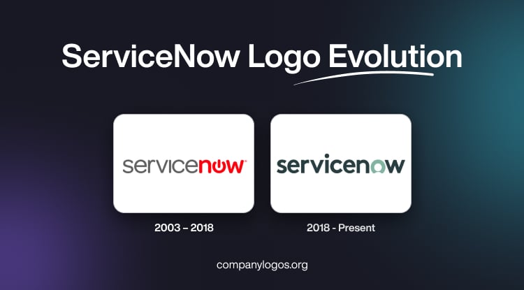
ServiceNow Logo Evolution

ServiceNow is a software solution for helpdesk automation project management, customer service management, IT service desk management, and others. It was founded in 2003 by Fred Luddy under the name “Glidesoft.” The company quickly positioned itself in the growing field of IT service management (ITSM) and enterprise workflow automation.

By 2006, it was officially renamed ServiceNow to better reflect its core value proposition, that is, delivering rapid, on-demand solutions for enterprise services. The ServiceNow logo has changed only once since the inception of the company. The logo iteration reflects the technological changes and design trends of the day. The article delves into the logo of ServiceNow, among other details.

The Genesis of the ServiceNow Logo (2003 – 2018)

The initial ServiceNow logo was a simple wordmark written in a straightforward lowercase sans-serif typeface. The word “Service” was mentioned in grey, while “now” was rendered in a distinctive dark red colour. Besides, the letters in “now” were bolder, and the letter “o” was stylised as a power/start button. It was a subtle reference to the technological foundation of the company and its focus on enabling action in IT environments. This logo balanced sophistication (grey) and passion (red), and the power button symbol served as a powerful metaphor for empowerment and operational readiness.

ServiceNow Logo (2003 – 2018)

(2018 – Present)

In 2018, ServiceNow radically reimagined its visual identity following strategic developments. These included the acquisition of an AI company. The brand sought to reposition itself, not just as a tech enabler, but as a partner putting people at the centre of digital transformation. The font used in the redesigned logo remained minimal but became more uniform in weight for better balance.

The colour palette shifted from grey and red to two signature shades of green to symbolise growth, sustainability, and renewal. The most significant change was to the letter “O.” It was no longer a power button but a stylised human head and shoulders.This redesign was done to conveyServiceNow’s mission about empowering people and not just technology. This subtle humanisation of the logo was meant to reinforce the core promise of ServiceNow of streamlined, people-first workflows and customer focus.

ServiceNow Logo (2018 - Present)

The Elements of the ServiceNow Logo

Font

The wordmark in the ServiceNow logo uses a simple and clear typeface from the Arial family. And due to its smooth sans-serif letters, the logo is visible even at a cursory glance and easy to read.

Colour

The colour palette of the ServiceNow logo is based on a combination of dark and light colours. For instance, it used to be grey and red previously but is now dark green and turquoise.

The History of ServiceNow

ServiceNow was founded in 2003 by Fred Luddy under the name Glidesoft in San Diego, California. Luddy, who was a former CTO of Peregrine Systems and Remedy Corporation, aimed to deliver cloud-based IT service management (ITSM) solutions that streamlined IT operations, which had traditionally relied on cumbersome on-premises software.

In the earliest days of the company, Luddy was the sole employee. He developed the software on a single laptop until a small group of volunteers joined him. External funding and the first official hires followed in mid-2005. By 2006, the company had changed its name to ServiceNow and acquired its first paying customer. The following year, it opened its first Silicon Valley office and reached cash flow positivity by reporting $13 million in annual revenue.

In 2012, ServiceNow held its Initial Public Offering (IPO) on the New York Stock Exchange and raised over $210 million in capital. After the IPO, ServiceNow shifted its headquarters to Santa Clara, California, and expanded its platform beyond ITSM into broader enterprise workflow solutions. These include HR, customer service management, security operations, and the introduction of the low-code Now Platform.

From 2018 to 2021, the company pursued strategic acquisitions such as VendorHawk for cloud resource management, Passage AI and Loom Systems for AI and robotic process automation, Element AI for advanced AI research, and Lightstep for observability and monitoring. These acquisitions enhanced its automation and artificial intelligence capabilities.

In the 2020s, ServiceNow continued to innovate by supporting low-code/no-code development. It entered strategic partnerships with leading technology firms and deepened AI integration, which included collaborations with companies like NVIDIA to advance large language models. Over the years, ServiceNow has maintained a culture founded on humility, integrity, customer-centricity, and collaboration, which remains central to its reputation today.

Interesting Facts About ServiceNow

  • ServiceNow was founded in 2003 by Fred Luddy, who was previously the CTO of Peregrine Systems. It started as a platform focused on IT Service Management (ITSM) to help organisations automate and manage their IT services.
  • Luddy personally wrote the entire first version of the ServiceNow platform by himself in Java. His philosophy was to create “a platform that would make work better for people.”
  • Initially called Glidesoft, the company changed its name to ServiceNow in 2006. The term reflects the platform’s goal to deliver services efficiently “now,” not later.
  • ServiceNow went public in June 2012, under the ticker symbol NOW on the NYSE. Its IPO raised over $200 million, and the stock surged 37% on the first trading day.
  • Though it began with ITSM, ServiceNow has expanded its capabilities to include:
    • Human Resources Service Delivery
    • Customer Service Management
    • Security Operations
    • Governance, Risk, and Compliance (GRC)
    • Creator Workflows for custom apps
  • ServiceNow positions itself as a “platform of platforms” to help large enterprises connect and automate processes across multiple legacy systems.
  • ServiceNow’s customer base includes most of the Fortune 500 companies. This reflects its growing influence in the enterprise IT ecosystem.
  • With its Now Platform, ServiceNow integrates AI, machine learning, and robotic process automation (RPA) to help businesses predict issues, automate tasks, and improve decision-making.
  • To enhance its capabilities, ServiceNow has acquired several companies, including Element AI (AI capabilities), Loom Systems (AIOps), Sweagle (configuration data management), and Intellibot (RPA).
  • Bill McDermott, former CEO of SAP, became ServiceNow’s CEO in 2019. Under his leadership, the company has aggressively expanded its vision to become the “defining enterprise software company of the 21st century.”
  • ServiceNow has made Environmental, Social, and Governance (ESG) a priority. It offers ESG management tools within its platform to help businesses track and meet their sustainability goals.
  • ServiceNow enjoys very high customer renewal rates (often over 98%), which indicate strong customer satisfaction and reliance on its services.

Finally

The logo history of ServiceNow is more than a visual record; it tells the story of a company maturing from a utilitarian SaaS vendor to a globally recognised brand. It also shows the brand’s deep focus on people, workflow optimisation, and growth. The shift from a power button to a human-like form in its logo marks a transition in brand identity as well as the underlying philosophy guiding the company into the future.

Leave a Reply

Your email address will not be published. Required fields are marked *