
Seoul Broadcasting System (SBS) stands as one of South Korea’s leading private broadcasters and is recognised for its influential programming and distinctive branding. The evolution of its logo reflects both the broadcaster’s growth and the broader trends in media design. It encapsulates shifts in corporate identity and audience engagement. The article delves into the evolution of the SBS (Korea) logo over the years and discusses other details of the company.
The Genesis of the SBS (Korea) Logo (1991 – 2000)
When SBS was established on November 14, 1990, it adopted a logo that featured the brand name in Korean script. Although the logo was used prominently during its formative years, the Korean logotype in monochrome emphasised the broadcaster’s local roots and cultural identity. It resonated with its initial audience in Seoul and the surrounding areas.

(1991 – 1994)
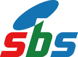
Designed by Yang Sung-Chun, another visual identity of the broadcaster was designed without the Korean script. Launched on March 20, 1991, it featured the abbreviation “sbs” in a slanted custom sans-serif typography along with a slanted disc on top. Each letter of the abbreviation appeared in a different colour – “s” in red, “b” in green, and “s” in blue. The disc in blue was placed just above the letter “b”, and the intersection between the two was coloured in white.

(1994 – 2000)
The 1994 logo iteration saw the removal of the blue disc and the abbreviated “SBS” rendered in a large size using the Gill Sans Bold typeface. The blue-coloured logotype was launched on September 19, 1994.

(2000 – Present)
On November 14, 2000, SBS unveiled another logo featuring the English initials “SBS” in custom typography in a deep blue colour. It appeared to the right of three concentric circles of varied circumference. The outer thick circle was painted in blue, the middle one in light brown, and the inner in white.
Designed by INFINITE, the circles symbolised harmony, connection, and the broadcaster’s commitment to bridging people and ideas. The arrangement and colour palette of the concentric circles conveyed a sense of dynamism and inclusivity.

The Elements of the SBS (Korea) Logo
Font
The SBS (Korea) logo utilises a modern, sans-serif font that emphasises clarity and readability. Another font associated with SBS branding is “SeoulHangang EB” (Extra Bold). This is characterised by clean, modern design with a strong emphasis on readability. It has well-balanced characters with consistent stroke width.
Colour
The primary colour used in the SBS logo is a distinctive blue, which is often referred to in branding materials as “Prism Blue”. This colour serves as the main identity colour across the visual assets of SBS (Korea). The Prism Blue colour unifies the brand image and conveys a sense of trustworthiness and modernity.
The History of SBS (Korea)
SBS (Korea), or Seoul Broadcasting System, was established on November 14, 1990, in Seoul, South Korea, as the second commercial broadcaster in South Korea after MBC. The company came into being after the democratic reforms in South Korea in 1987, which paved the way for a more open media landscape. The government of the day wanted to provide a broad alternative to the public-dominated airwaves. It also wanted to counterbalance the influence of foreign broadcasters like Japan’s NHK BS1, which resulted in the granting of new private broadcasting licences in June 1990 after a hiatus of a decade.
SBS (Korea) began with experimental demo broadcasts and test transmissions for both TV and radio channels on December 1, 1990. However, its establishment was not without controversy, particularly due to the involvement of the Taeyoung Construction Corporation, which owned a significant share of the company. This raised concerns in the media, with some labelling it “the scandal of the Sixth Republic”.
SBS Radio launched its first regular broadcast on March 20, 1991, on AM 792 kHz. SBS TV began official broadcasts on December 1, 1991, at 10:00 am in Seoul. It was a date that is since marked as “The Day of Birth of SBS”. Initially, its terrestrial broadcasts were limited to Seoul and nearby regions. In the early 1990s, the government allowed the creation of private regional broadcasters. SBS (Korea) developed a network of affiliates in major cities. These include KNN (Busan), TJB (Daejeon), TBC (Daegu), and KBC (Gwangju). These affiliates broadcast SBS programmes while also producing local content tailored to their regions.
On March 17, 2000, the company officially changed its corporate name from Seoul Broadcasting System to SBS. This was done to reflect its broader ambitions and modernised identity. SBS continued to expand its offerings by launching additional TV channels (such as SBS Plus, SBS Golf, SBS funE, and SBS Sports) and radio stations (Power FM and Love FM). SBS embraced digital technology early. Consequently, it began providing terrestrial digital TV services from 2001 and launched T-DMB (Digital Multimedia Broadcasting) services in 2005.
Today, SBS (Korea) operates a wide range of television and radio channels, with its flagship terrestrial channel broadcasting on Channel 6. It is recognised for its influential news, entertainment, sports, and drama programming. It continues to serve audiences both domestically and internationally.
Interesting Facts About SBS (Korea)
- SBS is South Korea’s second commercial broadcaster that was established on November 14, 1990. It came into existence following government reforms that allowed for more private media competition.
- Unlike its main rival MBC, SBS operates with a federalised model. It manages a network of nine regional stations. So, while SBS in Seoul is the flagship, affiliates outside Seoul produce local programming to cater to regional audiences.
- SBS is owned by Taeyoung Construction, a major South Korean construction company. This makes it unique among broadcasters for its corporate parentage.
- SBS has been at the forefront of technological innovation. It launched digital terrestrial television services in the ATSC format in 2001 and T-DMB (Digital Multimedia Broadcasting) services in 2005. It also supports mobile and multimedia content.
- SBS operates a wide range of platforms, which includes its main terrestrial channel (Channel 6), several cable/IPTV/satellite channels (such as SBS Drama Plus, SBS Golf, SBS funE, and SBS Sports), and three radio networks (Power FM, Love FM, and AM radio).
- Through SBS International, the network distributes original Korean content to audiences worldwide. It plays a major role in the global spread of the Korean Wave (Hallyu), especially in the U.S. and other regions.
- The headquarters of SBS is located at 161 Mokdongseo-ro, Yangcheon District, Seoul, South Korea, which is a major media hub in the country.
- The broadcaster legally changed its name from Seoul Broadcasting System to SBS in March 2000, reflecting its national and international ambitions.
- SBS TV broadcasts in high definition (HD) and has adopted 2160p UHDTV technology (downscaled to 1080i for HDTV feeds), staying current with global broadcast standards.
- SBS is known for producing some of Korea’s most popular dramas, variety shows, and entertainment programmes, contributing significantly to the country’s pop culture and media exports.
Finally
The history and evolution of the SBS logo show the journey of the broadcaster from a regional player to a national and international media powerhouse. By using thoughtful redesigns and symbolic elements, SBS has crafted a visual identity that balances tradition, modernity, and a forward-looking vision. The logo is one of the most recognisable media brands in South Korea.