The State Bank of India (SBI) is one of the largest public sector banks in India, with an extensive network of branches and ATMs in even the remotest parts of India. It has a rich history that goes back to the British era. Today, SBI plays a key role in promoting financial inclusion with services such as retail banking, bancassurance, corporate finance, asset management, and international banking, among others.
The evolution of the SBI logo shows the transformation of the bank from its colonial roots to a symbol of national pride and financial stability. The article explores the transformation of the SBI logo over the years.
The Genesis of the SBI Logo (1921 – 1955)
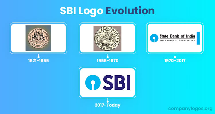
The origins of SBI can be traced back to 1921, when the British government combined three presidency banks—Bengal, Bombay, and Madras— to create the Imperial Bank of India. The logo from this period featured a golden coin with the English coat of arms to symbolise imperial authority over currency in British India. This emblem represented the bank’s connection to colonial governance and financial control.

(1955 – 1970)
In 1955, after India’s independence and the enactment of the State Bank of India Act, the Imperial Bank was rebranded as the State Bank of India. This transition brought about a new circular logo that featured a banyan tree at the centre. The periphery of the circle showed the bank’s name in both English and Hindi scripts.
The banyan tree was chosen as it is regarded as a symbol of longevity and growth in Indian culture. Also, the banyan tree reflected the bank’s strength and stability. It represented the bank’s roots and its aspirations for growth and service to the community.

(1970 – 2017)
In 1970, the State Bank of India underwent a significant rebranding exercise. It got a new logo designed by Shekhar Kamat from the National Institute of Design (NID). He introduced a minimalistic blue circle with a gap at the bottom to resemble a keyhole. This design marked a departure from the intricate banyan tree emblem and was intended to convey several meanings as given below:
- Security: The keyhole symbolises safety, which suggested the SBI to be the custodian of customers’ wealth.
- Accessibility: The gap signifies that SBI serves even those in remote areas. It emphasised the bank’s commitment to financial inclusion.
- Customer Centricity: The small circle represents customers to be at the centre of the bank’s operations.
This logo was officially adopted on October 1, 1971, during a ceremony to mark the inauguration of SBI’s Central Office in Bombay. The circular emblem of the logo in blue with a vertical white element appeared on the left of the brand name “State Bank of India” and the tagline “THE BANKER TO EVERY INDIAN.”
The brand name and the tagline were written in two levels and were separated by a thin black line. For instance, the brand name was written using a modern sans-serif typeface, while the tagline was written using a lightweight typeface.

(2017 – Today)
In 2017, the wordmark in the logo was shortened in the form of an abbreviation, while the tagline was removed altogether. The abbreviated “SBI” was written in a simple sans-serif typeface in deep purple where the horizontal bar of the letter “B” was shortened. The circular emblem on the left of the wordmark remained the same.

The Elements of the SBI Logo
Symbol
The symbol of the State Bank of India (SBI) logo has remained almost unchanged over the years. However, in 2017, the accompanying logotype underwent a significant update. The full name of the bank was replaced with the abbreviation “SBI” in dark purple.
Font
The typeface used in the updated SBI logo is a modern sans-serif design. The font has been extensively modified to emphasise “weight and institutional authority,” as per the company’s official guidelines. The geometric style of the typeface ensures excellent legibility, even from a distance. A unique characteristic of the wordmark is the gap in the letter “B,” which visually complements the gap in the logo’s emblem, thereby achieving a cohesive design.
Colour
The lighter blue tone, which has been a hallmark of the State Bank of India logo for decades, was paired with a dark purple wordmark in the 2017 redesign. On the other hand, the colour white was used more sparingly. This blue and dark purple palette aligns with trends seen in digital banking and payment platforms like PayPal and PayTM. However, this similarity has also presented challenges for SBI, as it faces increasing competition from such digital-first services.
Finally
Today, the SBI logo stands as a powerful symbol of trust and reliability for millions of Indians. Its evolution reflects broader changes in Indian society and banking practices. With SBI continuing to grow and adapt in an ever-changing financial landscape, its logo will remain a testament to its enduring legacy and commitment to customer service.