Skip to content
Home » Famous logos » The History and Evolution of the Santander Group Logo

The History and Evolution of the Santander Group Logo

Santander Group Logo Evolution

The Santander Group is a major banking group from Spain, which was founded in 1857 by the Spanish Queen Isabel II to finance trade between Spain and Latin America. The Santander Group logo is one of the most recognisable symbols in the global banking industry. Over the years, it has undergone several changes to reflect the bank’s growth, modernisation, and adaptation to the digital age. This article explores the evolution of the Santander Group logo and other details.

The Genesis of the Santander Group Logo (1857 – 1949)

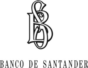
The first logo of Banco Santander was an arched textual representation of its heritage in monochrome. It featured the words “Banco de Santander” in an ornate Old English font, adorned with intricate swirls and decorative elements. The individual letters of the wordmark resembled the art of calligraphy. This design reflected the Spanish roots of the institution and its focus on trade between the port of Santander and Latin America.

Santander Group Logo (1857 – 1949)

(1949 – 1971)

In 1949, Santander updated its logo to include a monogram with the intertwined initials “BS” (Banco Santander). These letters were rendered in white with black outlines to maintain a classic yet modernised aesthetic. The full name “Banco de Santander” was displayed in a slender serif typeface below the monogram. It signalled a balance between tradition and contemporary design.
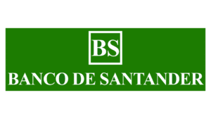
Santander Group Logo (1949 – 1971)

(1971 – 1986)

In the 1971 logo iteration, the design was simplified using a green-and-white colour palette. The monogram of the previous design was replaced by two bold letters “BS” in uppercase and placed within a thin square frame. The wordmark “Banco De Santander” in uppercase was placed below the monogram in a typeface that was thicker and wider. The foreground, including the monogram and the wordmark, was in white, while the rectangular background was in green.

Santander Group Logo (1971 – 1986)

(1986 – 1989)

In 1986, the logo underwent further simplification. The wordmark “Banco Santander” was split into two lines, with “Banco” appearing in a smaller size above “Santander” in a bold red typeface. The wordmarks were presented in a title case and underscored by a bold red line. To the left of the wordmarks was placed a graphical element in the shape of a pointed drop. It consisted of a solid green oval and a few curved stripes in green and white rising above.

Santander Group Logo (1986 – 1989)

(1989 – 1999)

The previous logo iteration was changed in 1989, wherein the green was replaced with red. The red and white coloured graphical emblem looked more powerful and dynamic. At the same time, the black wordmark exuded stability and professionalism.

Santander Group Logo (1989 – 1999)

(1999 – 2001)

The logo was redesigned again in 1999 after the merger of the Santander Group with Banco Central Hispano. It comprised a vertically oriented rectangular emblem in two parts and a wordmark in four levels and underscored by a red line. The upper part of the emblem had a solid red background with the letters “BSCH” inside in white. The bottom part of the emblem with an arched head was in blue. The four-level wordmark in blue was written using a traditional bold typeface.

Santander Group Logo (1999 – 2001)

(2001 – 2007)

This logo featured the wordmark “Santander Central Hispano” in two levels in white against a rectangular red background. To the left of the wordmark appeared the red oval emblem. The thin font used to write the wordmark had serifs. 

Santander Group Logo (2001 – 2007)

(2007 – 2018)

In 2007, Santander refined its logo by making a lighter version of the previous one. Consequently, the red rectangular background was retained but narrowed. Also, only “Santander” from the previous logo was featured in white, while the other words were removed.

Santander Group Logo (2007 – 2018)

(2018 – Present)

In 2018, Santander partnered with Interbrand for a significant rebranding effort that was aimed at adapting to the digital age. The updated logo features a slimmer wordmark in a sans-serif typeface for improved readability on digital devices. The wordmark appears in a bright red colour for enhanced visibility. Further, the red background was removed in favour of a clean white backdrop for a minimalist aesthetic.

Santander Group Logo (2018 – Present)

The Elements of the Santander Group Logo

Symbol

The Santander Group logo is made of the wordmark and a stylised fiery swirl. The swirl is made of an oval with wavy lines.

Font

The wordmark in the Santander Group logo is written using a French old-style semi-bold serif font. It resembles the Bergstrom DT Bold typeface.

Colour

The colour palette used to design the Santander Group logo comprises red and white. Red is the dominant colour, as it symbolises energy, strength, and determination.

The History of Santander Group

The Santander Group, headquartered in Santander, Spain, is one of the largest and most influential banking institutions in the world. It was established in 1857, and its journey from a local bank facilitating trade to a global financial powerhouse is marked by strategic acquisitions, international expansion, and consistent innovation.

Banco Santander was founded on May 15, 1857, after a royal decree signed by Queen Isabella II of Spain. Its initial purpose was to support trade between the Port of Santander in northern Spain and Latin America. The bank began operations with just 17 employees and focused on regional financial services.

During the early 20th century, Santander expanded its reach by integrating other banking institutions. Some of the key acquisitions included Banco Hispano Americano (1900) and Banco Español de Crédito (1902). These mergers helped Santander grow its market presence within Spain. In 1946, Santander acquired Banco Mercantil, which marked its first major expansion beyond regional boundaries. This acquisition laid the foundation for its transformation into a national bank.

Santander opened its first office outside Spain in Havana, Cuba, in 1947, thereby signalling its entry into the Americas. By 1955, it had established its first European office in London at Lombard Street. The bank continued to grow through acquisitions and partnerships during this period. For example, in 1980, it acquired CC-Bank in Germany to strengthen its presence in Europe.

Santander’s major wave of international expansion began in the late 1980s with a focus on Latin America. It acquired several banks across Brazil, Chile, Mexico, and Argentina during this period. These strategic moves positioned Santander as a leading player in the Latin American banking market. Domestically, Santander merged with Banco Central Hispano in 1999 to form Banco Santander Central Hispano (BSCH). This merger created one of Spain’s largest banking entities and further consolidated its dominance within the country.

The early 2000s marked a period of aggressive acquisitions for Santander. For instance, in 2000, it acquired Banespa (Brazil), Serfín (Mexico), and Banco Santiago (Chile). In 2004, it purchased Abbey National in the United Kingdom, which marked its entry into the British market. Furthermore, in 2010, Santander acquired the Sovereign Bank in the United States and rebranded it as Santander Bank by 2013. These acquisitions helped Santander achieve global scale and diversify its portfolio across Europe, Latin America, and North America.

In recent years, Santander has focused on adapting to the digital age while maintaining its global leadership. It launched innovative digital banking services and expanded its consumer finance division. The bank also streamlined operations by integrating acquired entities like Banesto and Banif under the Santander brand. Today, Santander operates in ten major markets worldwide—Spain, Germany, Poland, Portugal, the UK, Brazil, Mexico, Chile, Argentina, and the US—with over 195,000 employees serving millions of customers globally.

Interesting Facts About Santander Group

  • Banco Santander was originally set up in 1857 to finance trade between Spain and Latin America, especially Cuba, which was still a Spanish colony at the time.
  • Santander has been strongly influenced by the Botín family for generations. Today, Ana Patricia Botín (great-granddaughter of one of the early chairmen) is leading the bank. It is a rare example of a family-run company at such a massive global scale.
  • Santander launched Openbank in 1995, which is one of the first entirely online banks in Europe. This was way before the “fintech” wave made its way.
  • The famous red flame in the Santander logo represents warmth, energy, and the bank’s Latin spirit. Red also symbolises passion and vitality, two values the bank wants to project globally.
  • Although headquartered in Spain, Santander earns a huge chunk of its profits from Brazil and other Latin American countries. In fact, the earnings are often more than from its European operations.
  • Santander became a household name in the UK almost overnight when it bought Abbey National, Bradford & Bingley, and Alliance & Leicester between 2004 and 2008. These entities were rebranded under the Santander name.
  • Santander runs Santander Innoventures, which is a venture capital fund investing in fintech startups. It deals with everything from digital payments to blockchain companies.
  • Santander has been a major sponsor of soccer (football), including naming rights for Brazil’s Copa Libertadores and Spain’s La Liga Santander for several seasons.
  • Santander also sponsored Ferrari’s Formula 1 team for many years.
  • While many banks needed government bailouts during the 2008 financial crisis, Santander remained profitable and even expanded its footprint during that period, especially by acquiring struggling banks.
  • As of 2025, Santander serves more customers than the entire population of many large countries, like Russia or Japan!
  • Santander has a “Work Café” concept — branches that combine banking services with a coffee shop! These hybrid spaces are especially popular in Chile and Spain.

Finally

The Santander Group’s logo evolution over the years is a testament to how visual identity can adapt while preserving heritage. Also, how a logo and its various iterations can ensure relevance for a brand in an ever-changing financial landscape. Today, the Santander Group logo stands as a symbol of trust, innovation, and global leadership in banking.

Leave a Reply

Your email address will not be published. Required fields are marked *