Samsung Internet is a mobile web browser developed by Samsung Electronics. It is designed to deliver a fast, secure, and customisable browsing experience across Galaxy smartphones, tablets, foldables, and even wearables. The browser is built on the Chromium open-source platform and combines the speed and compatibility of modern web standards. It also aligns with Samsung’s own innovations in privacy, accessibility, and device integration.
Since its launch in 2012, the Samsung Internet browser has evolved from a Galaxy-exclusive browser into a globally recognised alternative to Chrome, Firefox, and Edge. It stands out for features like Secret Mode with biometric security, content blockers, Smart Anti-Tracking, and seamless integration with Samsung Cloud and Samsung DeX.
Central to the evolution of this browser has been the continuous refinement of its visual identity, particularly its logo design. The various logo iterations over the years have been brought about to reflect changing design trends and Samsung’s broader brand strategy. The article delves into the various logo iterations of the Samsung Internet browser, among other details.
The Genesis of the Samsung Internet Logo (2005 – 2007) (Unavailable)
Samsung has been developing web browsers for its feature phones for quite some time. The earliest designs to be made available in 2005 are not present in the public domain.
(2007 – 2009)
The first available design was from 2007 and featured a tilted three-dimensional globe icon in blue and white and white latitudes emanating from the top.

(2008 – 2009)
The 2008 iteration showed a straight two-dimensional globe in blue with clear demarcation of latitudes and longitudes in white. The globe was surrounded by a thick grey outline.

(2009 – 2010)
It was in 2009 that the real Samsung Internet logo was introduced in the form of a three-dimensional globe in green and white.

(2010 – 2011)
The 2010 logo iteration saw the introduction of a three-dimensional logo in blue and white with a gradient and interspersed with straight white lines, vertically and horizontally. The globe was further enclosed within a bluish-green square with rounded corners.

(2011 – 2012)
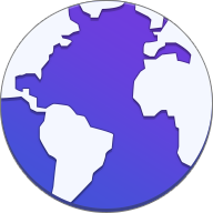
The logo during this period saw a slightly left-tilted globe in blue and white, where blue symbolised the oceans and white the continents.

(2012 – 2013)
The Samsung Internet browser made its debut in 2012 as a replacement for the stock Android browser on Samsung Galaxy devices. The browser was initially developed to provide a browsing experience specifically optimised for Samsung’s hardware ecosystem. The logo design featured a right-tilted globe in green and white colours with a gradient. The globe had green-coloured longitudes enveloping it across.

(2013 – 2014)
The green colour had its prominence in the 2013 logo iteration when it represented the oceans in a globe icon with white continents.

(2014 – 2015)
The green colour of the previous logo was changed to deep blue in the 2014 iteration without the presence of horizontal or vertical lines. The grey outline with shadows gave the globe icon better traction in digital landscapes.

(2015)
The previous logo design was almost repeated in the 2015 iteration, but with purple colour replacing green. This logo was used on the Galaxy S6 smartphone.
(2015 – 2016)
As Samsung Internet gained traction, reaching an estimated 400 million monthly active users by 2016, the company began to invest more heavily in the browser’s visual identity. The logo during this period showed a smaller globe in white and purple enclosed within a bigger oval-like figure in deep purple with a gradient. This was integrated with the Galaxy Note 5 system.
(2016) (February to October 2016)
The previous logo iteration was repeated again between the months of February and October 2016, but with a lighter shade of purple.
(2016) (May to December 2016)
The shade of purple in the previous logo was diluted a little in the 2016 iteration.
(2016 – 2017)
In the 2016 logo design, the size of the continents was increased, and the colour of oceans within a somewhat “flatter” globe was made lighter. The colour of the outer oval remained more or less the same. During this period, the wordmarks “SAMSUNG” and “Internet” in black were shown to the right of the globe icon in two levels.
The upper level saw the brand name “SAMSUNG” in uppercase, where the letter “A” did not have any middle bar. The lower level saw the wordmark “Internet” in a title case and in a sans-serif typeface.

(2017 – 2018)
In 2017, there was a pronounced shift in logo design. The globe was made into a stylised planet with a ring in white (like Saturn) and enclosed within a purple oval. The previous logotype was repeated here as well.

(2018 – 2019)
The previous logo design was repeated in 2018, but with a lighter shade of purple given to the outer oval.
(2018) (Unused)
The 2018 logo iterations were prototypes where the globe icon became fully white and the white ring was replaced by five small circles of uneven dimensions in blue. Interestingly, the much smaller first and last circles even spilled out of the white globe and into the outer oval space.

In the second prototype of the same period, the number of small circles was reduced by one, while the remaining elements of the logo were intact.

(2019 – 2022)
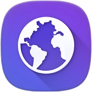
One of the most significant logo transformations occurred with Samsung Internet version 9.2 in 2019. This update introduced a “redesigned app icon” that would establish the visual foundation for all subsequent iterations. The new design featured a distinctive white planet with a tilted blue ring, set against a gradient oval background transitioning from purple to blue.
The blue tilted ring around the central sphere created a sense of dynamism and movement and suggested the active nature of web browsing. The black-coloured wordmark “Samsung Internet” in a title case appeared to the right of the globe icon.

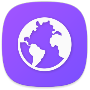
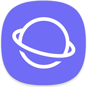
(2022 – 2025)
During this period, the logo design elements remained the same, but the colour of the outer oval was changed to a darker shade of purple. The outer ring around the tilted white globe changed from the earlier blue to a deep purple colour palette.

(2024) (Unused)
In 2024, the logo colour was changed from purple to various shades of blue, and the orientation of the ring was upended. However, this iteration was not introduced officially and remained unused.
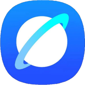
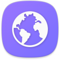
(2025 – Present)
The latest logo iteration represents Samsung’s response to modern design trends. It featured the design of the unused logo of 2024, but with a significant change in colour. The outer oval was made into dark purple, while the colour of the ring around the left tilted globe turned from light blue to deep blue. The logotype accompanying the globe motif was written in black using a custom Samsung Sharp Sans typeface.

The Elements of the Samsung Internet Logo
Font
The text forming a part of the Samsung Internet logo uses Samsung’s custom, bold, sleek and sans-serif typeface called Samsung Sharp Sans. The font is designed to offer a friendly and modern feel while ensuring strong visibility and consistency across Samsung’s extensive product ecosystem. Key characteristics of this font include straight lines, open shapes, and a distinct “A” without the horizontal bar.
Colour
The Samsung Internet logo employs a wide spectrum of gradient colours. These include deep blue, purple, and white. For instance, blue and purple in transition are set as the background for the app icon. However, the central symbol representing a planet with an orbital ring is rendered in white. The colour gives the logo clarity and emphasis against the vibrant backdrop.
The gradient of blue and purple evokes themes of technology, reliability, and innovation. It also aligns with Samsung’s use of blue as its signature brand colour since 1993. White conveys simplicity and modernity, while the subtle addition of purple adds a sense of creativity and futuristic style.
Finally
The evolution of the Samsung Internet logo represents more than mere aesthetic updates. It reflects the browser’s journey from a basic Samsung device utility to a globally recognised web browsing platform. Each logo iteration has built upon previous designs and at the same time adapted to new technological capabilities and user expectations.